The Elegant Simplicity of Monochromatic Colours
There is a profound beauty in simplicity. Monochromatic colour schemes, with their variations in lightness and saturation of a single colour, offer a cohesive and elegant look that can infuse your artwork with depth and sophistication.
Building on our exploration of complementary, analogous, and triadic colour schemes, we now turn to the refined world of monochromatic colours. Today, we’ll explore how to use monochromatic colours to create minimalist and serene compositions.

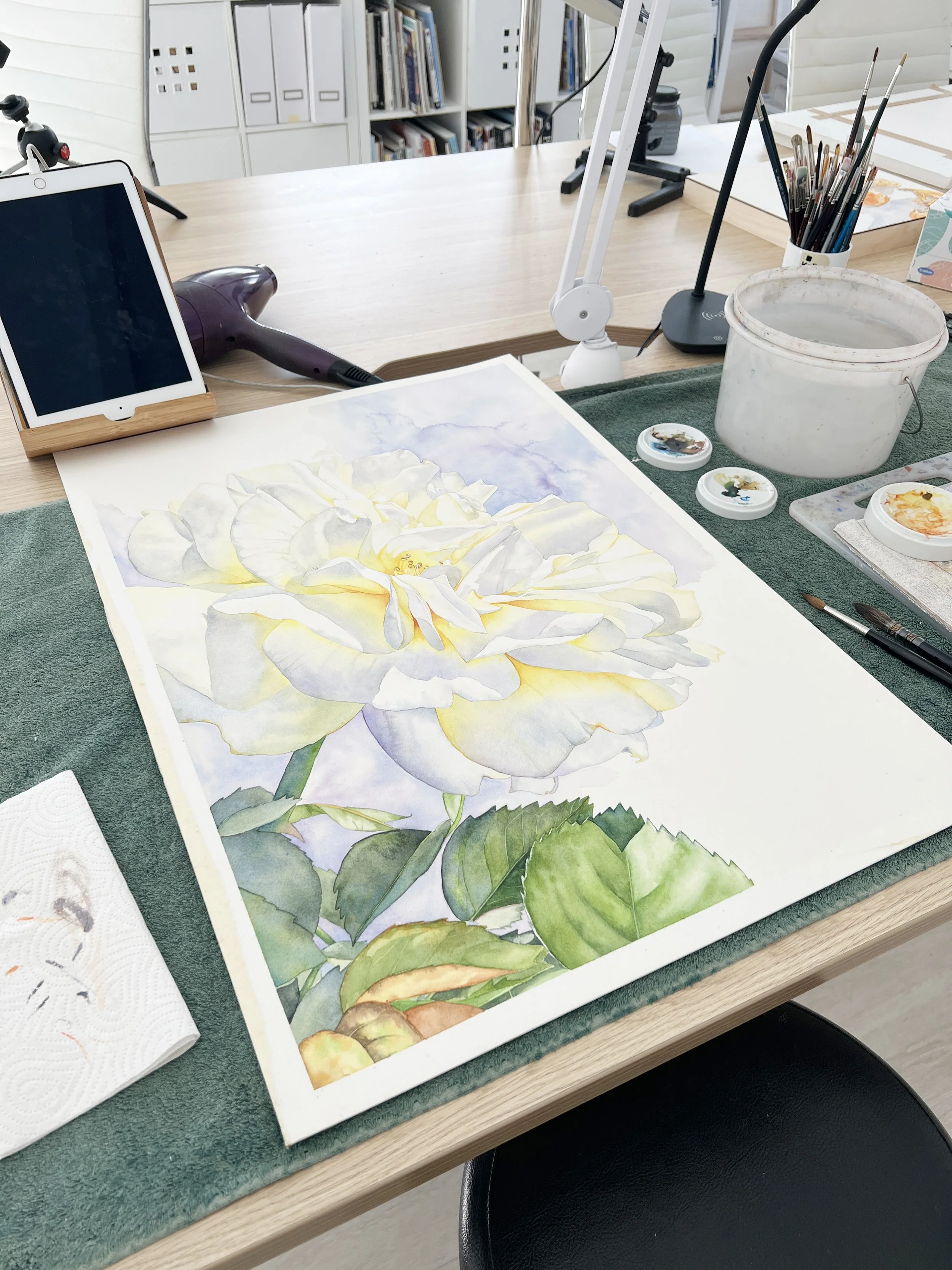
I used one hue - Winsor Green blue shade - to paint this monochromatic watercolour painting.
Monochromatic Colour Scheme
A monochromatic colour scheme uses variations in lightness and saturation of a single colour. By using the colour wheel, you can create a monochromatic palette by selecting shades, tones, and tints of a base colour. This harmony creates a cohesive and elegant look, perfect for minimalist and serene compositions.
How to Create a Monochromatic Palette

Start with a single hue.
Choose Your Base Colour: Start with a single hue that will serve as the foundation of your colour palette. This colour will be the anchor for all the variations you create to form a monochromatic palette.
Create Tints: Add white to your base colour to create lighter versions, or tints, of the colour. These tints will help you achieve highlights and softer areas in your painting. If you are working in watercolour - add water to create tints.
Create Shades: Add black to your base colour to create darker versions, or shades, of the colour. These shades are perfect for shadows and depth. If you are working with watercolour, add more pigment to the paint mixture to deepen the colour.
Create Tones: Mix your base colour with gray (a mix of black and white) to create tones. Tones add subtlety and complexity to your palette, providing a range of mid-tones that are less intense than pure hues or shades.
Monochromatic colour scheme examples, applications, and emotional Impact
Using the same hue throughout a painting creates a deep sense of elegance. It captivates the viewer's eye by playing with accents, variations in saturation, and differences in tones and shades.
Shades of Blue
Different shades of the colour blue can create a calm and soothing seascape, evoking feelings of peace and introspection. Imagine the gentle waves of the ocean in varying blues, bringing a sense of tranquility to the viewer. Blue can also evoke sadness.
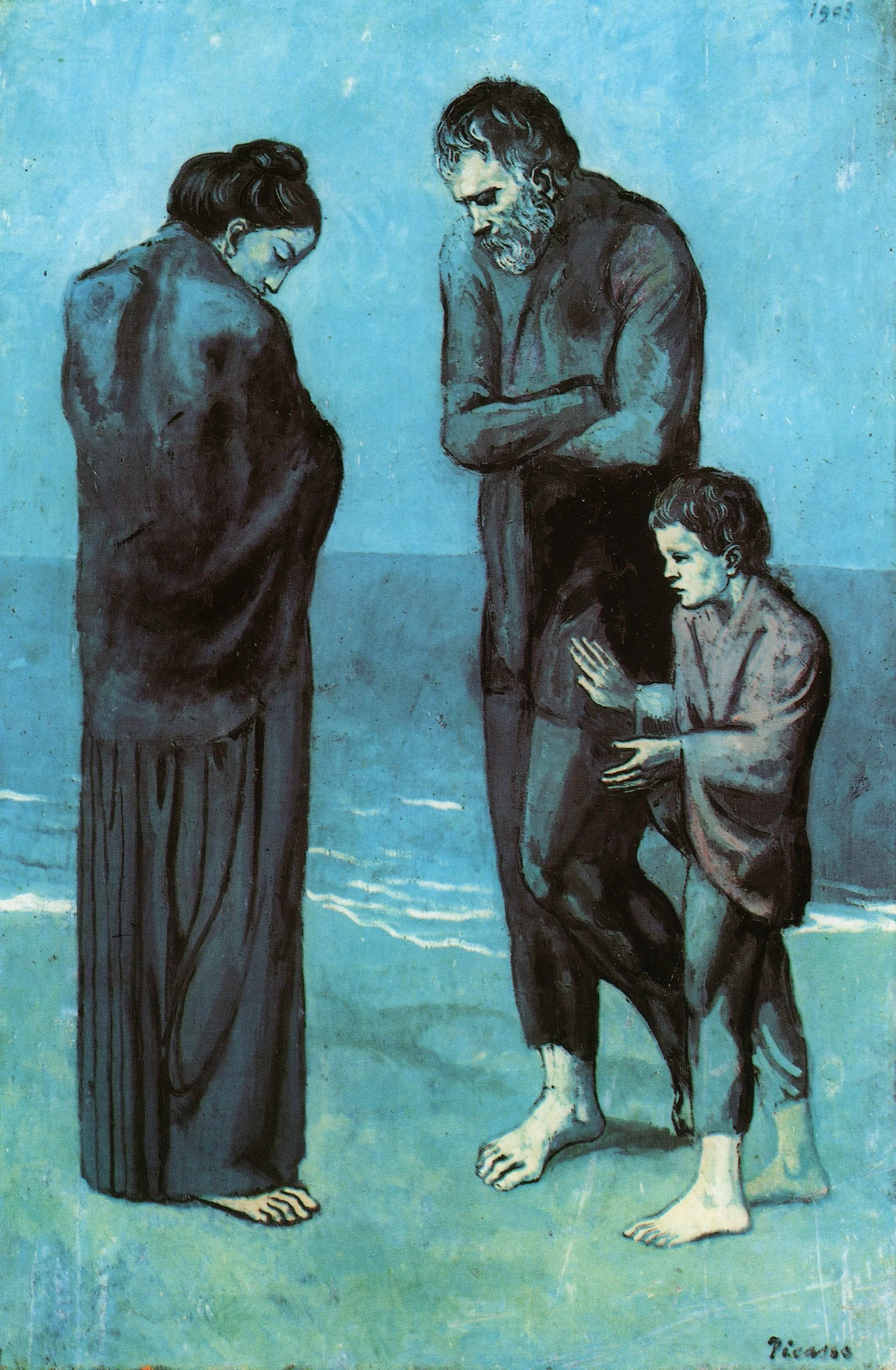
Picasso's 'The Tragedy' is a monochromatic painting, utilising a range of blue tones to evoke a profound sense of melancholy and desolation.
Tints of Green
Various tints of green can capture the vitality and freshness of a lush forest. Picture the layers of foliage in different greens, evoking renewal, growth, and harmony, perfect for natural and serene scenes.

Van Gogh - 'Green Wheat Fields, Auvers'. Van Gogh employs different shades of green to bring depth and dynamism to the fields, with the sky and distant trees providing subtle contrasts.
Tones of Grey
This monochromatic colour scheme can add a touch of sophistication and timelessness to portraits or architectural studies. The varied grays emphasize form and structure, evoking a sense of elegance and contemplation that can draw the viewer into a thoughtful, introspective experience.
The Grey Tree by Piet Mondrian. The painting is composed entirely of various shades of grey, ranging from light to dark. Mondrian uses these shades to create depth and texture within the abstracted forms of the tree.
Build your Painting Skills using a Monochromatic Colour Scheme
If you are a beginner painter, using a monochromatic colour scheme for a painting is a worthwhile exercise because it will help you:
Understand Value: Focus on creating depth and dimension through different tones and shades of a single colour.
Simplify Learning: Reduce the complexity of colour choices, allowing you to concentrate on technique and form.
Enhance Creativity: Experiment with various ways to manipulate one colour, improving your skills in blending and layering.
Build Confidence: Gain confidence in your ability to create visually appealing artwork with limited resources.
Tips for Use
Incorporate a variety of shades and tones to add depth and interest. Using darker shades can create balance and tone down the intensity of the base colour.

Use texture and patterns to enhance the visual appeal of your monochromatic compositions.
Monochromatic schemes work beautifully for creating mood and atmosphere, allowing you to focus on the emotional resonance of your artwork.
Monochromatic colour schemes bring a refined and elegant simplicity to your art. By using variations of a single hue, you can create paintings that are both visually cohesive and emotionally profound, inviting viewers to appreciate the subtle beauty of your work.
Mastering monochromatic colour schemes enhances your ability to convey mood and depth through subtle variations. This knowledge completes our exploration of colour theory, providing you with a comprehensive understanding of how to use colour harmonies to create impactful and resonant artworks.
Let your single colour sing in harmony, creating a symphony of shades and tints.
Happy painting!