Colour Theory Art & Why It's Important
A Complete Guide for Creatives
Whether you're an artist, designer, or simply a colour enthusiast, understanding how colours interact and influence is essential.
Bookmark this page, for it is your treasure map to the riches of colour theory. The insights and resources provided will ease your entry into this vibrant field, inviting you to explore with enthusiasm and curiosity. Think of this guide as your trusted map through the colourful landscapes of colour theory.
As we embark on this journey together, remember that what lies ahead is essential knowledge every enthusiast needs. But fear not! For those thirsting for deeper understanding of colour theory, each section below serves as a gateway to a more expansive universe of concepts, applications, and detailed guides.
Consider this your go-to resource, a foundational pillar to bookmark and return to time and again as you delve into the vivid world of colour theory. This guide is like a beacon, illuminating the path through the landscape of hues and shades that form the basis of all visual arts. Ready to unlock the full spectrum of possibilities in your creative endeavours?

Introduction to Colour Theory and Primary Colours
Dive into the world of colour with this introductory guide on colour theory. Whether you’re a painter, designer, or enthusiast, understanding the colour wheel and the basics of primary, secondary, and tertiary colours is crucial.
The colour wheel is essential for understanding colour theory as it visually represents the relationships between colours.
Primary colours form the basis of colour mixing in various colour models such as CMYK, RGB, and RYB.
Secondary colours are created by mixing two primary colours and are positioned between the primary colours on the colour wheel.
Tertiary colours are formed when a primary colour is mixed with a secondary colour, and they are located between the primary and secondary colours on the colour wheel. In this blog post, I lay the groundwork for mastering colour harmony, ensuring that you can apply these concepts practically in any creative endeavour.

Understanding Colour Psychology
Colours do more than beautify - they evoke feelings and influence moods. This part of our series will explore the psychological effects of colours, revealing how different hues can manipulate emotions and perceptions.
Cool colours, such as blue, green, and purple, create a calming, serene feeling in artwork. Warm colours, like red, orange, and yellow, are associated with energy, passion, and excitement.
Ideal for marketers, designers, and artists, this post will help you choose the right palette to convey the desired response, whether it’s excitement, calm, or something in between.
Exploring Colour Harmonies

Harmony is key in colour theory, and this section breaks down the different types of colour harmonies -complementary, analogous, triadic, and monochromatic - and their uses in visual compositions.
Complementary colour plays a crucial role in creating contrast by pairing colours opposite each other on the colour wheel. A complementary colour scheme utilises these pairs to create striking contrast and vibrant effects in artwork.
Split complementary is a variation where one colour is used along with the two colours adjacent to its complementary colour, providing a more subtle contrast.
The triadic colour scheme uses three evenly spaced colours around the colour wheel, creating a balanced and dynamic effect.
This post focusses on all the harmony types, offering detailed insights and practical applications to enhance your projects with stunning colour schemes.
Colour Contrast and Complementary Colours
Uncover the secrets of using contrast effectively in the final section on colour contrast.
Learn about the importance of value, hue, and saturation contrasts to create depth and focus in your artistic and design projects.
This essential guide will equip you with the knowledge to make your work not only seen but felt.
Stay tuned as we delve deeper into each topic, providing detailed examples in subsequent posts.
This is your gateway to mastering colour, enriching your projects with every shade and tint. Join us on this colourful journey and transform your creative process with the power of colour theory.
As you embark on this vibrant journey into the realm of colour theory, consider this guide as your initial steppingstone towards greater mastery and understanding. Each concept introduced here paves the way to a deeper appreciation and skillful use of colour in all your creative endeavors.
Bookmark this page, explore the links to more detailed posts, and let your artistic flair flourish. Welcome to the dynamic and rewarding world of colour theory, where your exploration is just beginning, and the possibilities are boundless.
I'm cheering you on as you dive deeper or continue refining your skills!
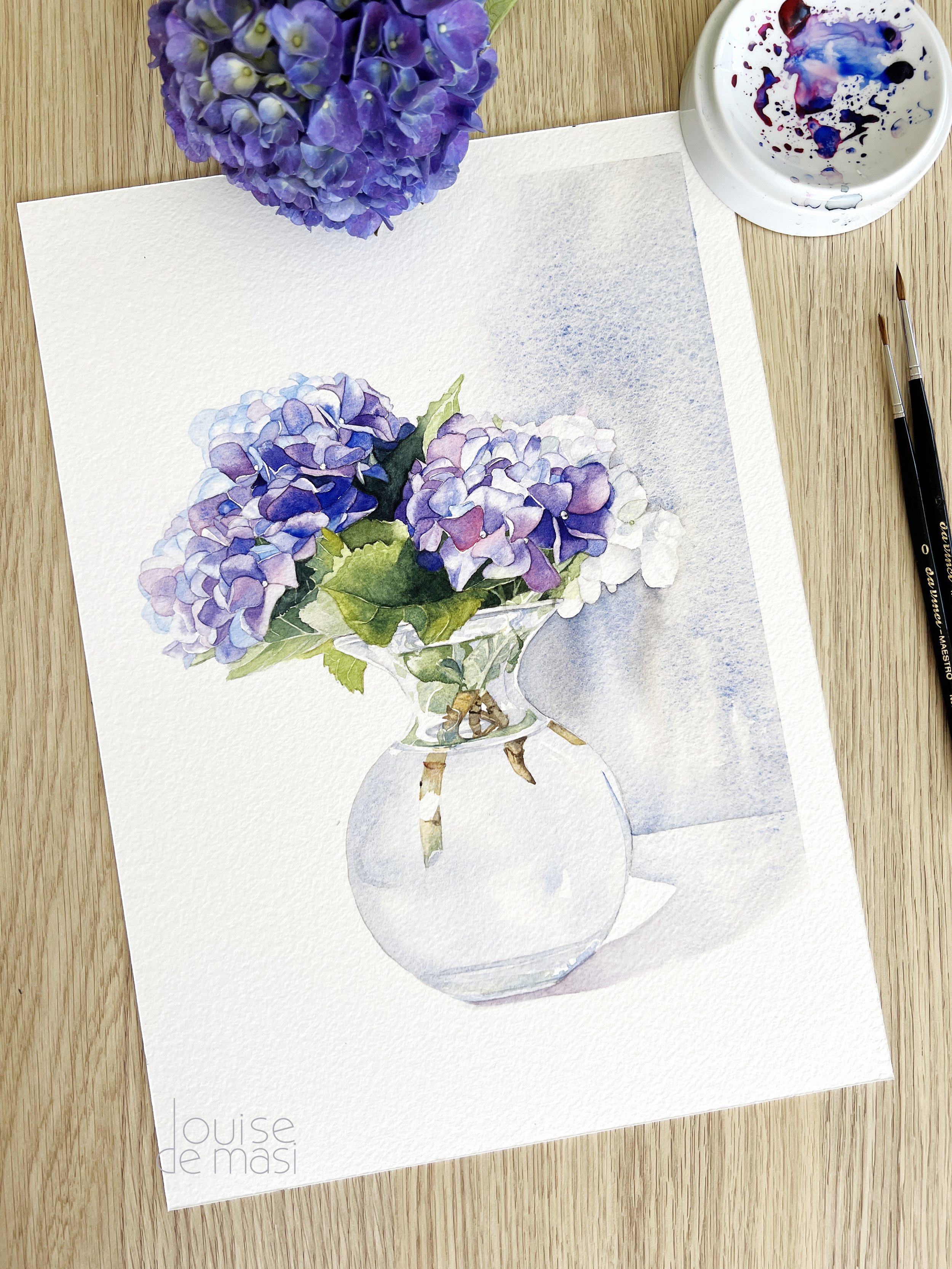
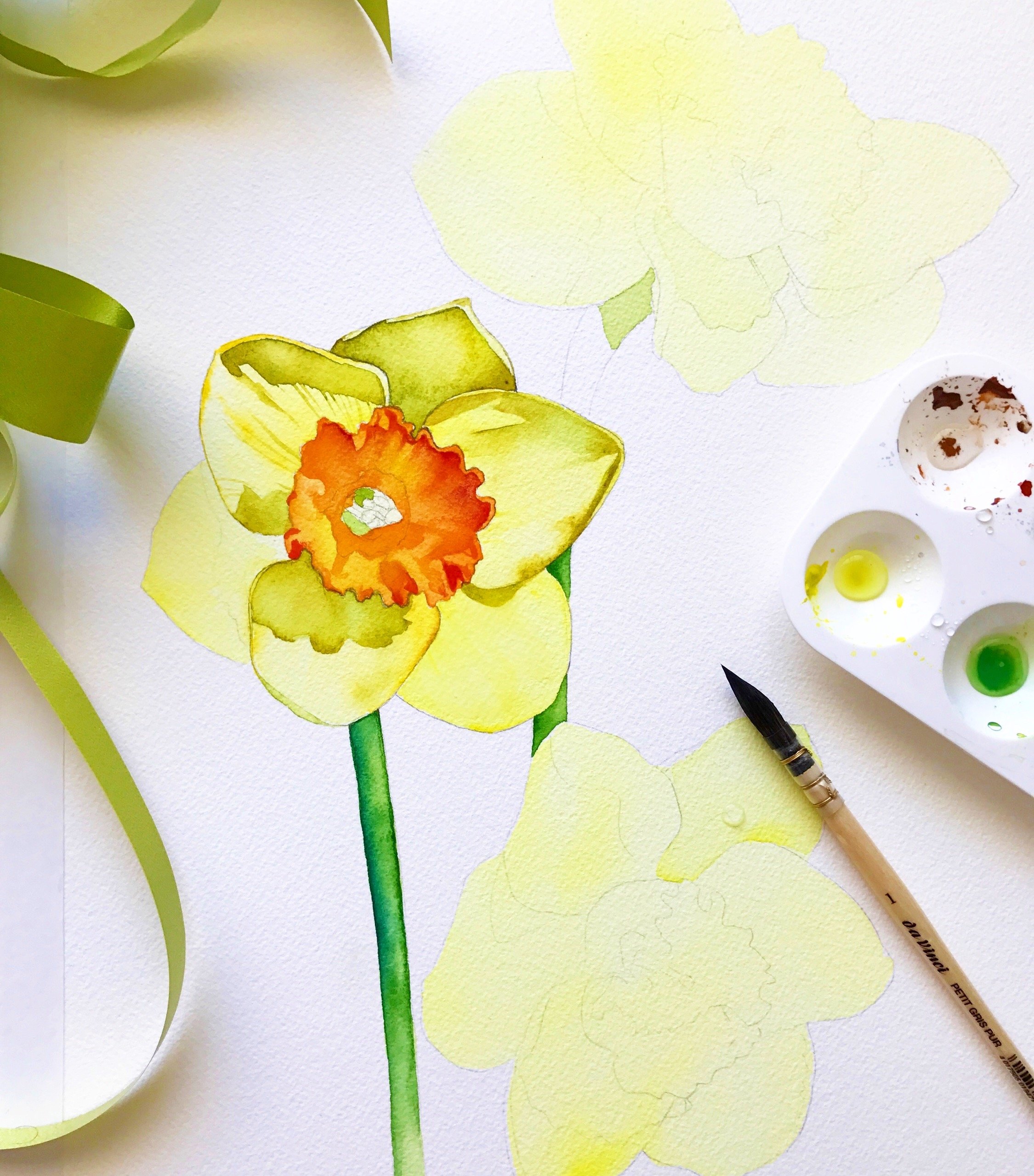
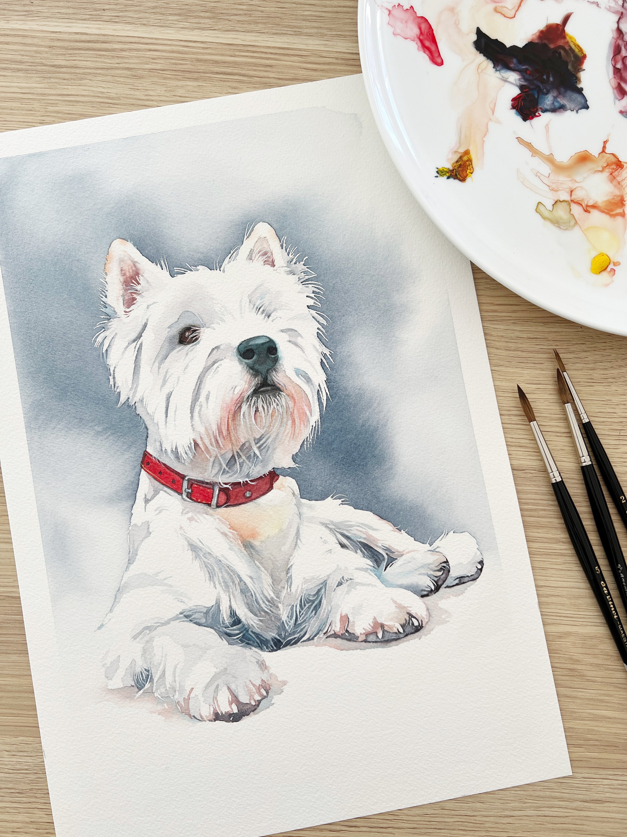
If you are interested in learning to paint in watercolour, I have over 200 online, voiced over watercolour tutorials for all skill levels.