Hydrangea Watercolour Painting
Step by Step Guide to Capturing Glass and Florals
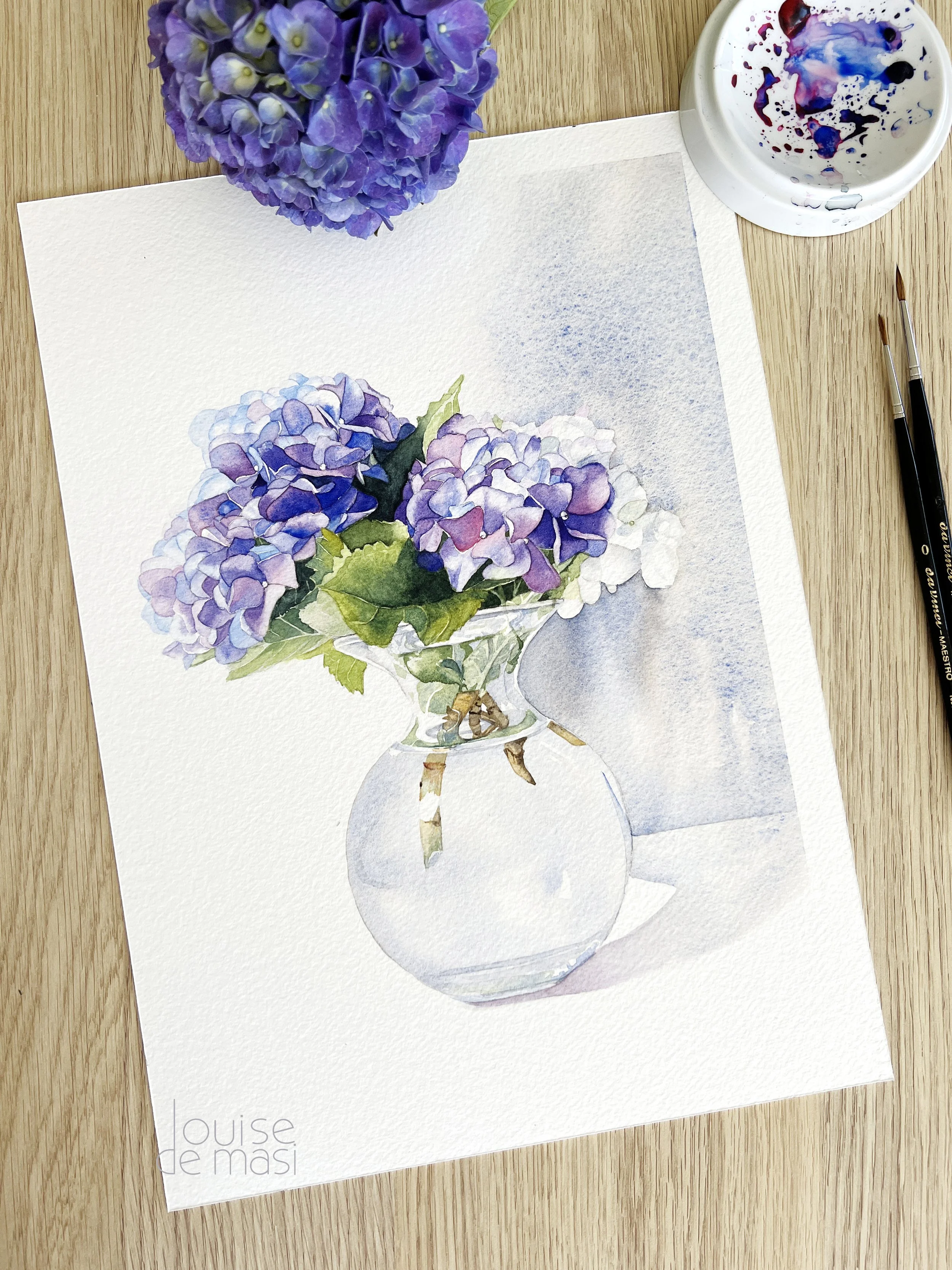
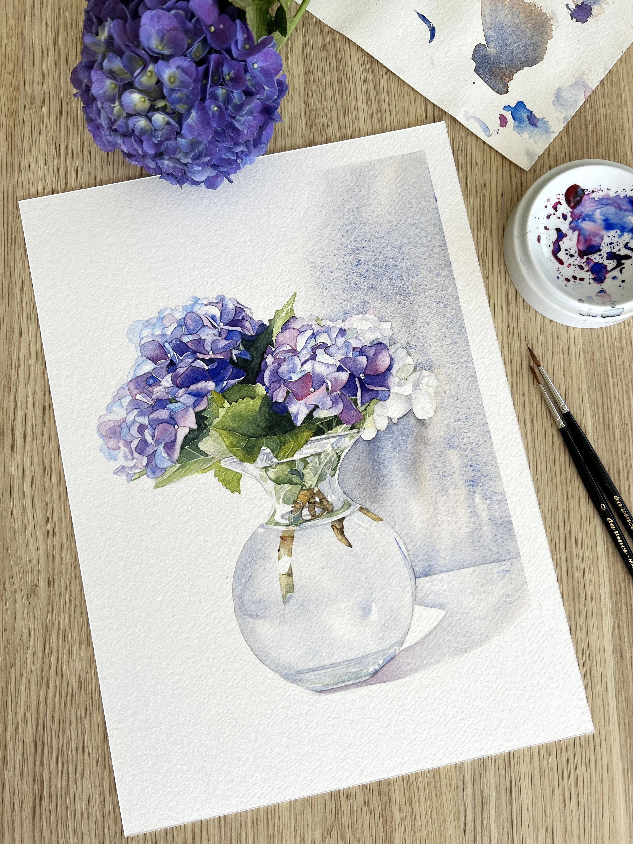
Watercolour Hydrangea painting on Arches cold press watercolour paper.
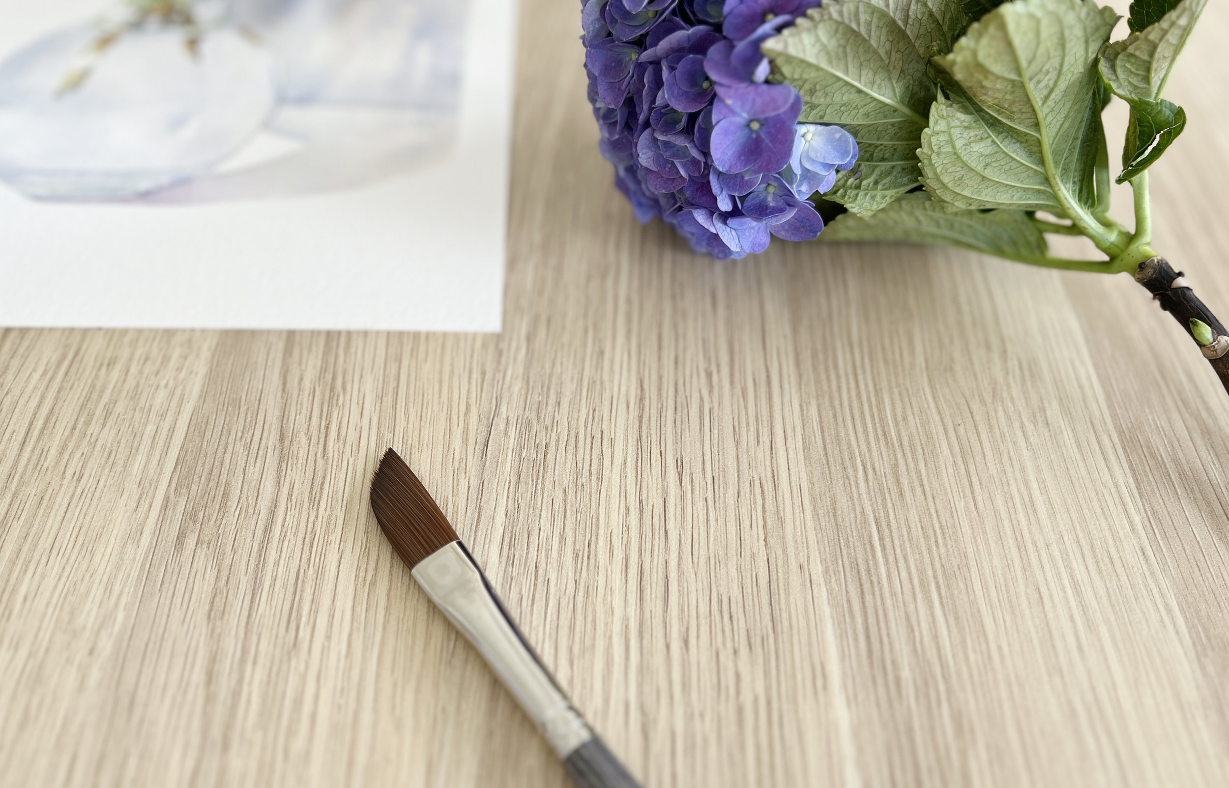
There’s something so beautiful about the hydrangea flower - the full, delicate blooms, the shifting colours, and the way they fill a space with softness. I have a few hydrangea bushes growing in my garden, and when they’re in bloom, I always feel inspired to bring them indoors and start painting. This watercolour hydrangea piece came together after I popped a few freshly cut stems into a glass vase and decided it was the perfect moment for painting flowers.
In this post, I’ll walk you through the steps I took to paint it, from the initial drawing to the final touches.
My paints and paper
I painted this on Arches cold pressed watercolour paper, 640gsm. I cut a full sheet into quarters and used one for this piece.
The colours came from my custom Schmincke watercolour set - French Ultramarine, Ruby Red, Transparent Sienna, Transparent Ochre, and Transparent Yellow. I also added a touch of Payne’s Grey and Cobalt Blue to my palette.
Painting Hydrangeas in Watercolour
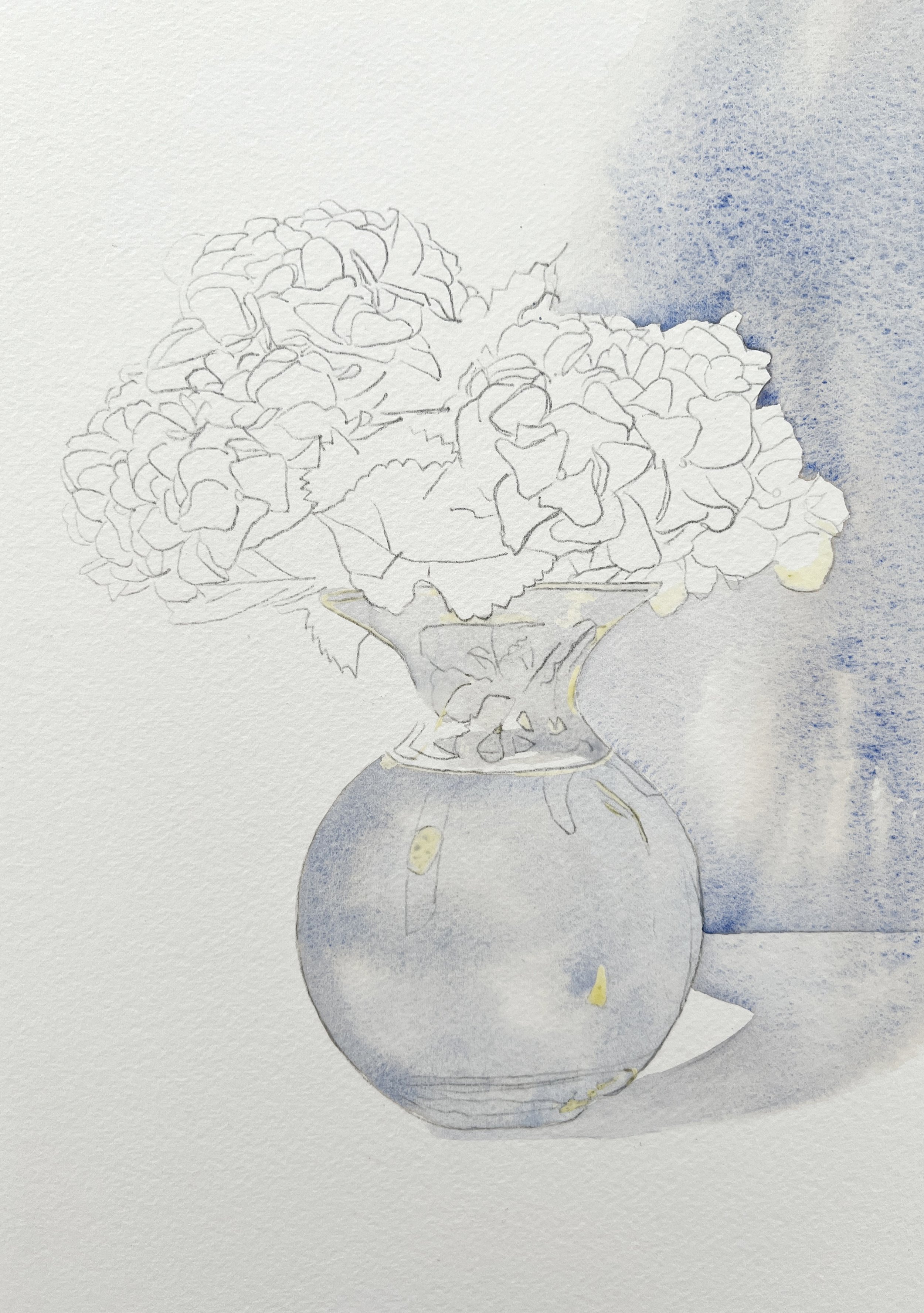
Step 1
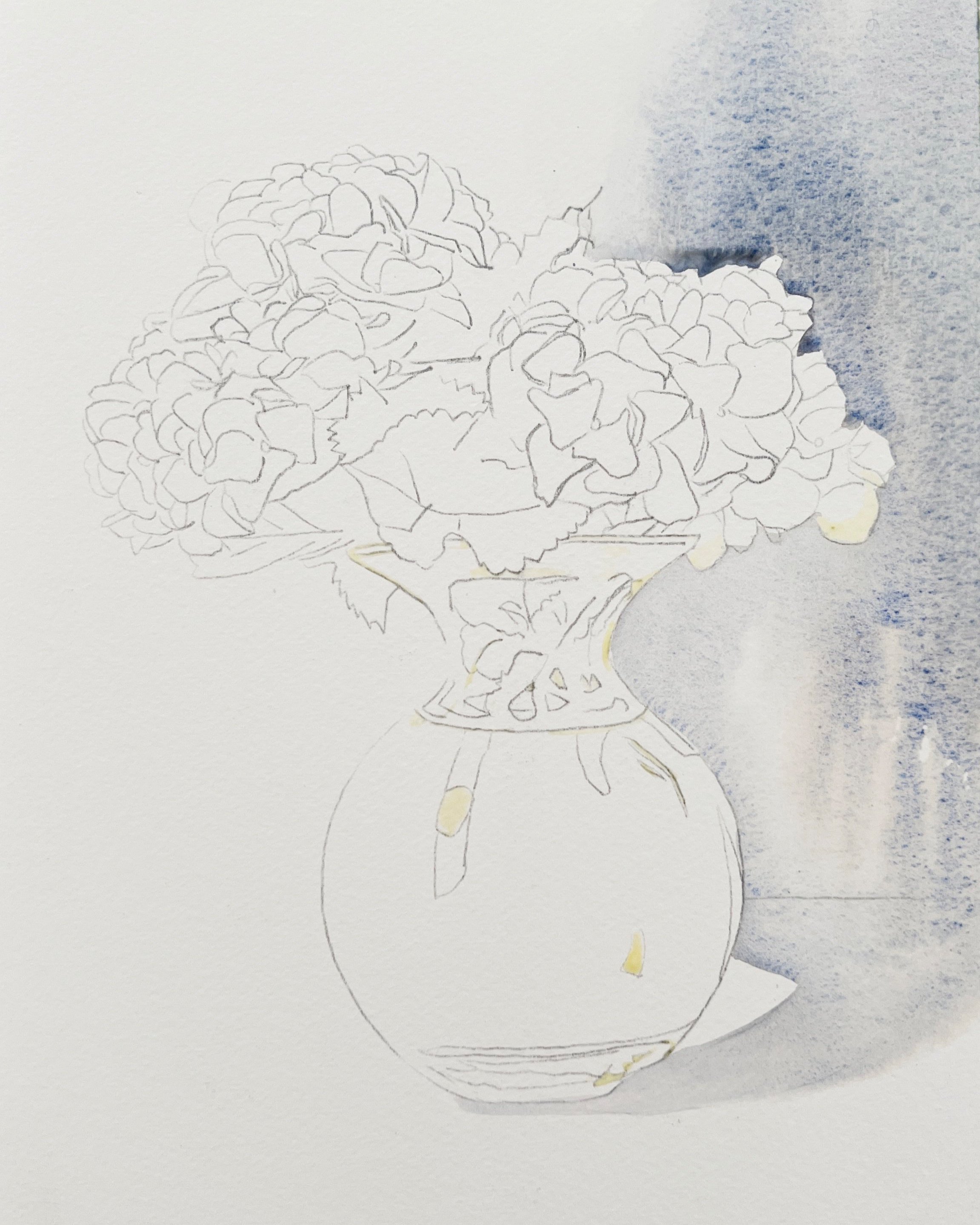
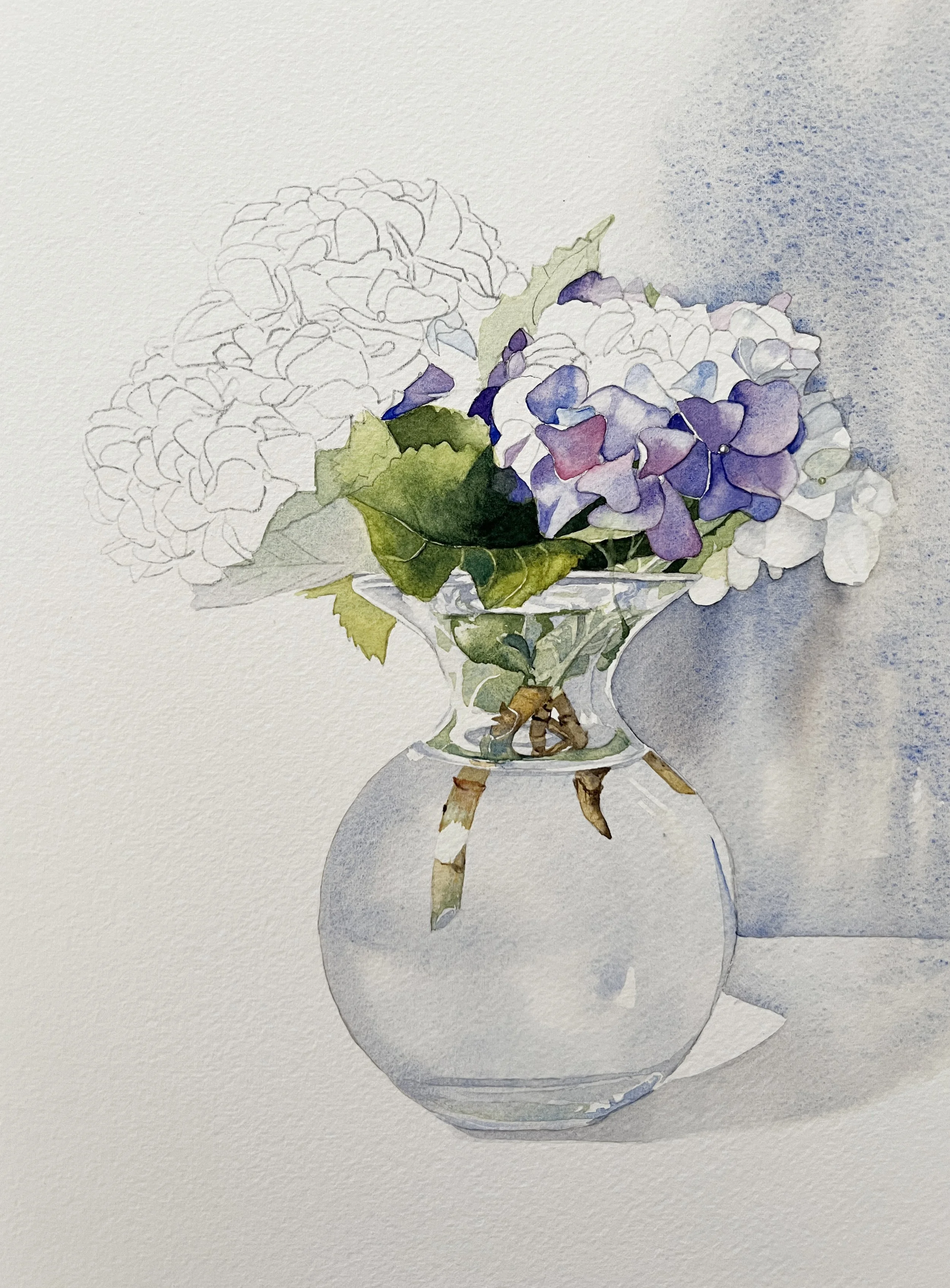
Step 1 - A wash of grey on the background. I painted carefully around the flowers and along the edge of the vase.
I started with a fairly detailed drawing based on my reference photo and transferred it onto the watercolour paper. Then I applied masking fluid to all the white highlights on the vase because I wanted to lay down a wash all over the vase without having to paint around those areas.
To create a cool grey, I mixed French Ultramarine with Transparent Sienna, then used my Da Vinci Colineo dagger brush to paint a wash of that grey onto the background. I had the board tilted so the paint would flow down and I kept the paper damp in that area to help it move. The dagger brush made it easy to follow the curves of the glass vase quickly and smoothly. I painted the background wash because I wanted to anchor the vase to one side of the painting - it makes for a more interesting composition. There were also some white petals on the right side so I needed some background there to make them stand out.
My dagger brush hugged the curves of the vase beautifully.
Step 2
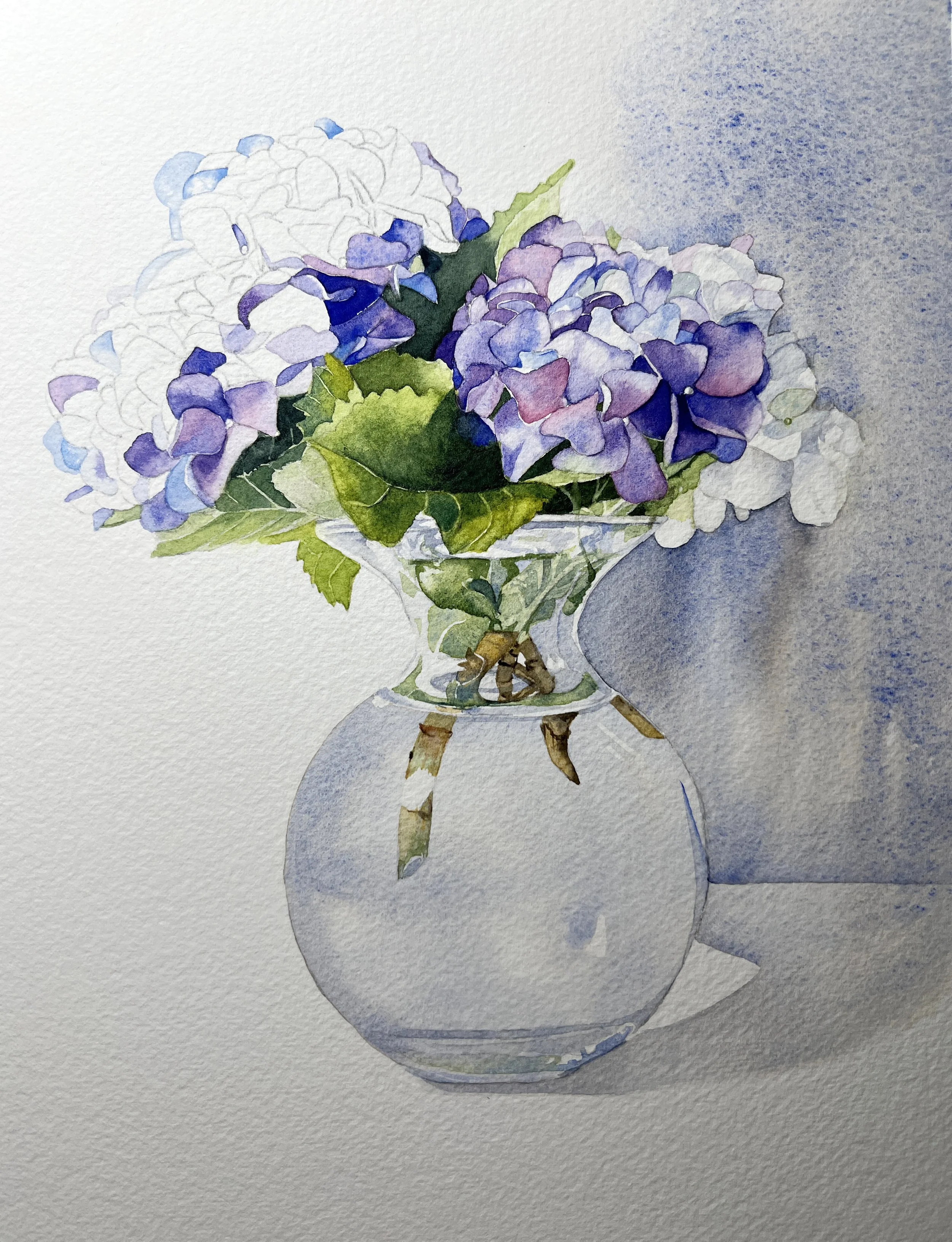
Step 2- A beautiful blue grey was painted on the vase.
Once the background wash had dried, I rewet the area above the table line and added more of the grey to define the edge of the tabletop. This time, I tilted the painting in the opposite direction so the paint would flow upward.
Next, I painted the vase using the same grey, again with my dagger brush. I left a few white areas around the neck of the vase to preserve highlights.
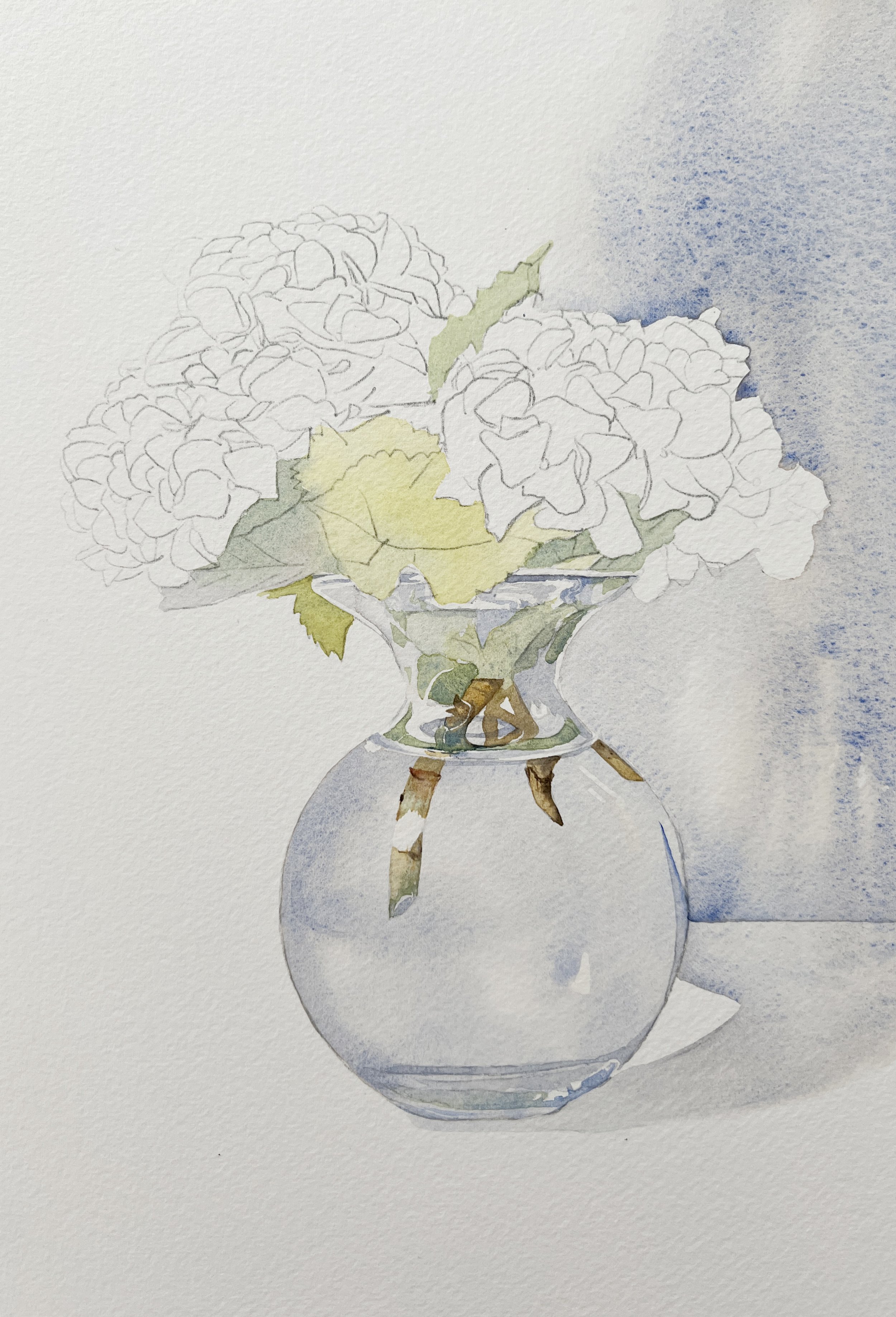
Step 3

Step 3- I started painting in the shapes that the stems made within the vase.
I removed the masking fluid and than I deepened the grey slightly and used it to paint the darker areas on the vase. Then I started painting the stems and leaves of the hydrangeas inside the glass. Since they’re distorted by the glass, I didn’t overthink it - I just focused on the reference photo and painted the shapes I saw.
For the stems, I used Transparent Ochre and Transparent Sienna. I added a bit of French Ultramarine to the Transparent Sienna to create a dark brown for the shadowed areas. The green for the leaves was mixed from French Ultramarine and Transparent Yellow.
Step 4
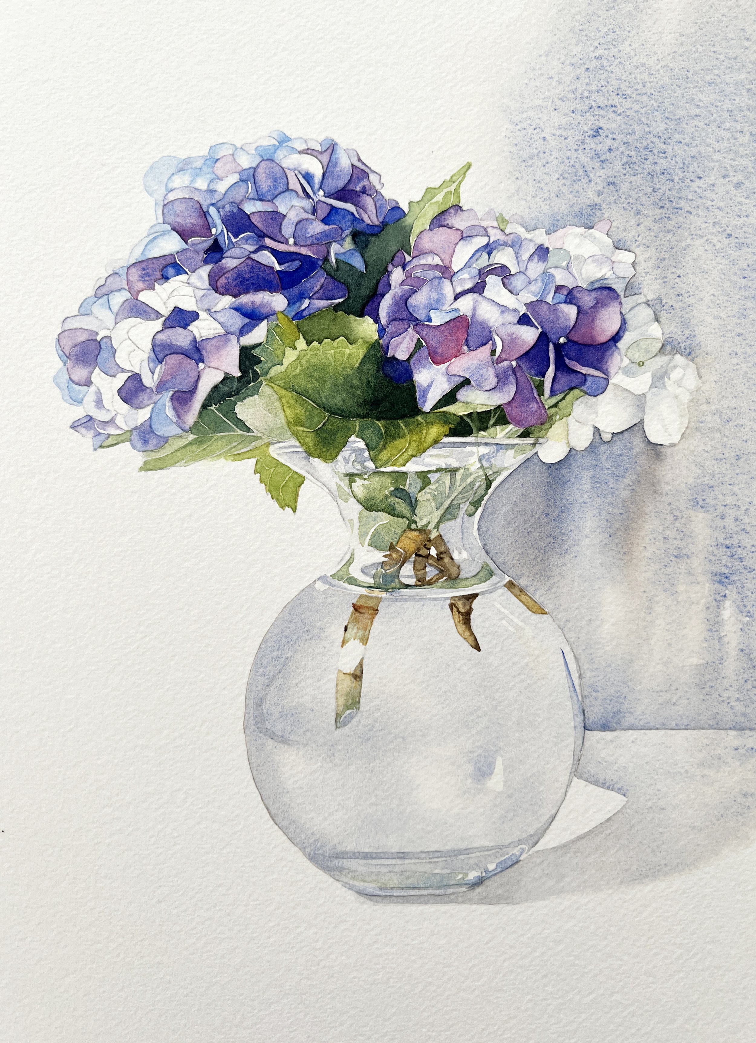
Step 4 - I used a mix of French Ultramarine and Transparent Yellow, adjusting the ratio to create lighter or darker greens. Loose washes helped keep the colour soft and natural-looking.
Then I moved on to the leaves outside the vase, mixing French Ultramarine with Transparent Yellow. I adjusted the mix depending on the value - using more yellow for the lighter areas and more blue for the darker sections. I painted them in with loose washes, keeping the colour soft and varied.
Step 5
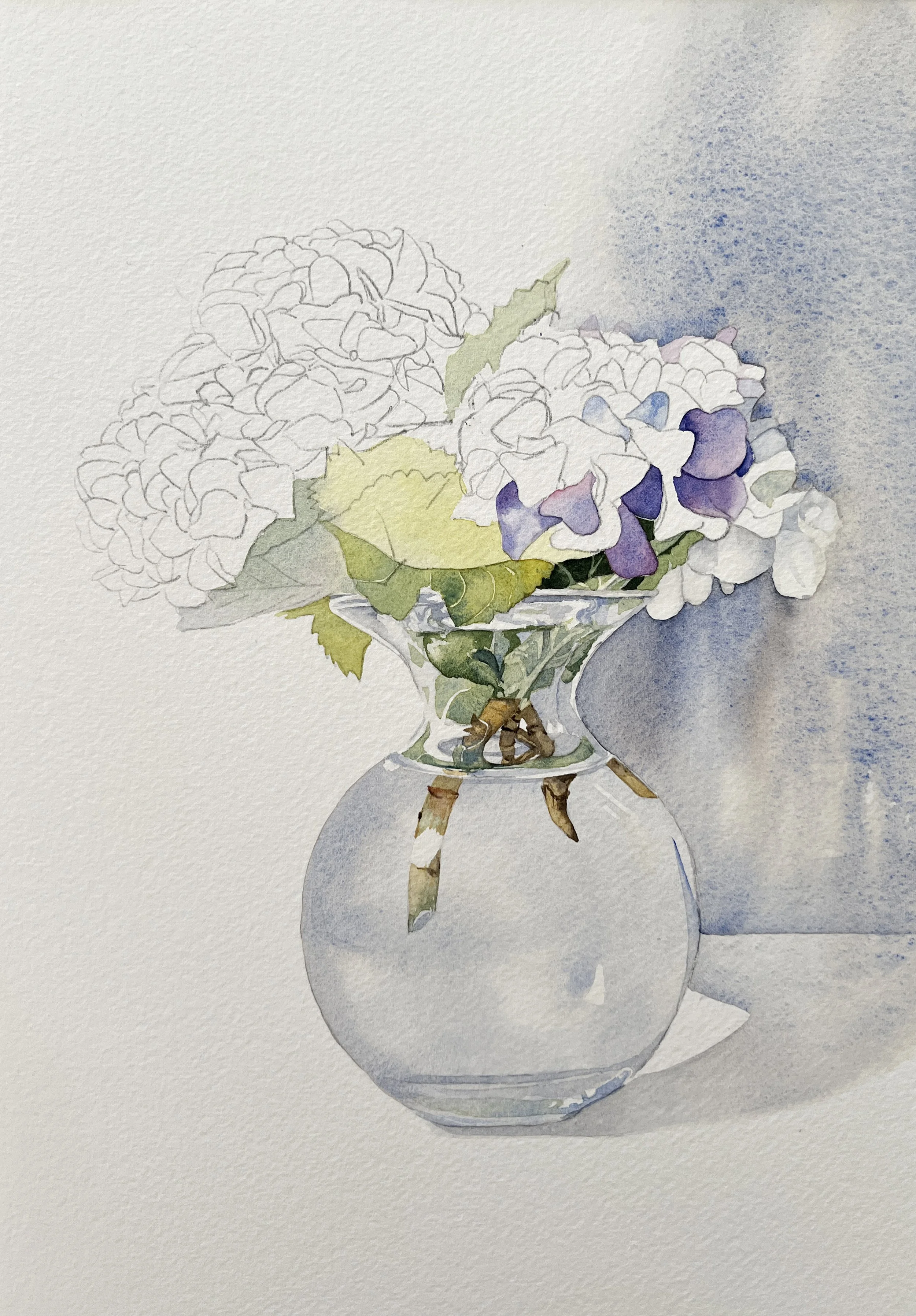
Step 5 - Adding detail to the front leaf and beginning the right-side petals with soft violet tones and varied edges.
I added some detail to the front leaf where it curls over the vase. I used a stronger green mix - more pigment, less water - and painted it on dry paper, leaving small gaps from the first wash to suggest the veins. I mixed Payne’s Grey with Transparent Yellow to create a rich dark green for the shadowed parts of the leaves. I used it to paint the darker shape just above the right side of the vase.
Then I started painting the petals on the hydrangea flower on the right. I mixed French Ultramarine with Ruby Red to create a soft violet and painted the petals individually to capture their subtle variations. Sometimes I dropped in a bit of Ruby Red while the paint was wet to add interest. The white petals on the far right were painted using the same grey mix I used for the background wash and the vase.
Step 6
Step 6 - Building up leaf shadows with a dark green mix and adding varied violet tones to the hydrangea petals for depth and interest.
I used the dark green mix of Payne’s Grey and Transparent Yellow to start adding shadows to the leaves. At the same time, I continued painting the hydrangea petals - sometimes wetting them first for soft edges and gentle blends, and other times painting directly onto dry paper for sharper detail. Since I mixed the violet from French Ultramarine and Ruby Red, I could easily shift the colour - leaning more blue in some areas and more pink in others, which gave the petals a lovely variation.
Step 7
Step 7- Deepening the leaf colour and softening the back petals with pale Cobalt Blue to create a sense of depth.
I added more detail to the leaves, using a stronger mix of French Ultramarine and Transparent Yellow with less water for deeper colour. I painted on both wet and dry paper and, as before, left parts of the lighter wash showing through to suggest the veins.
Then I moved on to the other flowers. I kept using the violet mix of Ruby Red and French Ultramarine for the front petals, but for the petals towards the back, I used a pale wash of Cobalt Blue. Keeping the colours softer in the background helped create a sense of depth in the painting.
Final Steps
Almost done.
The hydrangea blooms were nearly finished at this point, so I started adjusting the values. I layered more paint onto some of the front petals to increase contrast and make them stand out. I also added a bit more detail to a few of the leaves to bring everything together.
I also brushed clean water over the petals at the back on the left side, then dabbed them with paper towel while still wet. This softened the edges and lifted some of the paint, helping those petals fade into the background even more.
This painting was such a joy to work on - from the soft petals to the glass reflections and delicate leaves. Hydrangeas are always a rewarding subject, and I loved the challenge of capturing their subtle colours and structure in watercolour. I hope this breakdown inspires you to try painting hydrangeas yourself!
If you are interested in learning to paint in watercolour, I have hundreds of online, voiced over watercolour tutorials for all skill levels.