Introducing My Custom Schmincke Watercolour Palette
Guten Tag!
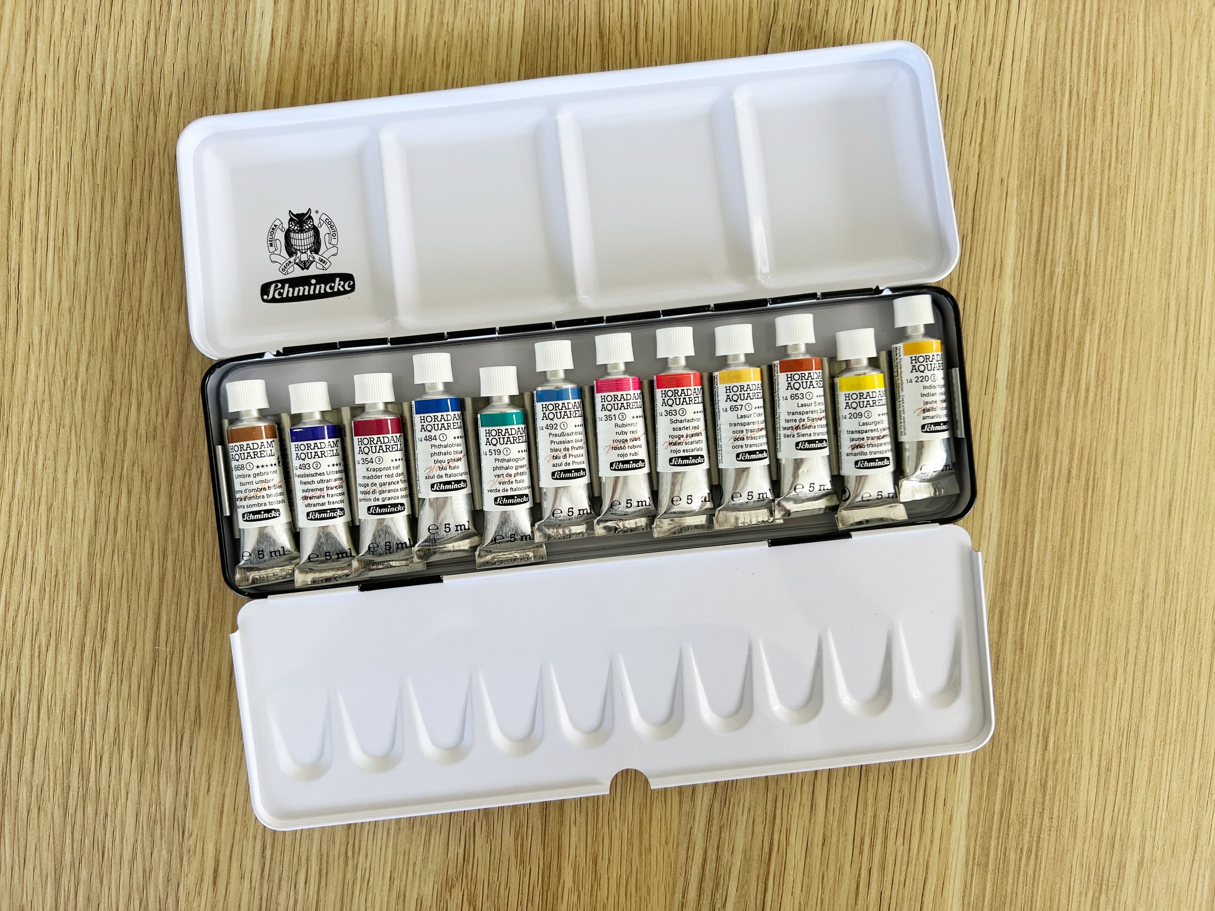
I am thrilled to share that I’ve collaborated with Jackson’s Art Supplies to create a special watercolour palette featuring my name and handpicked selection of 12 Schmincke watercolors! Each hue has been carefully chosen based on my artistic journey, aiming to inspire creativity and bring vibrancy to your own watercolor projects.
In this blog post, I'll take you through the colors in my palette, the inspiration behind each choice, and how they can elevate your painting experience. Join me as we explore the heart of this unique collection!
Oh look - It's me!u
Schmincke Watercolours: A Legacy of Quality and Vibrancy
Schmincke has been producing high-quality artist paints since 1881, earning a stellar reputation for their craftsmanship and commitment to excellence. Made in Germany, their watercolors are renowned for their high pigment concentration, offering exceptional vibrancy and clarity that stand the test of time.
They are formulated using high-quality, finely milled pigments and gum arabic, to ensure smooth application and vibrant colours.
I chose to collaborate with Schmincke because their paints align perfectly with my painting style and teaching philosophy. Their rich pigments allow for bold colour mixes, smooth blending, and the versatility that both beginners and experienced artists need to create stunning artwork.
12 Colours: A Versatile Palette for Every Project
I chose tube paints over pan paints because I find it easier to mix with freshly squeezed paint, which gives me more control over the consistency and vibrancy of my colours. My 12-colour palette strikes the perfect balance between being compact and versatile. With just these 12 colours, you can tackle a wide variety of subjects and techniques, from detailed botanicals to African wildlife. Each colour has been carefully selected not only for its individual beauty but also for its ability to mix effortlessly with the others, allowing you to create an almost infinite range of hues.
Where possible, I’ve chosen single-pigment, lightfast paints to ensure the highest vibrancy and longevity in your work. I prefer using single-pigment paints as much as possible because they offer greater purity and consistency in colour mixing, allowing for more predictable results and a broader range of vibrant hues in my artwork.
I’ve also included both cool and warm variations of the primary colours, giving you even more flexibility when it comes to mixing. This ensures a broad spectrum of possibilities, from subtle washes to bold, dynamic compositions.
Highest quality watercolour tube paints by Schmincke
The set contains the following colours:
French Ultramarine PB29
Phthalo Blue PB15:1
Prussian Blue PB27
Transparent Sienna PR101
Ruby Red - PV19
Scarlet Red - PR254
Madder Red Dark - PV19 , PR179
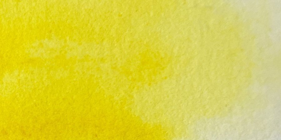
Transparent Yellow - PY150
Indian Yellow - PY110, PY154
Burnt Umber - PBr7
Transparent Ochre PY42
Phthalo Green PG7
Schmincke watercolours set in a metal palette.
Color Chart
The 12 Colours: Why I Chose Each One
French Ultramarine PB29
Phthalo Blue PB15:1
Schmincke's French Ultramarine is a rich, deep transparent blue with a slightly warm undertone. It is known for its strong granulating effect, making it perfect for adding texture and depth to your watercolour paintings. This highly lightfast pigment is excellent for mixing, especially with earth tones, to create natural, muted shades. I love to mix French Ultramarine with Transparent Sienna to create beautiful greys. Image below left
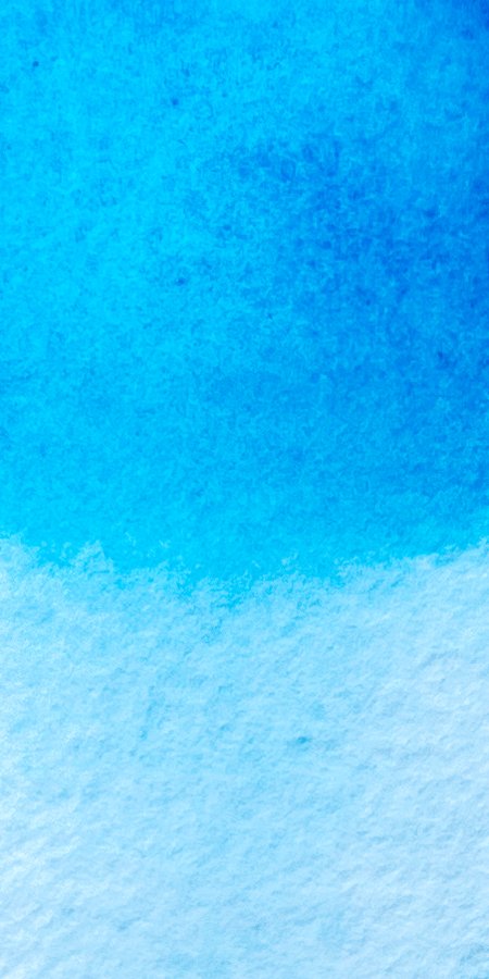
Schmincke's Phthalo Blue is a highly pigmented, vibrant cool blue that is known for its exceptional tinting strength and versatility. This intense colour has a slightly greenish undertone, making it perfect for mixing with yellows to create vivid greens and for achieving striking turquoise hues.
Phthalo Blue is also renowned for its excellent lightfastness, ensuring that your artwork will retain its brilliance over time. Its transparency allows for beautiful glazing techniques, while its strong staining properties enable it to create rich washes and deep shadows. Image below middle
French Ultramarine is a warm granulating blue.
Phthalo Blue is a vibrant cool blue.
Prussian Blue is a cool dark blue with a greenish undertone.
Prussian Blue PB27
Schmincke's Prussian Blue is a deep, intense blue pigment known for its rich, dark tone and excellent lightfastness. This colour has a slightly greenish undertone, making it versatile for creating a variety of shades and effects.
Prussian Blue is particularly effective for painting skies, water, and shadows, providing a strong foundation for both landscape and seascape compositions. It can be combined with other colours to create muted tones or to deepen mixes without overpowering them. It is similar to Phthalo Blue but it has a lower tinting strength making it easier to mix and control when creating subtler shades. Prussian Blue is semi-opaque and it's slightly warmer than Phthalo Blue. This subtle difference in undertones can influence the overall effect when mixed with other colours or used in a composition, making Prussian Blue feel richer and more inviting while Phthalo Blue maintains a brighter and more intense look. Image above right
Scarlet Red PR254
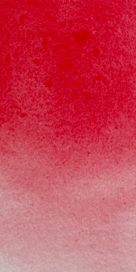
Scarlet Red is a warm, intense red pigment known for its excellent lightfastness. It leans towards the warmer side of the red spectrum, making it ideal for creating vibrant, fiery effects in your paintings.
The pigment has good staining qualities and is semi opaque, which makes it excellent for strong, bold applications. Its warm undertone makes it useful for mixing bright oranges, warm purples, and creating lively highlights in florals, or any subject where you need warmth and brilliance. Image below left
Madder Red Dark - PV19 , PR179
Madder Red Dark is a deep, cool-toned red made from a mix of PV19 and PR179. It’s slightly cool temperature makes it ideal for creating rich, dark reds and purples.
It’s semi transparent and highly lightfast. The inclusion of PR179 gives it a deep, moody quality, while PV19 provides some brightness and transparency. It's excellent for glazing and layering due to its transparency.
Madder Red Dark is particularly useful for creating depth in shadows, rich florals, and dramatic skies. It's great for adding warmth to dark areas without losing vibrancy. Image below middle
Scarlet Red is a warm red. It is a vibrant red that adds boldness and intensity to any composition.
Madder Red Dark is a cool red with deep, rich tones, perfect for adding depth and drama to shadows and dark areas in a painting.
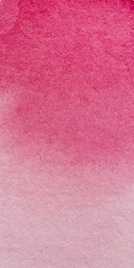
Ruby Red is a versatile cool red that is excellent for glazing.
Ruby Red - PV19
I absolutely love Ruby Red! It is a vibrant, cool-toned red pigment. It’s known for its strong transparency, lightfastness, and staining qualities. This makes it perfect for creating glowing, rich washes, especially in florals and portrait work. Because it’s a single-pigment colour, it mixes well without becoming muddy, giving you clean and luminous results when blending with other shades. Image above right
Transparent Yellow - PY150
Transparent Yellow is a vibrant, single-pigment hue with excellent transparency, perfect for clean mixing and layering.
When it comes to yellows, it's important to have a transparent yellow in your palette because they are great for mixing rich, dark colours. I chose Schmincke's Transparent Yellow because it’s a single-pigment colour (PY150), which provides clean mixes and maintains its vibrancy. It leans towards the cooler side, is highly lightfast and transparent, making it perfect for glazing or layering without muddying other colours. Its versatility makes it ideal for creating luminous greens and earthy tones when mixed with blues or reds. Image above left
Indian Yellow - PY110, PY154
Indian Yellow is a warm, golden yellow with excellent transparency, perfect for creating glowing washes and vibrant mixes.
Schmincke's Indian Yellow is a warm, glowing yellow made from a combination of two pigments: PY110 and PY154. It has a rich, warm temperature, making it ideal for creating luminous, sunlit effects in your work.
It is transparent with good lightfastness and has medium staining qualities. Its warmth and vibrancy make it excellent for mixing with other warm colours like oranges and reds, and it creates stunning greens when mixed with blues. It’s useful for glazing, layering, and adding depth to landscapes, florals, and any subject where you want to capture the warmth of sunlight. Image above right
Burnt Umber - PBr7
Burnt Umber is a rich, earthy brown with a warm temperature. It’s a versatile, semi-opaque pigment with excellent lightfastness and moderate staining qualities. Burnt Umber is a staple on many palettes because of its ability to create deep shadows, neutral tones, and natural textures.
This pigment is especially useful in landscapes, portraits, and any work where natural earthy tones are needed. It can be mixed with blues to create cool darks or with reds and yellows to form warm, muted tones. Burnt Umber is great for underpainting, glazing, and adding warmth to darker areas without overwhelming the composition. Image below left
Transparent Sienna PR101
Transparent Sienna is a versatile, transparent watercolour pigment with warm reddish-brown tones. It's often used in landscapes, skin tones, and natural subjects to create earthy, glowing washes. The pigment is a synthetic iron oxide (PR101), which gives it a rich depth and luminosity. It layers well, making it ideal for glazing and building up warm tones without overpowering other colours in the composition.
I use Transparent Sienna instead of Schmincke's Burnt Sienna because their Burnt Sienna contains two pigments (PR101 and PBk9) and is semi-opaque. I prefer Transparent Sienna for its transparency and because I like working with single-pigment paints whenever possible. It's a useful colour on its own and I often use it to mix greys, dark browns and blacks. Image below middle
Burnt Umber is a rich, earthy brown with warm undertones, ideal for creating deep shadows and natural textures.
Transparent Sienna is a warm reddish brown. It mixes beautifully with French Ultramarine to make gorgeous greys, blacks and dark browns.
Transparent Ochre is a warm, earthy yellow with great transparency, perfect for layering and adding natural, muted tones.
Transparent Ochre PY42
Schmincke's Transparent Ochre is a warm, earthy yellow with excellent transparency and lightfastness. It serves as a great alternative to Yellow Ochre, which is semi-opaque. I prefer to use transparent colours in my palette, which is why I chose Transparent Ochre. One of its unique features is its slightly gritty nature when mixed with water, requiring a bit of extra mixing due to the fine sediment.
Earth colours like Transparent Ochre are useful additions to any palette because they provide natural, muted tones and help balance vibrant colours. They are versatile for mixing, grounding compositions, and adding realistic, organic qualities to paintings. Image above right
Phthalo Green PG7
Phthalo Green is an intense, vibrant green with strong tinting strength, ideal for mixing bright, dynamic greens and deep shadow tones.
Schmincke's Phthalo Green is an intense, cool-toned green with excellent transparency and strong staining properties. Its vibrancy can be overwhelming when used straight from the tube, which is why it's often best utilised through mixing with other colours.
When mixed, Phthalo Green can produce a wide range of natural greens, turquoise tones, and deep shadow hues, making it especially useful for landscapes, seascapes, and foliage. Pairing it with yellows can yield vivid greens, while mixing with reds or earth tones can help mute its intensity and create more natural-looking, earthy greens. Its high tinting strength allows you to use just a small amount to achieve vibrant mixes, which helps balance its boldness in various compositions. Image above right
It's a beautiful tin box and it has my name on it!
How I use the Palette in my Work.
Let me show you how I use my customised palette to create a variety of effects in my watercolour paintings. By working with a limited range of colours, I can create harmony and depth while showcasing the unique qualities of each pigment. Below are examples of how I’ve used these colours in my work, highlighting techniques like granulation, transparency, and layering to bring my subjects to life.
For this painting I used three of the colours from the palette: French Ultramarine, Transparent Sienna and Transparent Yellow.
In this painting of a black cockatoo, I used just three colours from my palette: French Ultramarine, Transparent Sienna, and Transparent Yellow. The granulation of French Ultramarine creates soft textures in the feathers and background, adding depth and interest. The limited palette helps maintain harmony throughout the piece, allowing subtle shifts in tone and shading to bring the bird to life while preserving its moody, natural feel.
I used French Ultramarine, Prussian Blue, Ruby Red, Transparent Ochre, and Transparent Sienna for this watercolour painting of Rosy.
In this dog painting, I combined French Ultramarine, Prussian Blue, Ruby Red, Transparent Ochre, and Transparent Sienna to bring out the warm tones and soft textures of the dog's fur. The blues help create depth in the shadows and cooler areas, while the reds and ochres give a richness to the warmer highlights. Transparent Sienna adds natural warmth, and the subtle layering of these pigments creates a lifelike balance between light and shadow, making the fur look soft and realistic.
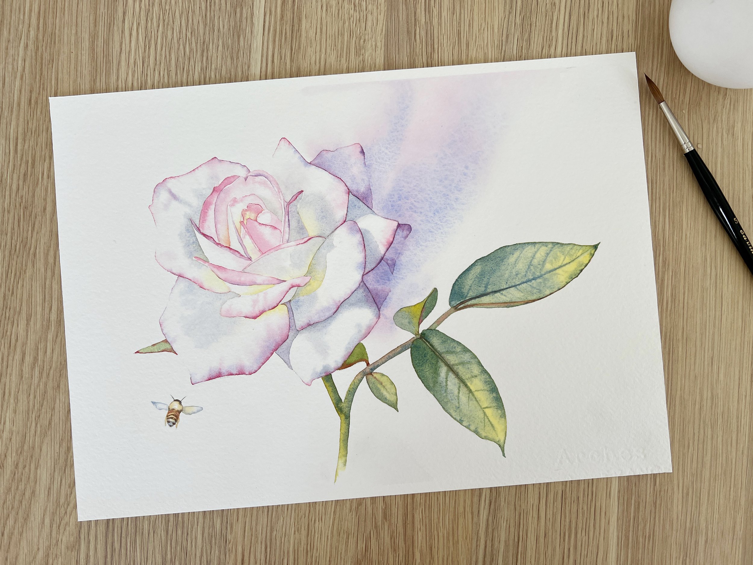
I used French Ultramarine, Ruby Red, Transparent Sienna, and Transparent Yellow for this rose painting.
In this watercolour painting of a rose, I used French Ultramarine, Ruby Red, Transparent Sienna, and Transparent Yellow to create soft, delicate transitions between the petals and leaves. The Ruby Red provided the pretty pink edges on the rose, while the subtle touches of Transparent Yellow brighten the highlights. French Ultramarine mixed with Transparent Sienna adds cool, airy shadows to enhance the form of the flower. French Ultramarine and Transparent Yellow created the green for the leaves. Transparent Sienna gives the foliage a natural, earthy undertone, helping balance the vibrant colours of the flower.
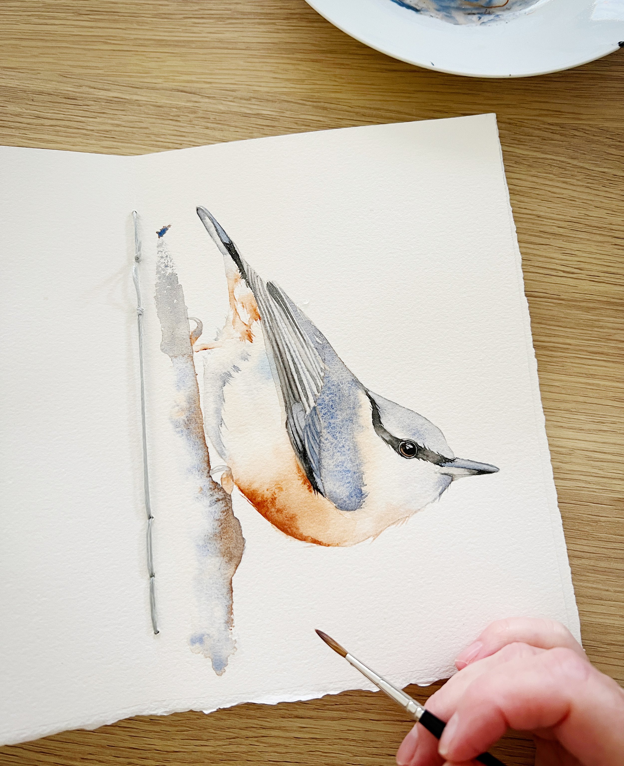
I used French Ultramarine, Transparent Ochre, and Transparent Sienna to paint this nuthatch.
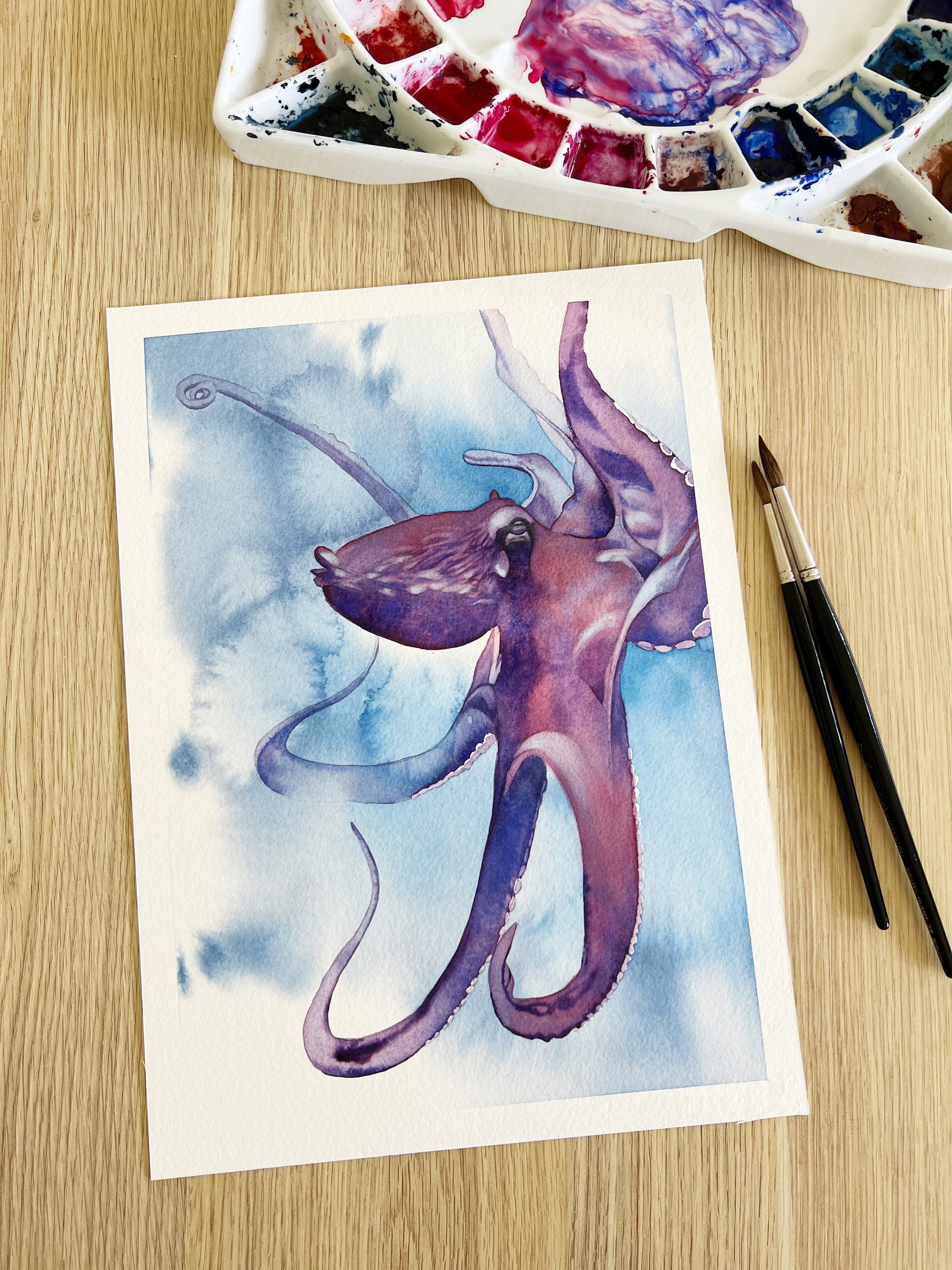
I used 4 colours on this octopus painting: Madder Red Dark mixed with French Ultramarine to create the beautiful purple and the water in the background was Madder Red Dark mixed with Phthalo Blue.
This little nuthatch watercolour in my journal was painted using just three colours from the palette: French Ultramarine, Transparent Ochre, and Transparent Sienna. I used Transparent Ochre for the soft wash on the bird's breast. French Ultramarine and Transparent Sienna were mixed to create all the greys and blacks, while Transparent Sienna was applied at full strength along the front of the bird.
For the Octopus painting I mixed Madder Red Dark with French Ultramarine to create the beautiful violet and the water in the background was a mix of Madder Red Dark and Phthalo Blue. I also used a little bit of Ruby Red on the Octopus.
Who is the Palette For?
This palette is perfect for artists at any skill level. For beginners, it offers a dependable range of colours that mix well and cover essential tones without overwhelming you with too many choices. More advanced artists will appreciate the high-quality pigments and the ability to create a wide variety of effects, from soft washes to detailed textures, using a simplified, yet versatile, selection. It’s a streamlined palette that supports growth and creativity at every stage.
A closer look at some of the paints in the set.
I’m excited to share this carefully curated palette with you, whether you're just starting your watercolour journey or you're an experienced artist looking to simplify your setup without sacrificing versatility. Each of these colours has been chosen not just for their individual beauty, but for how they work together to create a broad spectrum of possibilities. I hope this palette brings as much joy to your painting experience as it does to mine and helps you explore new creative horizons.
Happy painting!
If you are interested in purchasing this paint set or any of my other supplies you will find them on my website. louisedemasi.com/my-art-supplies


