The Dynamic Balance of Triadic Colour Combinations

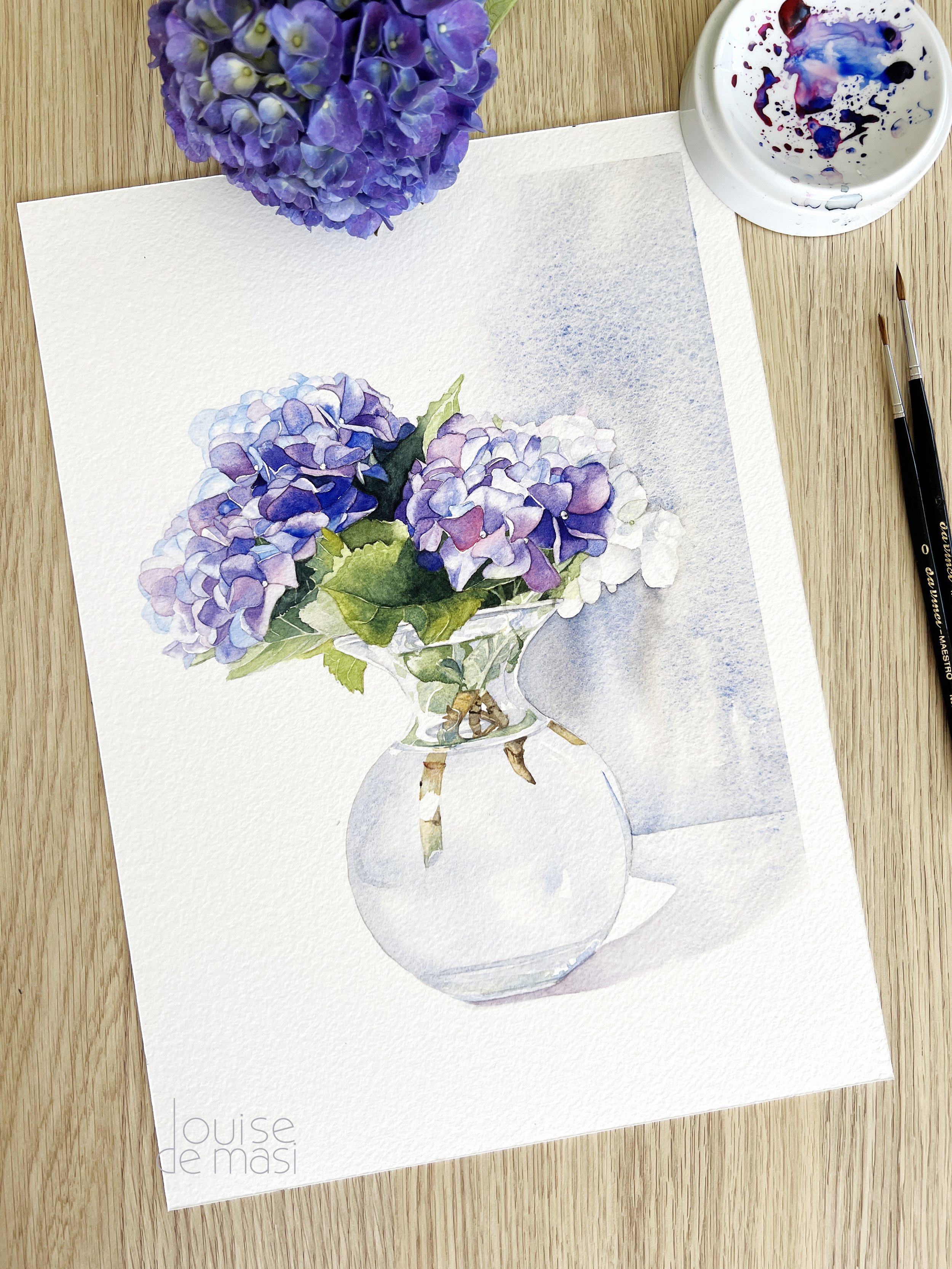
Triadic colour scheme examples - this beginner painting was painted with a triadic colour scheme.
The triadic colour scheme is a celebration of balance and vibrancy. Building on our understanding of complementary and analogous colours, we now explore how to use three colours evenly spaced around the colour wheel to achieve high contrast and rich harmony. Unlike complementary colours, which are opposite each other on the colour wheel and can desaturate and soften each other, triadic colour schemes use three evenly spaced colours to create a vibrant and interesting palette.
Today, we’ll delve into the dynamic and engaging world of the triadic colour palette, enhancing your ability to create lively and balanced compositions.
Triadic Colour Scheme Definition
A triadic colour scheme consists of any three colours of equal distance on the colour wheel. This harmony offers a high contrast and vibrant palette, while maintaining balance and richness in your compositions.
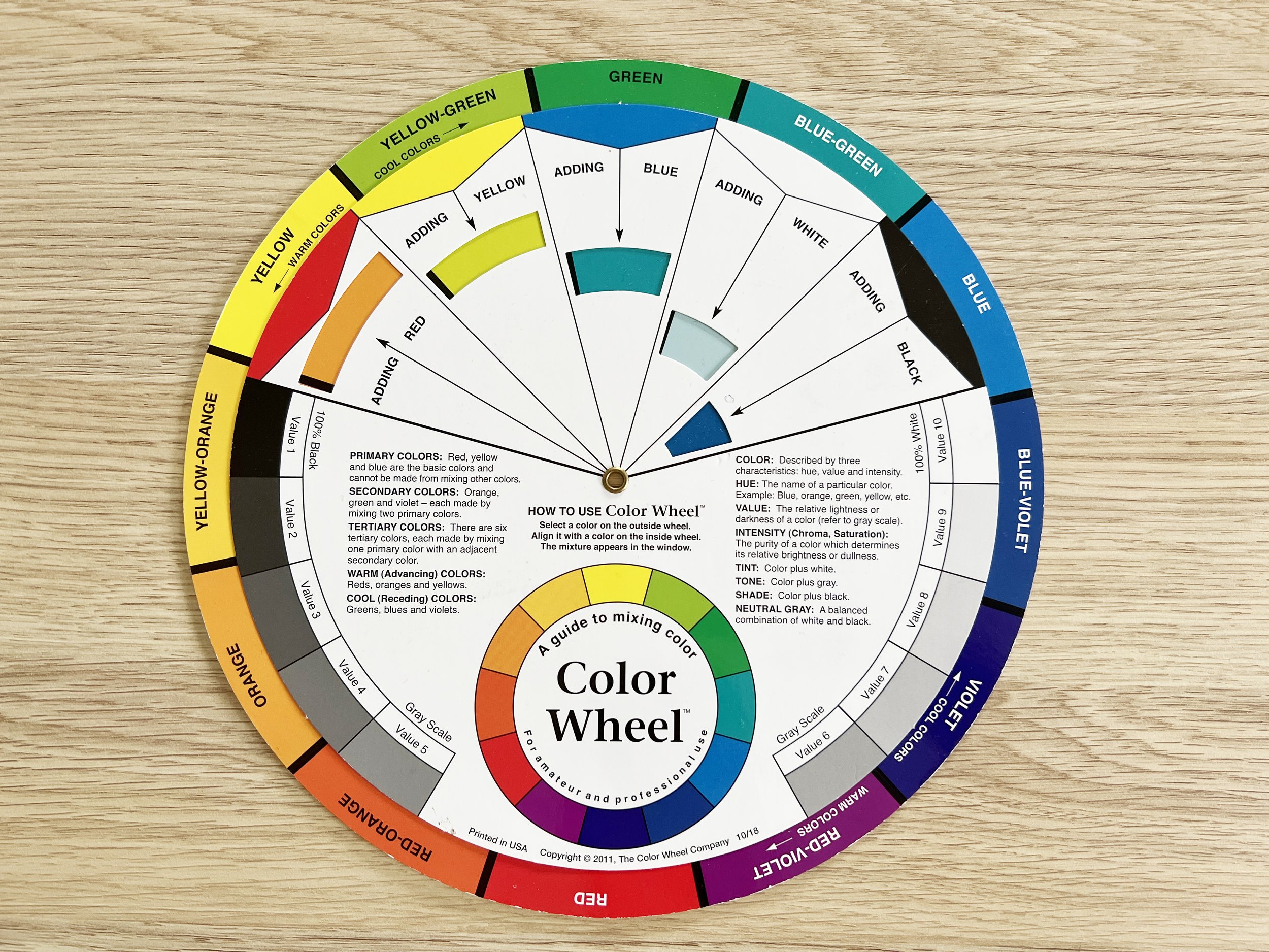
Triadic colours are equally spaced around the colour wheel.
How to Create Triadic Colour Palettes
Select Your Base Colour: Choose one colour from the colour wheel that you feel drawn to or that fits the mood of your composition.
Identify the Triad: Locate the two other colours that are evenly spaced around the colour wheel from your base colour. These three colours form your triadic palette. For example, if you choose red, the other two colours in the triadic scheme would be yellow and blue.
Balance the Colours: Decide which of the three colours will be the dominant hue in your composition and use the other two as accents. This will help maintain harmony and prevent the colours from competing for attention.
Adjust Intensity: Experiment with different shades, tints, and tones of your chosen colours to create variety and depth within the triadic scheme.
Triadic Colour Combinations, Applications, and Emotional Impact
Red, Blue, and Yellow
This primary triad is bold and balanced, often used in children’s art for its straightforward and lively appeal. It evokes playfulness and creativity, making it perfect for cheerful and energetic compositions.
Daniel Smith's Pyrrol Scarlet, Hansa Yellow Medium and French Ultramarine form a classic and versatile triadic colour scheme. These colours allow for a wide range of mixing possibilities, from creating secondary colours to subtle variations in shades and tones. They are foundational colours in watercolour painting and will serve well in both landscapes and still life compositions, providing depth and harmony to your artwork.

Daniel Smith's Pyrrol Scarlet, Hansa Yellow Medium and French Ultramarine.
The painting below by Erich Heckel is a great example of how a triadic colour scheme of red, yellow and blue can be used to convey energy and movement in a scene.

Erich Heckel's 'Bathers' is an example of a painting that uses a triadic colour scheme of red, yellow, and blue.
Orange, Green, and Purple
This secondary combination provides a lively and dynamic palette. It’s great for creating whimsical and adventurous scenes, evoking a sense of fun and excitement that can captivate the viewer.
Daniel Smith's Permanent Orange, Phthalo Green blue shade and Imperial Purple provide a dynamic and balanced triadic palette suitable for a wide range of watercolour techniques and subjects.

Daniel Smith's Permanent Orange, Phthalo Green blue shade and Imperial Purple.
Gauguin's post-impressionist style often featured vibrant and bold colour schemes. In 'The Siesta,' pictured below, he uses orange in the clothing and landscape, green in the foliage, and purple in shadows and additional elements, creating a striking visual balance.
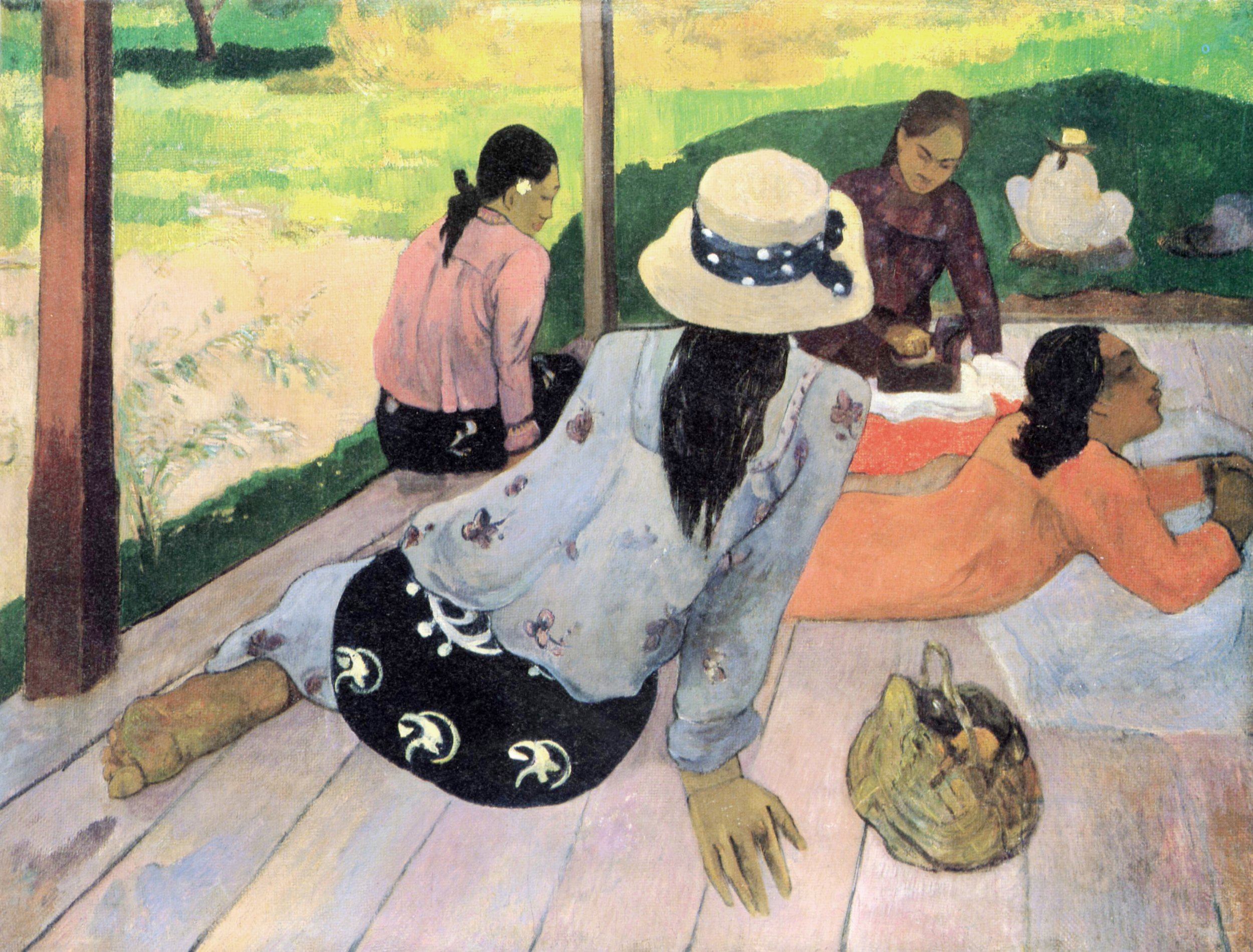
Paul Gaugin's painting 'The Siesta.'
Yellow-Green, Blue-Violet, and Red-Orange
This sophisticated triad can add complexity and elegance to your work. It evokes feelings of curiosity and creativity, making it ideal for modern and abstract art that seeks to engage and inspire.

Daniel Smith's Phthalo Yellow Green, Imperial Purple and Pyrrol Scarlet
Together, Daniel Smith's Phthalo Yellow Green, Imperial Purple and Pyrrol Scarlet - create a dynamic and balanced palette that offers a range of possibilities for mixing secondary colours and creating harmonious compositions. Whether used in landscapes, portraits, or abstract works, this triadic colour scheme can provide depth, contrast, and visual interest to your paintings.
Tips for Use
Select one colour as the main hue and one dominant colour, and use the other two colours as accent colour to maintain balance.
Balance the intensity of the colours to ensure harmony rather than competition.
Use triadic schemes to create vibrant and lively compositions that capture the viewer’s attention.
Triadic colour schemes bring a dynamic and vibrant balance to your art. By carefully selecting and balancing these colours to create triadic colour harmony, you can create paintings that are not only visually striking but also emotionally engaging, inviting viewers into a world of colour and excitement.
Understanding and applying triadic colour schemes enriches your artistic palette, allowing you to create balanced yet vibrant compositions. This knowledge builds on our exploration of colour theory, providing you with diverse tools to express your creative vision effectively.
Keep your colours dancing in harmony, and watch your paintings come to life.
Happy painting!