Ideas For Setting Up a Watercolour Palette
Why Palette Organisation Matters
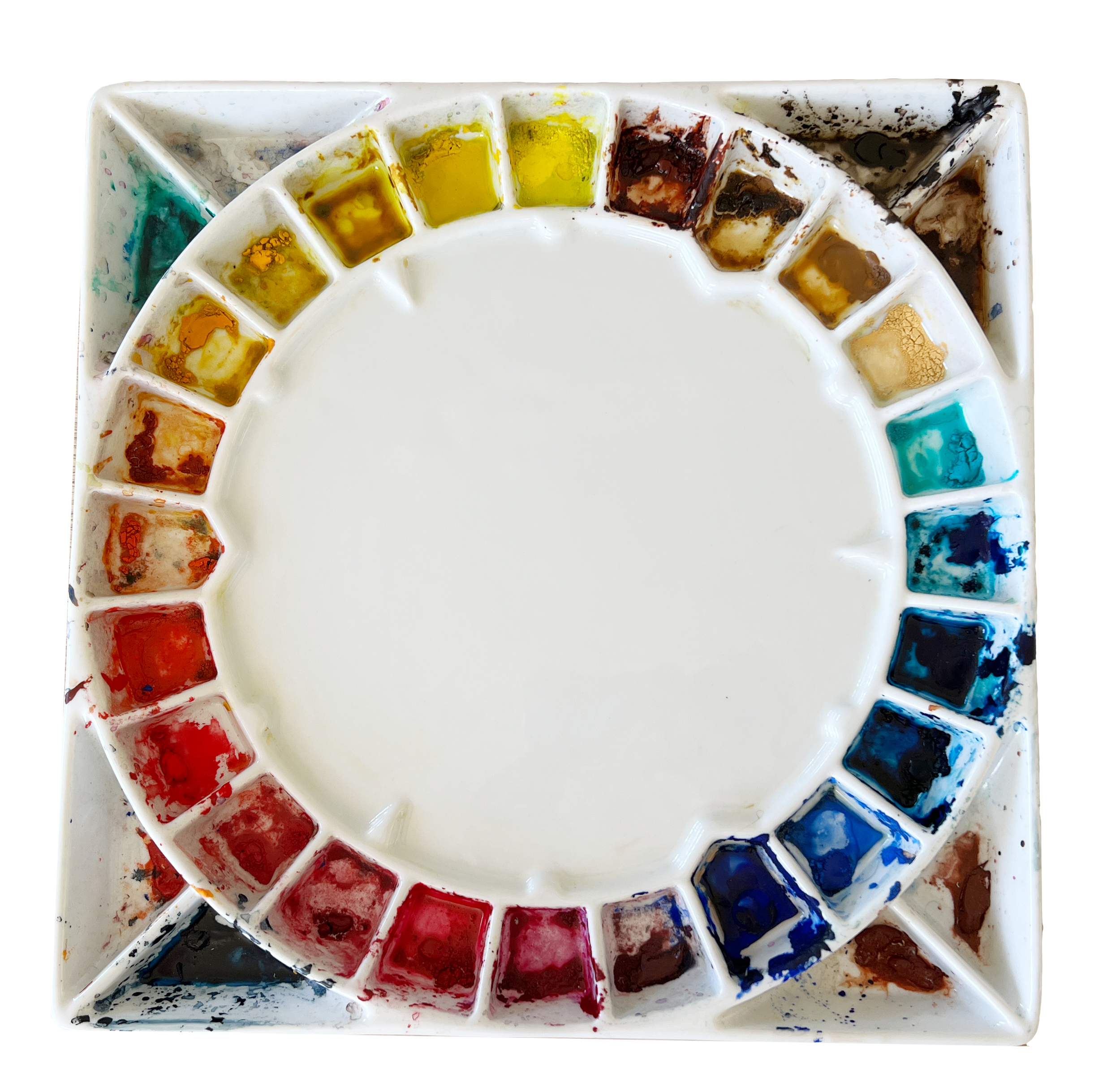
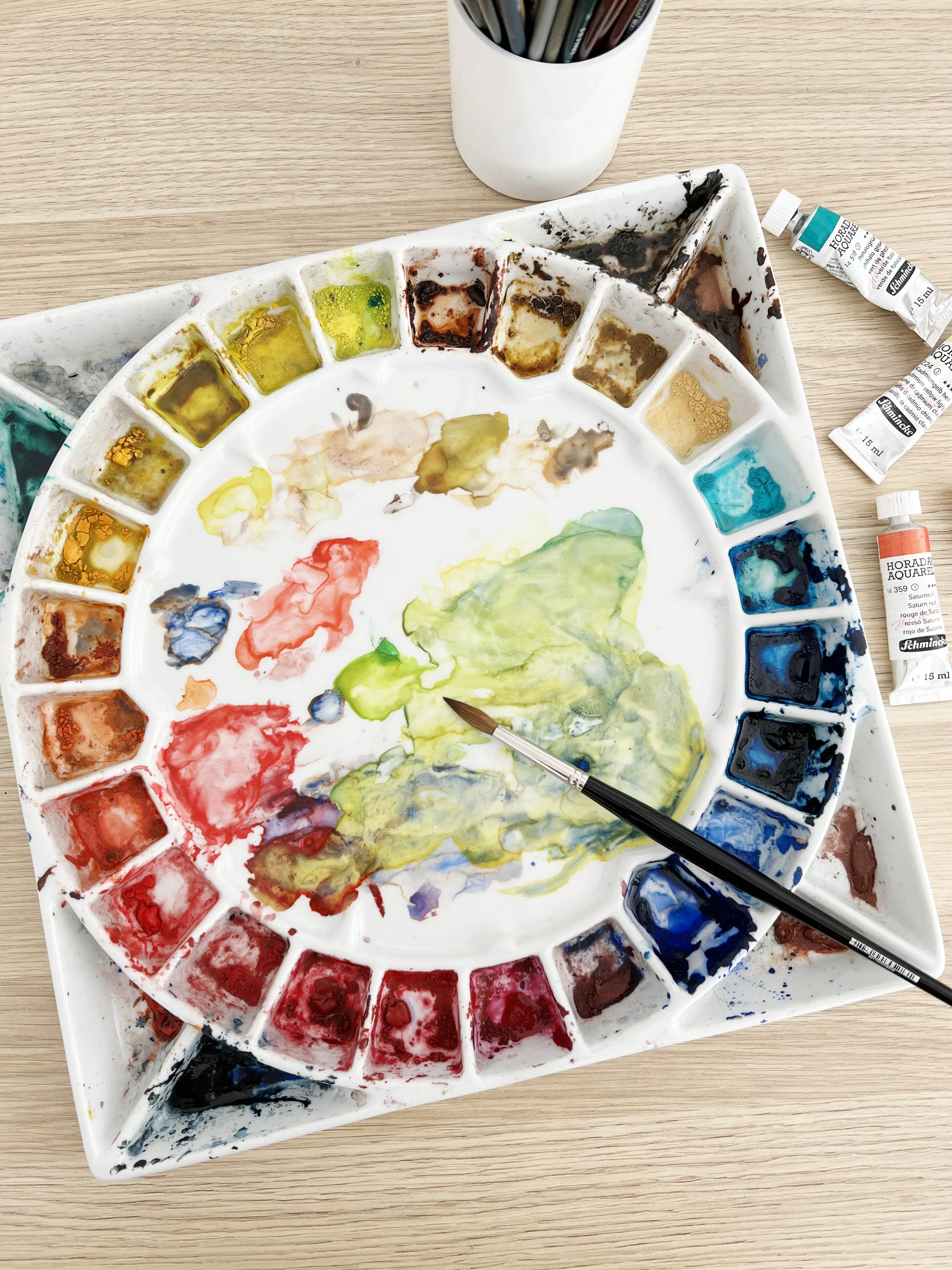
I prefer ceramic watercolor palettes because they don't stain like plastic palettes. On this palette I have my watercolour paints organised like a colour wheel.
A well organised palette can improve your efficiency, keep your colours clean, and help you create more harmonious mixes. By arranging your paints in a logical way you’ll save time and avoid muddy colours. An organised palette also reinforces your understanding of colour theory and allows you to work with ease. Ultimately, the right setup depends on your personal painting style and the colours you use most frequently.
Common Palette Layouts for Watercolour Artists
When setting up your watercolour palette, there's no one-size-fits-all approach. The best layout depends on your personal workflow, painting style, and the types of subjects you paint. In this section, we'll explore a few common palette layouts that can help streamline your process, making it easier to find and mix the right colours quickly and efficiently.
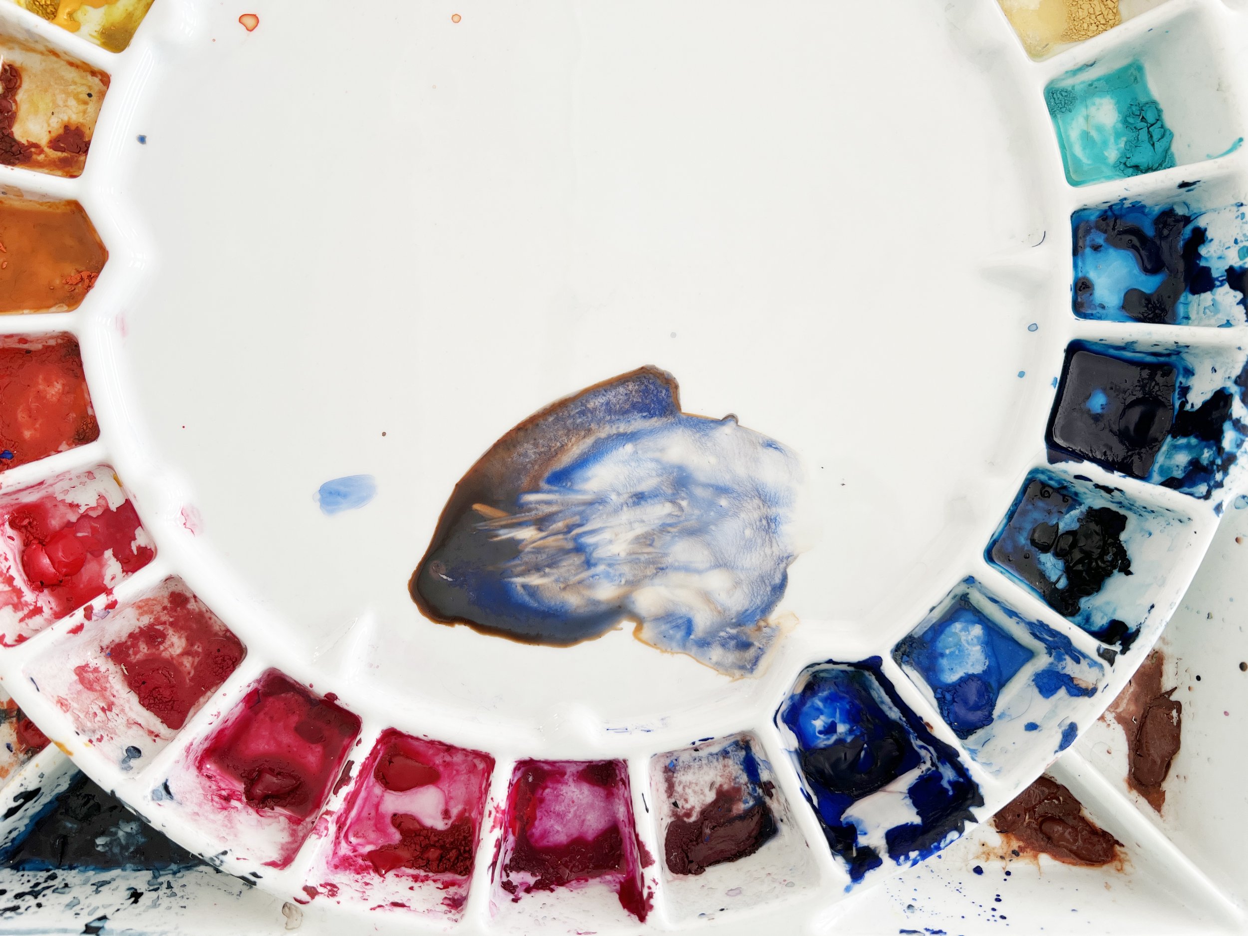
On my round ceramic palette I have grouped my paints like a colour wheel- starting with a cool yellow at the top.
1. Organise Like a Colour Wheel
For my round palettes, I organise my colours in the order of the colour wheel. Starting at the top with a cool yellow, I move anti-clockwise through warm yellows, warm reds, cool reds, warm blues, and cool blues, creating a split primary palette.
This setup ensures I have both warm and cool versions of each primary colour, allowing for greater flexibility when mixing secondary colours. The arrangement reflects the natural relationships between colours, making mixing easier and more intuitive. I reserve the remaining wells for earth tones and neutrals, while less frequently used colours - like Payne's Grey and Sepia - are placed in the triangular wells around the edges for easy access when needed.
2. Complementary Colours Layout
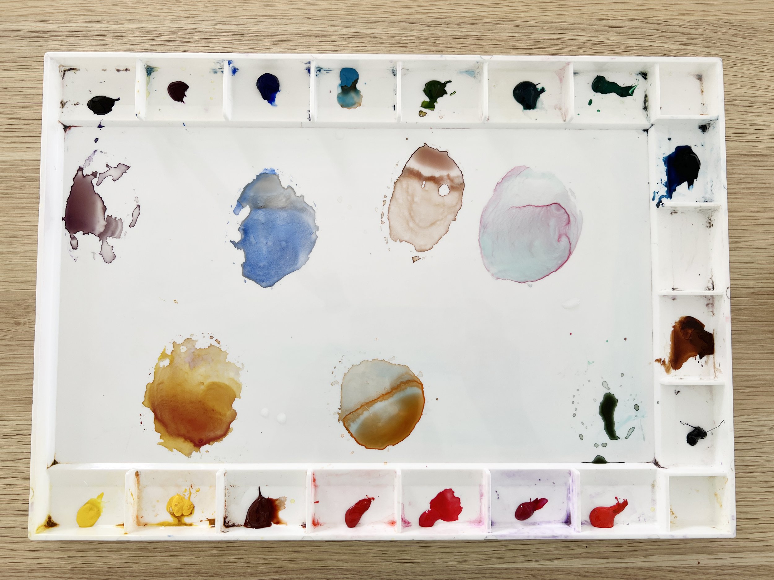
For rectangular palettes, an idea is to organise colours so that complementary pairs are placed opposite each other. For instance, yellow sits across from violet, red across from green, and blue across from orange. This setup is particularly useful if you frequently mix complementary colours to create neutrals or shadow tones, as it makes finding those combinations more intuitive. By having these colours directly across from each other, you can quickly access the pairs you need, speeding up your mixing process and helping you balance warm and cool tones more efficiently. It also helps you neutralize overly saturated colours with ease, allowing for more subtle, natural shades in your paintings.
Complementary colours arranged opposite each other allows me to easily create beautiful neutral colours in the mixing palette.
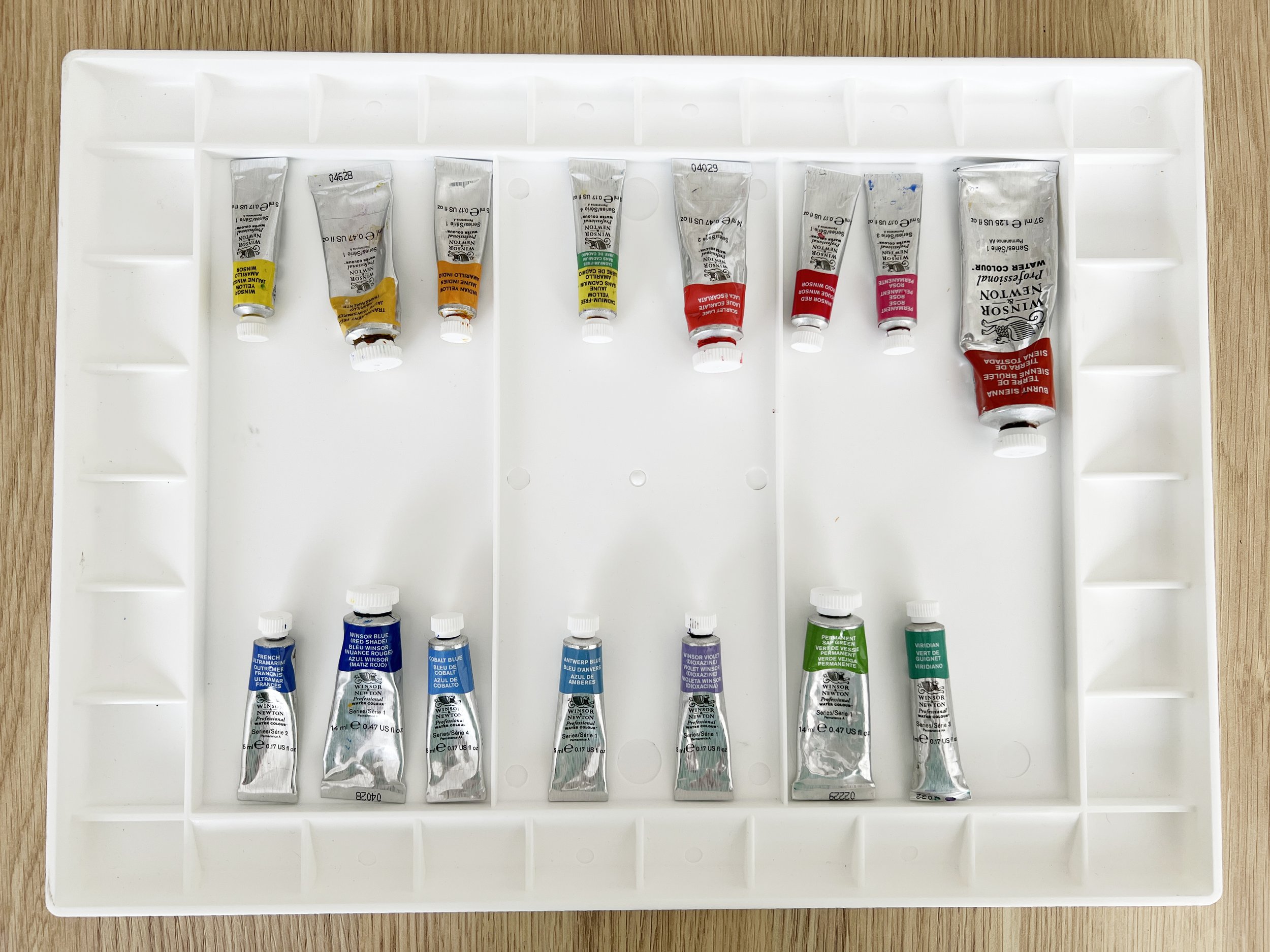
On my John Pike rectangular palette, I have arranged Winsor & Newton colours that I like to use. The complementary colours are set up as follows:
Winsor Yellow opposite Winsor Violet
Cadmium Yellow opposite Quinacridone Violet
Burnt Sienna opposite French Ultramarine Blue
Transparent Orange opposite Cerulean Blue
Winsor Red opposite Sap Green
Permanent Rose opposite Winsor Green (Blue Shade)
Scarlet Lake opposite Winsor Green (Yellow Shade)
In the remaining wells, I’ve included Burnt Umber, Prussian Blue, and Payne’s Gray as additional useful colours.
3. Group by Temperature
Organising your watercolour palette by temperature is another effective method to streamline your painting process. In this layout, you group your colours based on their temperature:
Warm Colours: Place all your warm hues on one side of the palette. This typically includes colours such as yellows, oranges, reds, and warm earth tones. These colours evoke a sense of warmth and can be used to create vibrant, lively paintings.
Cool Colours: On the opposite side of the palette, arrange your cool colours. This group consists of blues, greens, and cool earth tones. Cool colours tend to recede in a painting, providing a sense of depth and distance.
The practical advantages of separating your colours in this way, can help you more easily find the right tone for various effects. For instance, if you're working on a shadow or a highlight, having your warm and cool colours distinctly separated allows you to quickly access the appropriate temperature to achieve the desired effect. This method not only simplifies colour selection but also helps maintain harmony in your colour choices throughout the painting process.
Try arranging your palette with warm colours on one side and cool colours on the other.
4. Group by Transparency
Organising a palette by transparency and opacity can offer several advantages:
Easier Layering: Transparent colours are ideal for layering and glazing. By having them grouped together, you can quickly access them when you want to build up subtle layers without disturbing previous ones. Opaque colours are better for final touches or more solid areas, so it's handy to know where they are for those moments.
Better Control Over Effects: Watercolour often relies on transparency for its unique look. By organising by transparency, you can easily choose colours that allow the paper to shine through, creating luminosity. When you need a more solid, bold statement, you can quickly switch to the opaques.
Efficient Mixing: Knowing the transparency of your colours can help you predict how they’ll behave when mixed. Transparent colours mix more cleanly, while opaque ones can create muddier mixes. Grouping them lets you control your mixes more precisely.
Understanding Pigment Qualities: This setup helps you become more familiar with the characteristics of your pigments, which can improve your overall painting technique, especially when working with more delicate or layered effects.
Customising Your Palette
Every artist’s needs are different, and customising your palette for specific projects or styles can enhance your workflow. For example, you might create a separate palette for landscapes, focusing on earthy tones and a wider range of greens, while a portrait palette could include more colours for skin tones and lots of subtle neutrals.
You can also build a compact travel palette with just your essential colours for painting on the go. Tailoring your palette to suit the subject matter not only makes your painting process more efficient but also helps you achieve more accurate and cohesive results in your paintings.
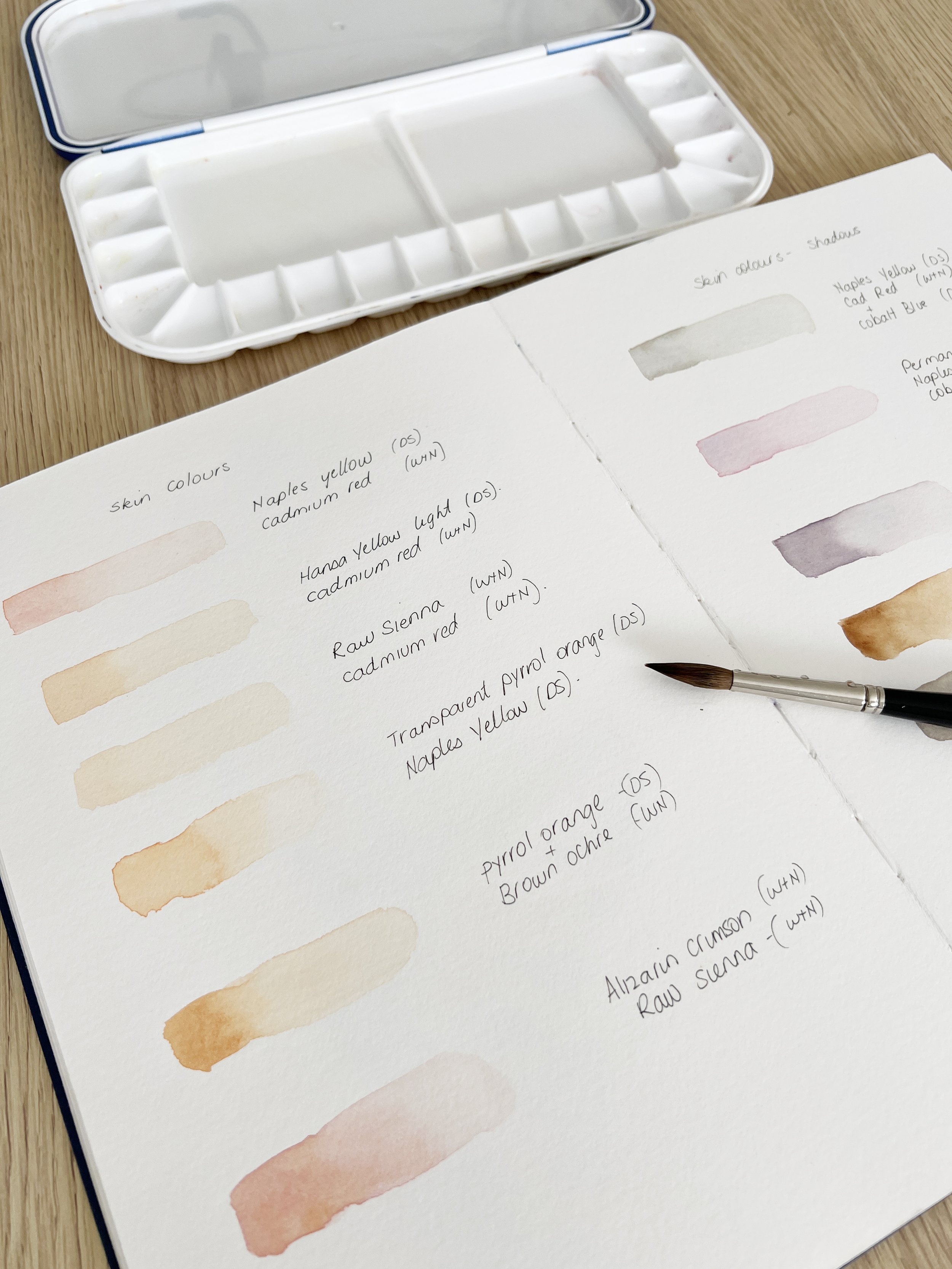
Some artists like to label their palettes by writing the names of the colours directly on the palette with a waterproof pen, ensuring they remember which colour is in each well. This can be especially handy when reusing dried paint or for quick reference. Personally, I prefer to write down the colours in a journal, along with the paint characteristics, in the order they’re placed in the palette. It’s a great way to track and understand how different pigments behave over time.
How much paint should you put on your palette?
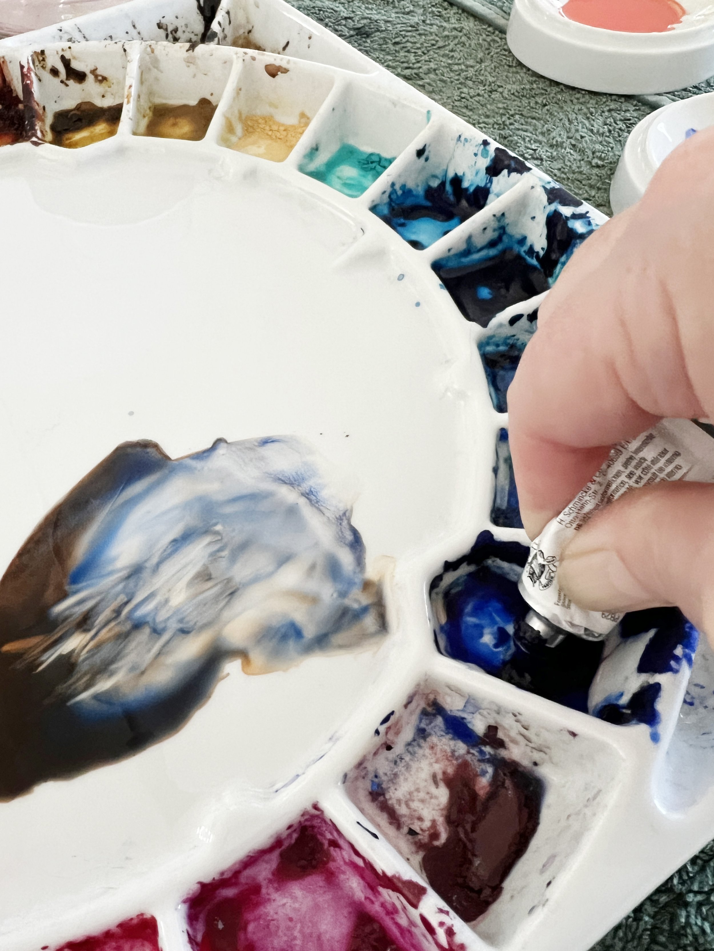
When it comes to how much watercolour paint to put on your palette, it really depends on your personal preference and painting style. I tend to squeeze just a small amount into each well, as I like working with freshly squeezed paint for mixing colours. It gives me more control over consistency and keeps my palette fresh. Any unused pigment remains in the palette and can be rewet when needed, but when I mix, I often squirt some new fresh paint on top of the hardened pigment. This allows me to combine the convenience of reactivating old paint with the vibrancy and control of using fresh pigment, offering the best of both worlds.
On the other hand, some artists prefer to fill the wells all at once. This allows the paint to dry and be reactivated with water later, which can be handy for those who like having all their colours ready to go without having to squeeze out new paint each time. Both methods work, so it’s all about what suits your workflow best.
A close look at my working palette. I like to mix with fresh pigment so I put small amounts of paint into each well and add more when I run out.
Frequently Used Colours
When organising your palette, it can be helpful to place your most frequently used colours in the most accessible wells. Colours like Ultramarine Blue, Burnt Sienna, or your go-to yellows and reds are often used in many paintings, so having them within easy reach can save time and make your workflow more efficient. This setup allows you to quickly grab and mix the colours you rely on most, keeping your painting process smooth and uninterrupted.
Avoiding Colour Contamination
Some artists prefer to leave an empty paint well between each colour on their palette to avoid accidental contamination. This extra space helps keep the colours clean, especially when colour mixing, and reduces the chance of picking up unwanted pigments. It’s a simple yet effective way to maintain pure, vibrant colours, particularly when working with transparent watercolours where clarity and precision are key.
Some artists like to leave a spare paint well between colours to avoid one colour contaminating another.
Final Thoughts
Ultimately, how you organise your watercolour palette is a personal decision, and there’s no right or wrong way to do it. Whether you prefer a more structured approach like arranging by the colour wheel, a split primary palette, or simply grouping by temperature, your palette setup should support your creative process.
Experiment with different layouts and find what works best for you, making sure it aligns with your style, workflow, and the type of paintings you enjoy creating. A well-organised palette is just one small step toward producing beautiful, harmonious art - so set yourself up for success!
If you are interested in learning to paint in watercolour, I have over 200 online, voiced over watercolour tutorials for all skill levels.
