Understanding Colour Psychology
The Psychological Effects of Colours on Emotions, Moods, and Perceptions
Colours affect us in every aspect of our daily lives. Colours are a powerful communication tool that can significantly affect our emotions, moods, and perceptions. The study of the psychology of colour is part of colour theory and explores how different colours influence human behaviour and feelings, providing insights into how we can use certain colours effectively in various contexts such as branding, marketing, interior design and, of course, art.

The Emotional Impact of Colours
Each colour has unique psychological effects and can influence mood, often triggering specific emotions and behaviours. Here are some common associations:

A fiery red Waratah
Red: Often linked with passion, excitement, and energy, red can increase heart rate and create a sense of urgency. This makes it a popular choice in marketing to attract attention or in dining areas to stimulate appetite. Red light, in particular, has been shown to raise blood pressure and increase heart rate, making it a stimulating colour.
Blue: Known for its calming and serene effects, blue is associated with trust, peace, and productivity. Blue light can help reset our circadian rhythms, aiding sleep cycles, and is commonly used in workplaces to enhance focus and in bedrooms to promote relaxation. Blue tones are also preferred for their ability to reduce stress and promote calmness.

Joyous yellow daffodils in watercolour
Yellow: Bright and lively, the colour yellow is associated with happiness, creativity, and warmth. Yellow means joy and is often used in spaces to promote a cheerful atmosphere. It can uplift moods but should be used cautiously as excessive yellow and bright shades may lead to feelings of anxiety.
Green: Symbolising nature, growth, and harmony, green colour has a soothing effect and is frequently used in spaces designed for relaxation and concentration, such as study areas. Green light is also known to be calming and is associated with positive effects on mental health.
Purple: Combining the stability of blue and the energy of red, purple is linked with luxury, creativity, and spirituality. It is often used to create a sense of sophistication and mystery. The colour purple can represent nobility and wisdom, making it a popular choice in branding for premium products.
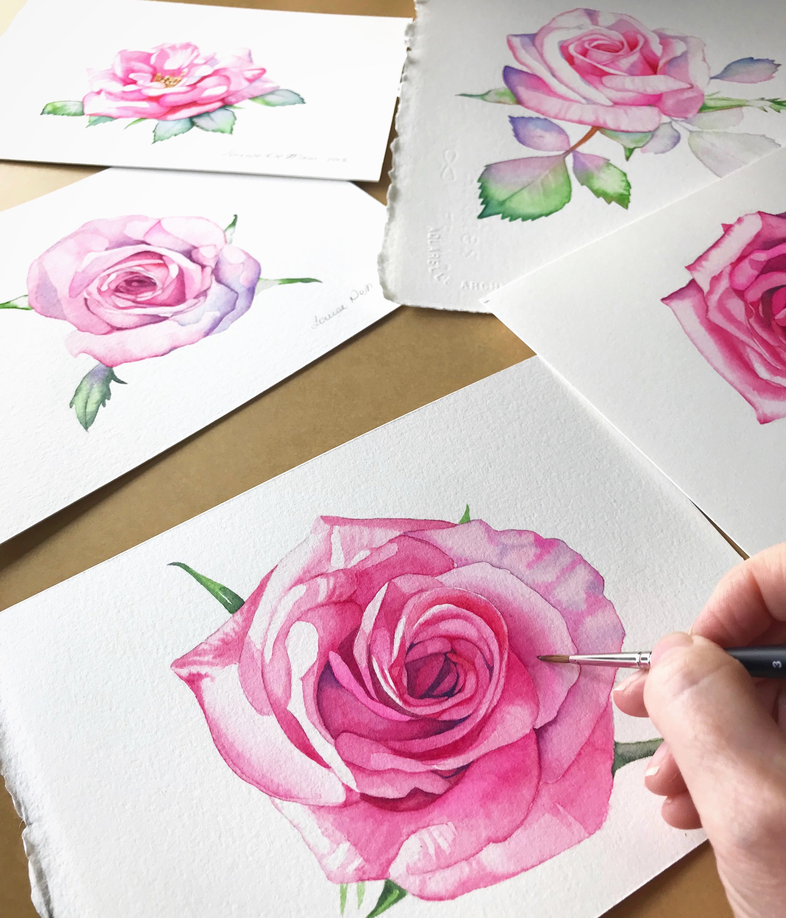
Several pink roses in watercolour
Orange: A warm and energetic colour, orange is associated with enthusiasm and encouragement. It is effective in promoting social interaction and is commonly used in fitness and creative spaces.
Pink: Representing compassion, love, and calmness, pink colour is typically used in environments meant to soothe and nurture. Hot pink can be more stimulating and is used to convey boldness and vibrancy.
Black: Often associated with sophistication, elegance, and power, black can also evoke feelings of mystery and authority. However, it can sometimes be perceived as intimidating or depressing if overused.
White: Symbolising purity, cleanliness, and simplicity, white can create a sense of space and neutrality. It is commonly used in minimalist designs and to convey a fresh, modern look.
Colour Psychology in Different Contexts
Branding and Marketing
In marketing, colours are strategically used to evoke specific emotions and influence consumer behaviour. For instance, red can create a sense of urgency, making it effective for clearance sales, while blue can establish trust, making it ideal for financial institutions. Yellow, with its attention-grabbing brightness, is often used in promotional materials to convey cheerfulness and optimism. The influence of colours on brand personality is significant; cool colours like blue and green often signify reliability and tranquility, while warm colours like red and yellow evoke excitement and energy.
Coca-Cola: Uses red to evoke excitement and energy, making their branding vibrant and dynamic.

Image by Kenny Holmes from Pixabay
IBM: Utilises blue to convey professionalism and trustworthiness, reinforcing their position as a reliable tech giant.
Interior Design
In interior design, colours play a crucial role in shaping the ambiance and functionality of spaces. Bedrooms regularly feature calming hues like blue or green to promote relaxation and sleep, while living rooms might use warm tones like yellow or orange to foster a welcoming and energetic atmosphere. Understanding these psychological effects allows designers to create environments that enhance well-being and productivity.
Tips for Using Colour in Interior Design:
— Bedrooms: Use shades of blue or green for a calming effect. Blue walls, in particular, are known to promote better sleep.
— Living Rooms: Opt for warm, inviting colours like soft yellow or orange.
— Home Offices: Incorporate blues or greens to boost concentration and productivity.

Colour Therapy and Mental Health
Colour therapy, or chromotherapy, is an alternative therapy that uses colours to promote healing and well-being. Different colours are believed to have specific therapeutic properties:
Red: Stimulates the body and mind, increasing circulation.
Yellow: Stimulates the nerves and purifies the body.
Orange: Heals the lungs and boosts energy levels.
Blue: Soothes illnesses and alleviates pain.
Indigo: Alleviates skin problems.
Although scientific support for colour therapy is limited, many people find it beneficial for stress reduction and mood enhancement. The use of coloured light in therapy can help address conditions such as Seasonal Affective Disorder (SAD), where blue-enriched light has been found to be particularly effective.
Personal and Cultural Influences
While certain colour associations are widely recognised, personal experiences and cultural backgrounds can significantly influence individual reactions to colours. For example, white is associated with purity in many Western cultures, but it is linked with mourning in several Eastern cultures. Personal preferences, shaped by individual experiences, also play a significant role in how colours are perceived and the emotional responses they elicit.

A white rose that I painted to be used on my daughter’s wedding invitations
Practical Applications of Colour Psychology
To apply colour psychology effectively:
— Choose Colours Based on Function: Use calming colours in spaces meant for relaxation and vibrant colours in areas designed for activity and interaction.
— Consider Cultural Contexts: Be mindful of cultural differences in colour meanings to ensure the intended message is conveyed appropriately.
— Personalise Spaces: Incorporate colours that resonate personally to create environments that reflect individual preferences and enhance comfort.

By understanding and leveraging the psychological effects of colours, we can create more harmonious, productive, and emotionally supportive environments.
Psychological Effects of Colour Combinations
Complementary colours- violet and yellow - create high contrast
Understanding how different colours work together can enhance the psychological impact:
Complementary Colours: These are opposite each other on the colour wheel and create high contrast and vibrant looks (e.g., blue and orange). They can draw attention and create a lively atmosphere.
Analogous Colours: These are next to each other on the colour wheel and create serene and comfortable designs (e.g., blue, green, and teal). They are often found in nature and are pleasing to the eye.
Triadic Colours: These are evenly spaced around the colour wheel and tend to be very vibrant (e.g., red, yellow, and blue). They offer high contrast while retaining balance.
Colour in Digital Media and Web Design
In the digital age, colour psychology also plays a critical role in web design and user experience (UX):
Call-to-Action Buttons: Bright, contrasting colours like red, green, or orange are frequently used to make buttons stand out and encourage clicks.
Background Colours: Soft, neutral backgrounds help keep the focus on the content and reduce eye strain.
Brand Consistency: Maintaining a consistent colour scheme across all digital platforms reinforces brand identity and recognition.
The Science Behind Colour Perception
Exploring the physiological and psychological mechanisms of how we perceive colours can provide deeper insights:
Light and Wavelengths: Colours are perceived based on the wavelengths of light they reflect. For example, blue light has shorter wavelengths and is linked to feelings of calmness and alertness.
Biological Responses: Our biological responses to colour can be quite profound. For instance, exposure to blue light can help reset circadian rhythms, aiding sleep cycles.
Cultural and Psychological Factors: Cultural background and personal experiences can significantly affect how we perceive and react to colours. These subjective experiences shape our emotional responses and colour preferences.
Colour Psychology in Fashion and Personal Expression
How we use colour in our clothing and personal style also reflects and affects our psychological state:
Professional Settings: Colours like blue and grey are often chosen for professional attire to convey reliability and professionalism.
Social Events: Bright colours like red, pink, and yellow can be used to stand out and convey confidence and energy.
Mood Reflection: People typically select clothing colours based on their current mood or the mood they wish to project. For example, wearing outfit colours black can signify elegance or a desire for privacy, while white can suggest a fresh start or simplicity.
Practical Tips for Using Colour Psychology
To apply colour psychology effectively in various aspects of life:
Home Decor: Choose colours that promote relaxation in bedrooms (e.g., blue or green) and energise social spaces like living rooms and kitchens (e.g., yellow or orange).
Office Design: Use colours that enhance productivity and reduce stress, such as blue for focus and green for balance.
Fashion Choices: Select clothing colours that align with your goals for the day—blue for calm and confidence, red for energy and attention.
Marketing and Branding: Align your brand's colour scheme with the emotions you want to evoke in your audience. Trustworthy blue, energetic red, or optimistic yellow can all play strategic roles.
Colour Psychology in Art
In the realm of art, colour psychology plays a pivotal role in conveying emotions, setting moods, and evoking specific responses from viewers. Artists have long understood the power of colour to influence the perception and emotional impact of their work.
Emotional Expression Through Colour
Artists use colours to express and evoke emotions, often selecting hues based on their psychological impact. For example, Pablo Picasso’s Blue Period (1901-1904) is characterised by the use of blue tones to convey melancholy and despair. The predominant use of blue during this period reflected Picasso’s own emotional state and aimed to evoke a sense of sadness and introspection in viewers. Similarly, Vincent van Gogh’s use of vibrant yellows and oranges in works like "Sunflowers" was intended to convey joy and optimism, contrasting with the darker themes present in other parts of his oeuvre.
Psychological Effects of Colour Combinations

Image by Oleksii Gnievzshev from Pixabay
Artists also experiment with colour combinations to enhance the psychological impact of their work. Complementary colours, which are opposite each other on the colour wheel, create dynamic contrast and can make elements of a painting stand out more vividly. For instance, the use of red and green together can create a striking visual impact, often evoking a sense of vibrancy and movement. Analogous colours, which are next to each other on the colour wheel, are used to create harmonious and serene compositions that are pleasing to the eye.
The Role of Colour in Abstract Art
In abstract art, where form and subject matter may be ambiguous, colour takes on an even more significant role in conveying meaning and emotion. Abstract artists like Wassily Kandinsky believed in the spiritual and emotional power of colour. Kandinsky’s theory of colour proposed that colours have intrinsic properties that can affect the soul and provoke emotional responses. His works often used bold colours and shapes to create compositions intended to elicit specific feelings from viewers.
I have written more about how to use colours in your art in this blog post.

An abstract painting by Wassily Kandinsky
The use of colour in painting is a powerful tool for artists to communicate emotions, symbolism, and psychological effects. By understanding and harnessing the principles of colour psychology, artists can create more impactful and evocative works that resonate deeply with their audiences. Whether through the melancholy blues of Picasso or the vibrant yellows of van Gogh, the strategic use of colour remains central to the artistic process and its ability to move viewers.
By understanding these effects, we can make more informed choices in various aspects of life, from personal expression and home decor to marketing and digital design. The strategic use of colour can enhance well-being, improve productivity, and create powerful emotional connections.
So go forth and explore the vibrant world of colours, letting each hue inspire and transform you.
Love, Louise.