Increase your Colour Knowledge
A Deep Dive into the Colour Wheel
Welcome, creative souls!
Today, we're diving deep into the mesmerising world of colour theory, more precisely, into a helpful tool called the colour wheel. Understanding this fundamental element of art and design can transform your approach to creating art, decorating your space, or even choosing your next outfit.
Let's embark on this colourful journey together!
The colour Wheel
Imagine a circle that holds the secrets to colour harmony. That’s the colour wheel, a tool first conceptualized by Sir Isaac Newton in 1666. It’s not just a pretty rainbow circle—it’s a roadmap for artists to understand and harness the relationships between colours.
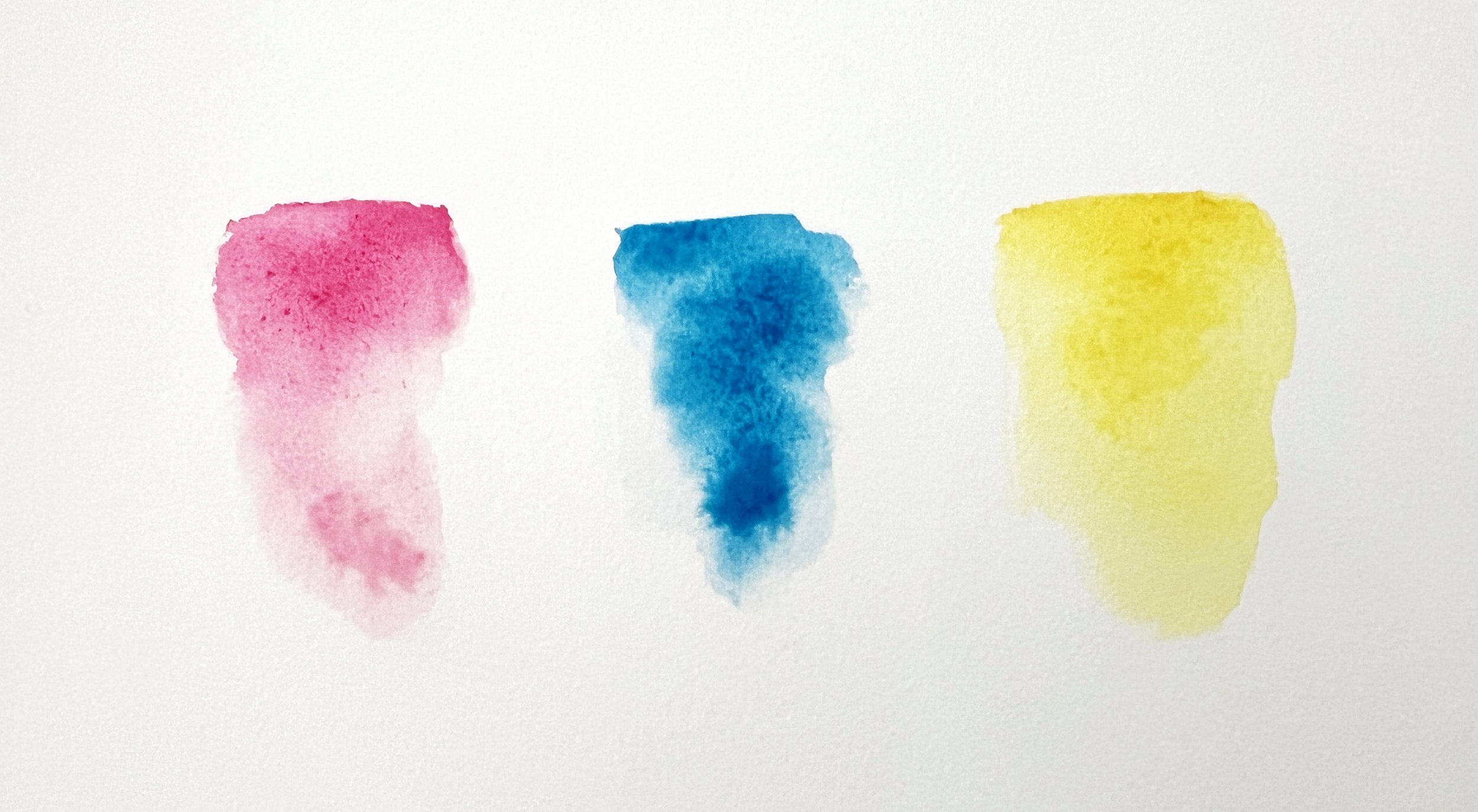
In the RGB colour model, red, green, and blue are the primary colours used to mix light and create various colour combinations.

The color wheel is a good starting point to learn about color theory.
Whether you’re painting a serene landscape or designing a vibrant logo, the colour wheel guides your colour choices, ensuring balance and beauty.
Types of colour Wheels
Traditional colour Wheel: Based on subtractive colour mixing (using pigments), typically used in painting and printmaking.
RGB colour Wheel: Based on additive colour mixing (using light), relevant in digital media and design. The primary colours in the RGB colour model are red, green, and blue. When these colours are combined in various ways, they create a wide range of colours, and when added together at full intensity, they produce pure white light.
The Primary colours: Building Blocks of Creativity
At the very heart of the colour wheel, we find the primary colours: red, yellow, and blue. These are the true originals, colours that cannot be created by mixing others. They are powerful and pure, providing the foundation for an infinite palette of shades. Think of them as the base notes in a symphony, essential and irreplaceable. Your basic colours you expand upon.
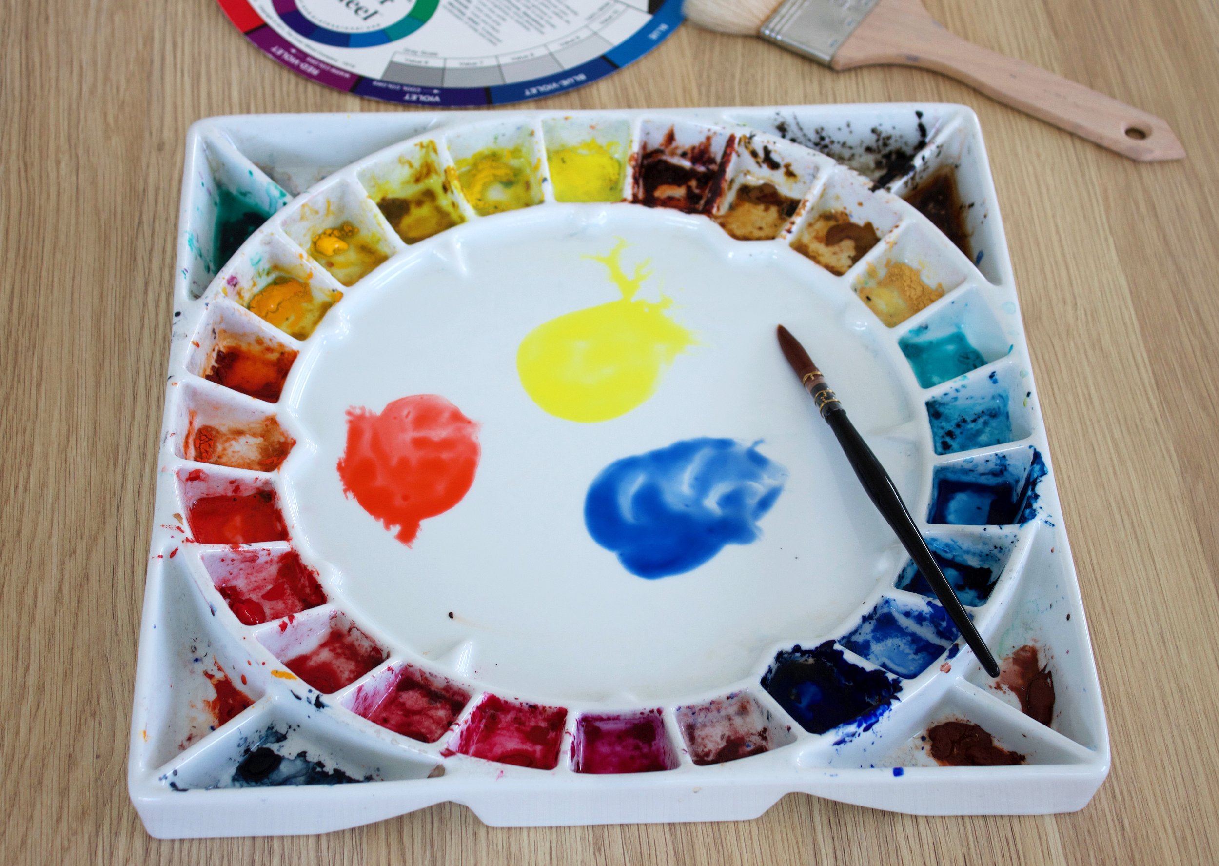
The primary colours: red, yellow and blue.
Did you notice before, that a printer can print all the colours imaginable by just using cyan, magenta and yellow mixed together? This is the magic of the colour wheel. Choosing the right colours to mix together is the basis of creating a harmonious colour wheel. I have written previously about how to avoid mixing muddy, dull and lifeless colours.

Image by Stefan Schweihofer from Pixabay
Beyond the Basics
Primary colours are more than just the basic building blocks:
Psychological Impact: Each primary colour evokes specific emotional responses. For example, red often signifies passion or danger, blue can be calming or authoritative, and yellow is typically associated with happiness and energy.
Cultural Significance: Different cultures interpret colours uniquely. Red can mean luck and prosperity in Chinese culture, while it often signifies warning in the western world contexts.

Blue can be calming.
The Secondary and Tertiary colours: Expanding the Palette
When you mix two primary colours, you get a secondary colour. These are orange, green, and purple—each a beautiful result of its primary parents. Orange blossoms from the joy of red and yellow; green emerges from the calm of blue and yellow; purple arises from the mystery of red and blue. These colours add depth and diversity to our palette.
Secondary colours
Orange: Created by mixing red and yellow, orange often symbolizes enthusiasm and creativity.
Green: A mix of blue and yellow, green represents growth, harmony, and freshness.
Purple: Combining red and blue, purple is associated with luxury, mystery, and spirituality.
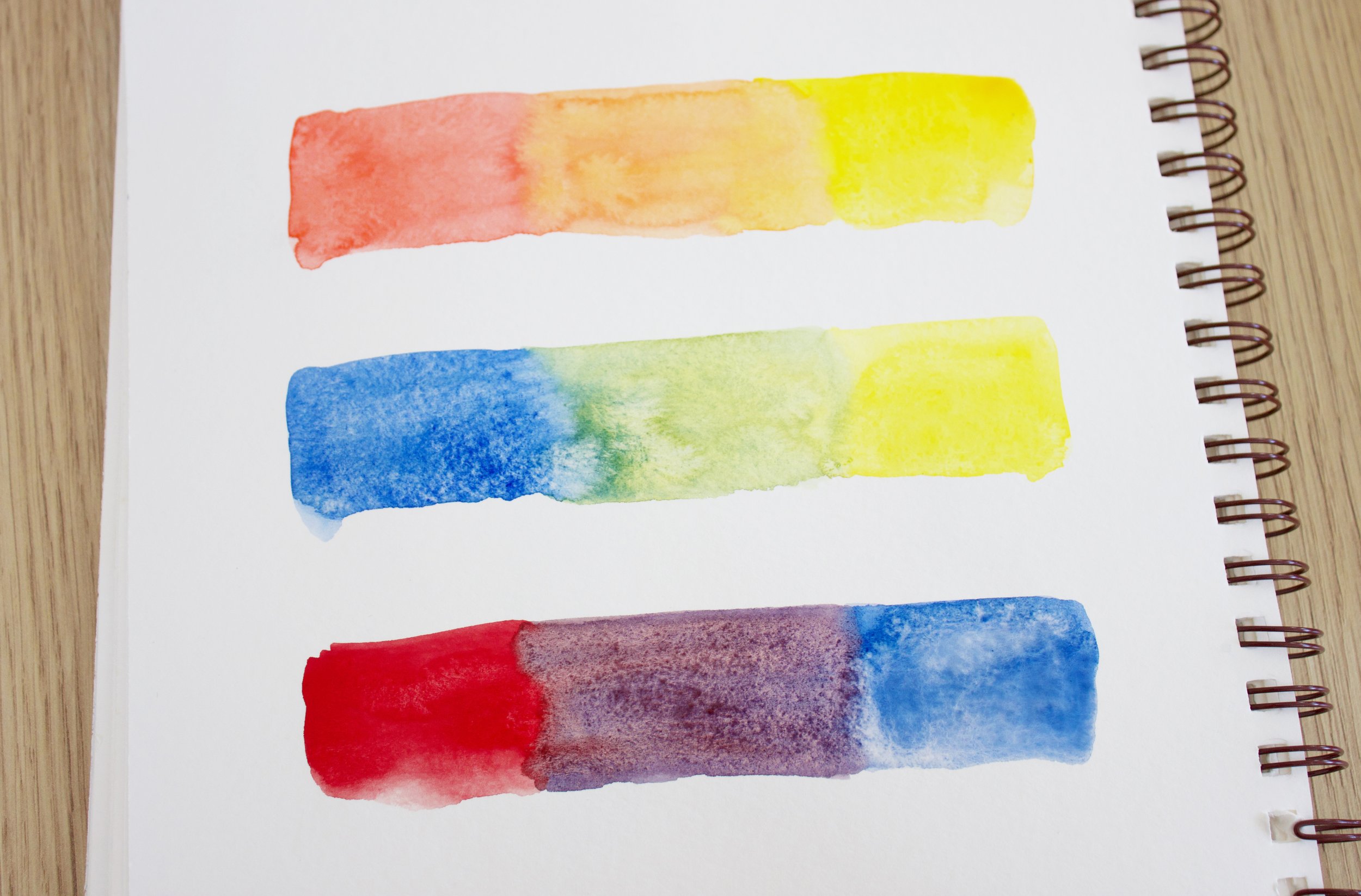
To create secondary colours- mix together red and yellow for orange, blue and yellow for green and red and blue for violet.
Tertiary colours
Mixed tertiary colours
But why stop there? Mixing a primary with a secondary gives us the tertiary colours: red-orange, yellow-orange, yellow-green, blue-green, blue-purple, blue-violet, and red-purple. These are the intricate notes that add complexity and nuance to our colour compositions.
These are created by mixing primary and secondary colours, leading to six unique shades:
Red-Orange: Energetic and stimulating.
Yellow-Orange: Warmth and optimism.
Yellow-Green: Freshness and vitality.
Blue-Green: Calmness and tranquility.
Blue-Violet: A blend of calmness and creativity.
Red-Violet: Passion and sophistication.
The Symphony of colour Schemes
Colour harmony is about creating a visual experience that is pleasing to the eye and resonates with the soul. It’s about balance and beauty, using the colour wheel to create relationships that enhance the overall effect of your work. A well-chosen colour palette is essential in achieving harmonious colour schemes, as it helps in selecting colours that work well together and evoke the desired emotional response.
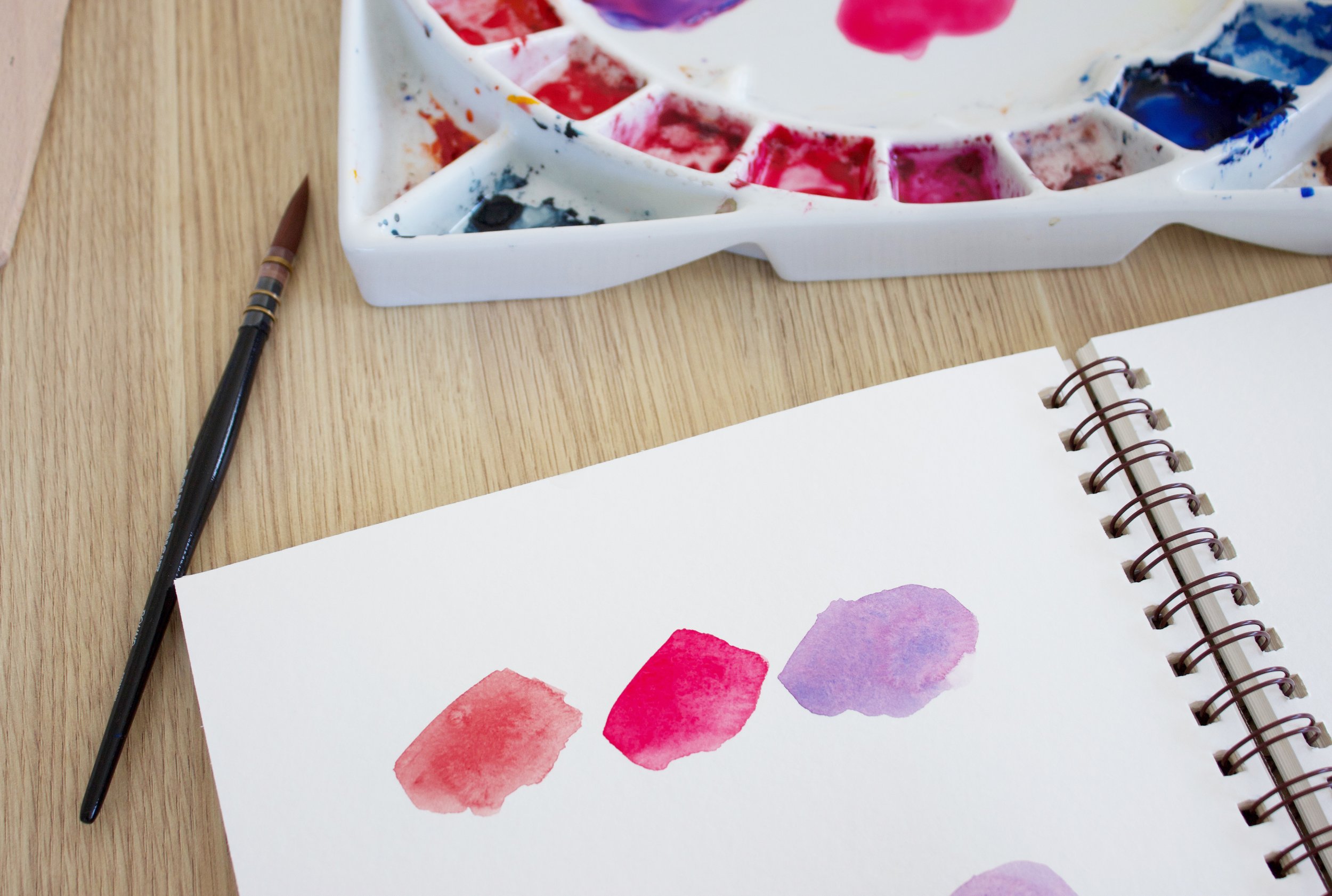
Complementary colours
Think of them as best opposites. Blue and orange, for instance, are directly across from each other on the wheel, offering a striking contrast that is dynamic and bold.
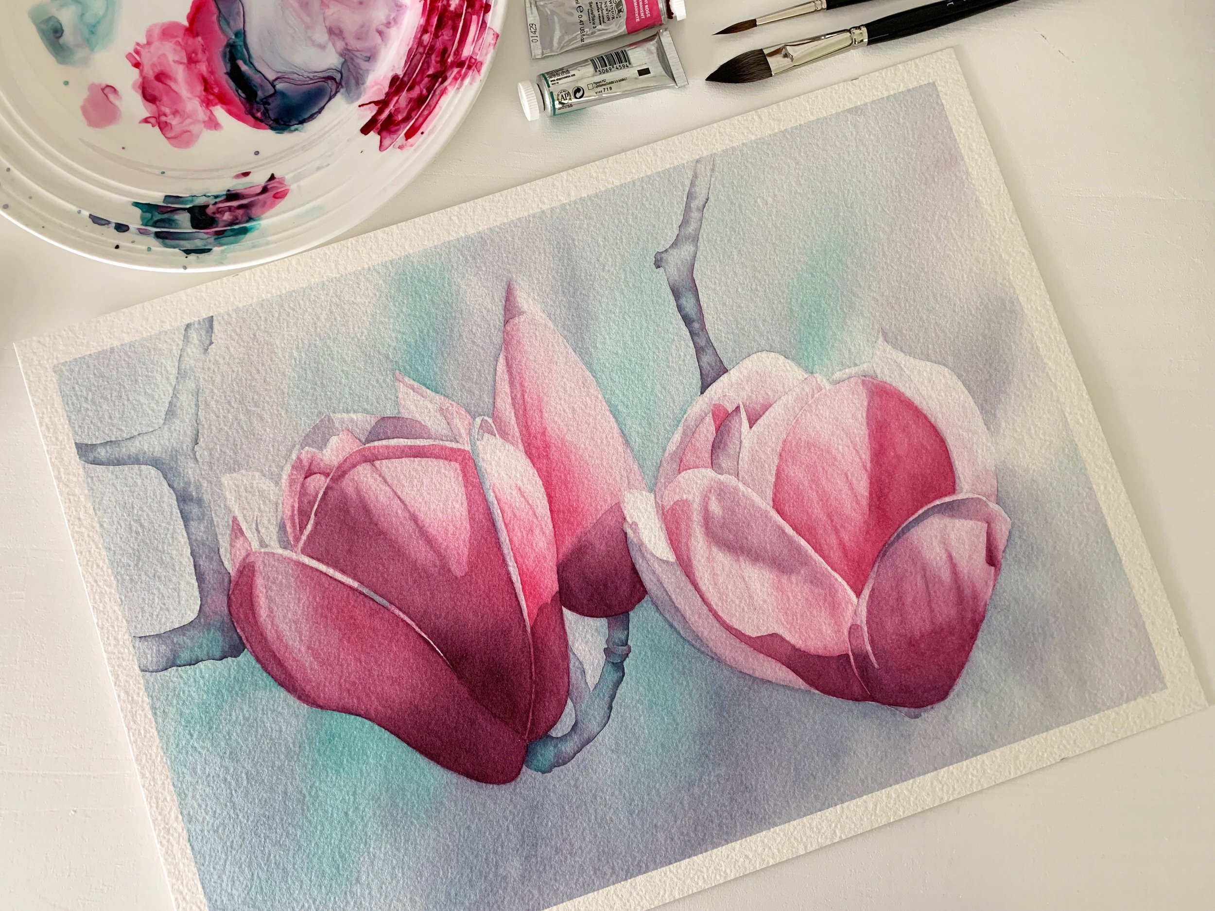
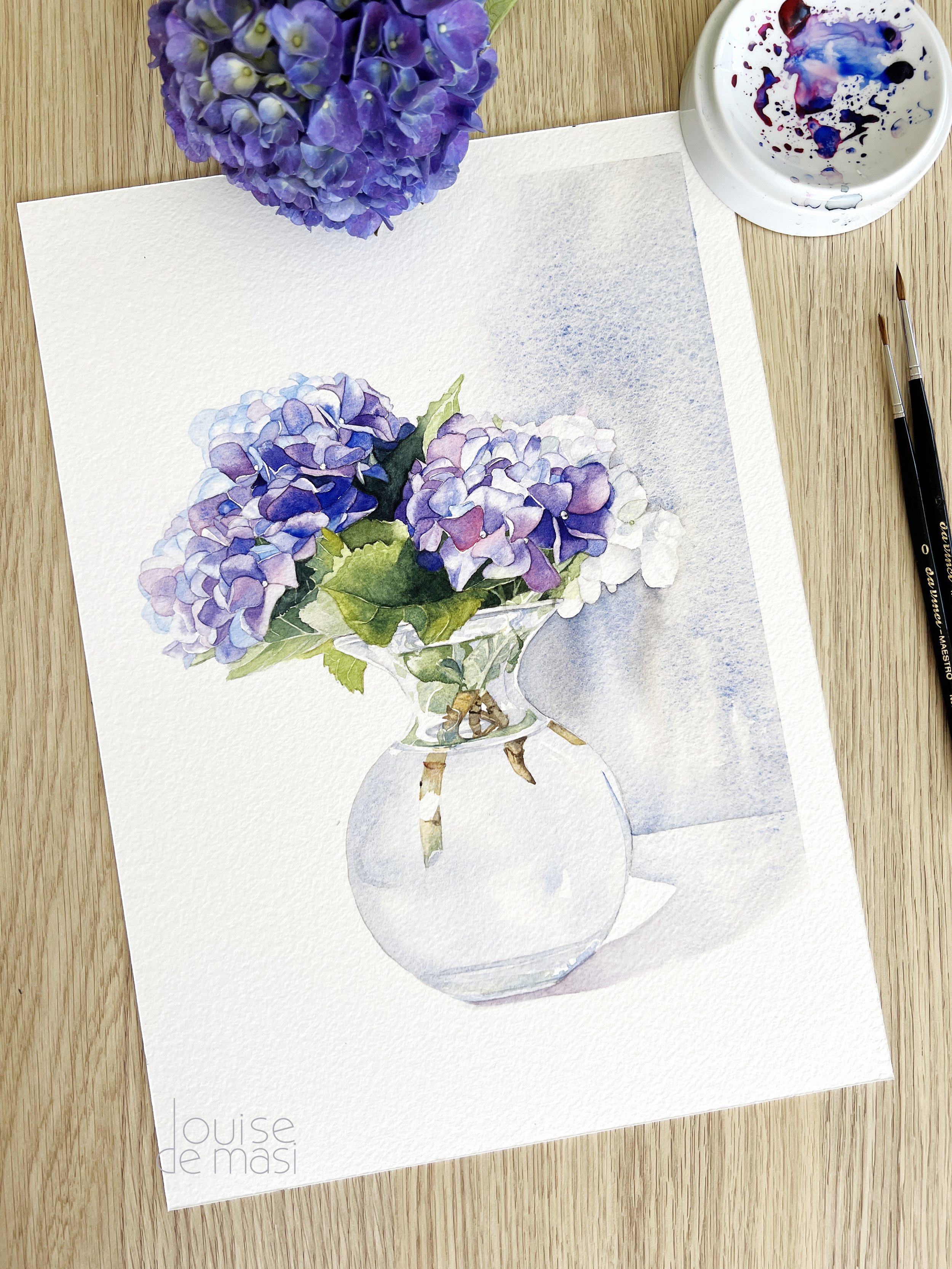
I used a complementary colour scheme on this Magnolia painting. The only two colours I used were Winsor Green Blue Shade – PG7 and Permanent Rose – PV19
Analogous colour scheme
These colours sit next to each other on the wheel, like blue, blue-green, and green. They provide a serene and comforting look, perfect for spaces where you want to evoke calmness.
An analogous color scheme is beautifully harmonious because it involves using adjacent, closely related colors on the color wheel.
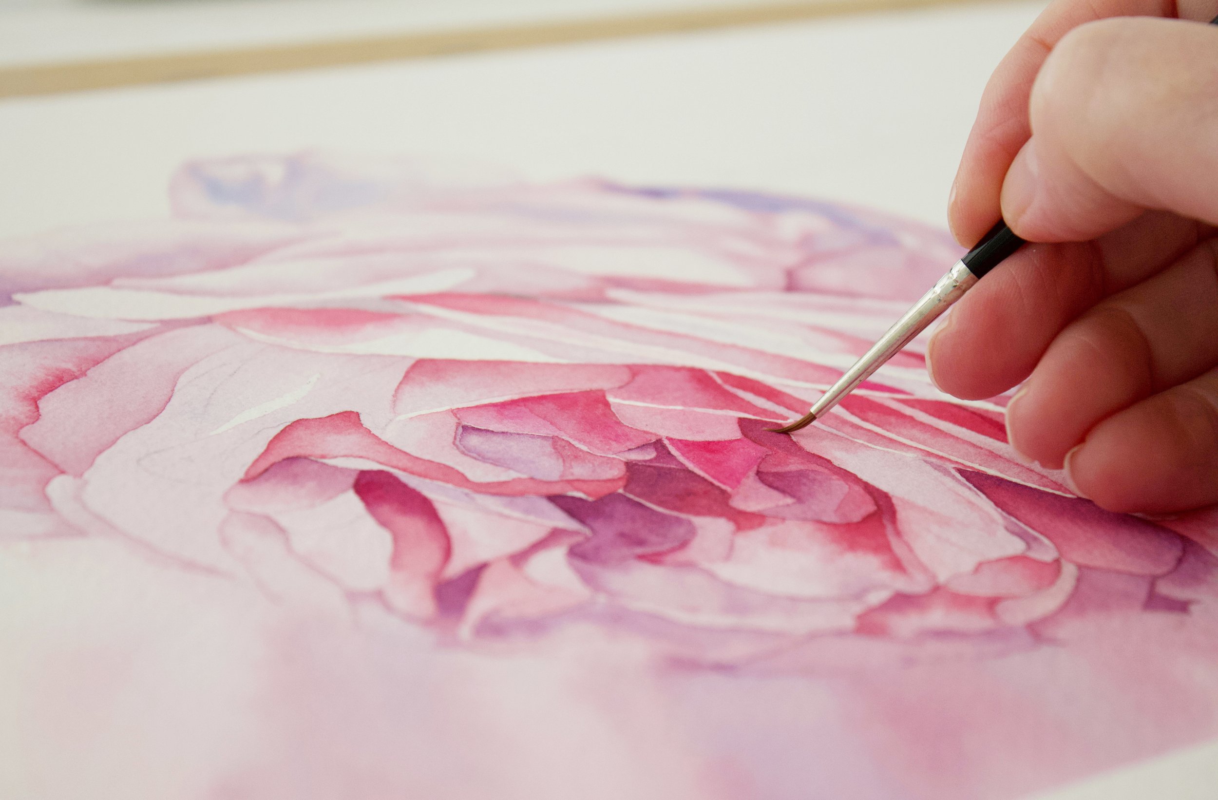
I used an analogous colour scheme when I painted this rose.
Triadic colours
This scheme uses three colours evenly spaced around the wheel, such as red, yellow, and blue. It’s a lively combination that brings energy to any composition.
A Triadic colour scheme of red, yellow and blue.

These leaves were painted using a triadic colour scheme of red, yellow and blue. Winsor Blue (red shade) – PB15 Winsor Lemon – PY175 Winsor Red – PR254
Split-Complementary colours
A twist on the complementary scheme, this uses a base colour and the two adjacent to its opposite. This offers high contrast with a harmonious balance.

A split complementary colour scheme of French Ultramarine - Transparent Orange and Scarlet Red
Tetradic colour Scheme - (Double Complementary)
Four colours, two complementary pairs, create a rich and varied palette. This scheme is ideal when you want complexity and vibrancy. To maintain balance and harmony, use these colours in different proportions, with one pair as the dominant colours and the other pair as accents.

A tetradic colour scheme of Ultramarine Blue, Transparent Orange, Permanent Green and Permanent Carmine
Monochromatic colour Scheme
Uses variations in lightness and saturation of a single colour. This creates a cohesive and elegant look, perfect for minimalist designs.

A monochromatic colour scheme.
Neutral colours
Blacks, whites, grays, and browns don’t appear on the colour wheel but play a crucial role in design. They can be used to tone down or balance more vibrant hues.
Colour Temperature
Warm and Cool colours
Understanding colour temperature is essential for creating depth and mood in your artwork. Warm colours, such as reds, oranges, and yellows, tend to advance in a composition, creating a sense of closeness and intensity. These colours evoke warmth, energy, and excitement, making them perfect for highlighting focal points and adding vibrancy to your work.

Van Gogh's - Starry Night - The balance of warm and cool colors in "Starry Night" not only highlights the focal points but also contributes to the overall emotional impact of the painting, making it a perfect example of how color temperature can be used to evoke specific feelings and create dynamic compositions.
On the other hand, cool colours like blues, greens, and purples tend to recede, providing a calming and soothing effect. These colours are ideal for backgrounds or areas where you want to create a sense of distance and tranquility. By balancing warm and cool colours, you can achieve a dynamic composition that engages the viewer and evokes the desired emotional response.
I have written an extensive blog post about how to easily identify warm and cool colours.
Simultaneous Contrast

Josef Albers' "Interaction of Color" is highly regarded for its exploration of color theory through hands-on exercises and visual examples, making it an invaluable resource for understanding the complexities and nuances of color perception and interaction.
Simultaneous contrast is a fascinating phenomenon where colours can appear differently depending on the colours surrounding them. For example, a grey square will look warmer when placed on a blue background and cooler on a red background. This effect occurs because our perception of a colour is influenced by the colours adjacent to it, making it appear more intense or altered in hue.
Understanding simultaneous contrast is crucial for creating harmonious colour compositions. By strategically placing colours next to each other, you can enhance their vibrancy and create visual interest. This concept is particularly useful in painting and design, where colour interactions play a significant role in the overall aesthetic. This effect demonstrates how colour perception is not static but influenced by the context in which a colour is viewed.
By understanding how adjacent colours impact perception, you can manipulate your palette to achieve desired effects and draw attention to specific areas of your composition. This technique allows for greater control over the visual impact of your artwork, making it more engaging and dynamic.
Why colour Matters
In the realm of art and design, colour is not just an aesthetic choice—it’s a communicative tool. It can soothe or excite, suppress, or enhance. It can draw attention, evoke moods, and make statements. By mastering colour theory, you unlock the power to use colour deliberately to evoke specific emotions and achieve desired responses.
Psychological Effects
Colour can significantly influence human perception and behaviour. For instance:
Red: Can increase heart rate and create a sense of urgency.
Blue: Often used in corporate designs to promote trust and reliability.
Yellow: Can grab attention and stimulate mental activity.

'The Scream' by Edvard Munch: This painting uses vibrant reds and oranges in the sky and figure to convey a sense of urgency and anxiety, illustrating how red can evoke intense emotions.
Cultural Interpretations
Understanding cultural connotations of colours can enhance the effectiveness of a design or artwork in different regions. For example:
White: Often associated with purity and peace in Western cultures, but can signify mourning in some Eastern cultures.
Modern colour theory
Since Sir Isaac Newton first introduced the concept of the colour wheel in 1666, the field of colour theory has seen significant advancements. One notable figure in this evolution is Johannes Itten, a Swiss painter and teacher at the Bauhaus school of design. Itten's work expanded on Newton's ideas, introducing a twelve-part colour wheel that has become a fundamental tool for artists and designers.
Itten's twelve-part colour wheel includes primary, secondary, and tertiary colours, creating a more detailed and versatile framework for understanding colour relationships. He emphasized the psychological and emotional effects of colours, pioneering concepts that have deeply influenced modern art and design. Itten's teachings on colour harmony and contrast provided artists with a structured approach to creating balanced and aesthetically pleasing compositions.
In addition to Itten, other contemporary theorists and artists have contributed to our understanding of colour. Their research has delved into how colours interact, the impact of light on colour perception, and the ways in which colour can be used to convey meaning and emotion in art.
Bringing Theory to Practice
As we wrap up our colourful exploration, remember that understanding colour theory is just the beginning. The true magic happens when you apply these principles in your art, design, or everyday life. Experiment with colours, try different combinations, and observe the effects. With each creation, you’ll grow more attuned to the nuances of colour and more skilled at wielding its power.
Practical Exercises to Master Colour Harmony
Let’s roll up our sleeves and get our hands tinged with hues! Here are some engaging activities to truly internalize what we’ve discussed:
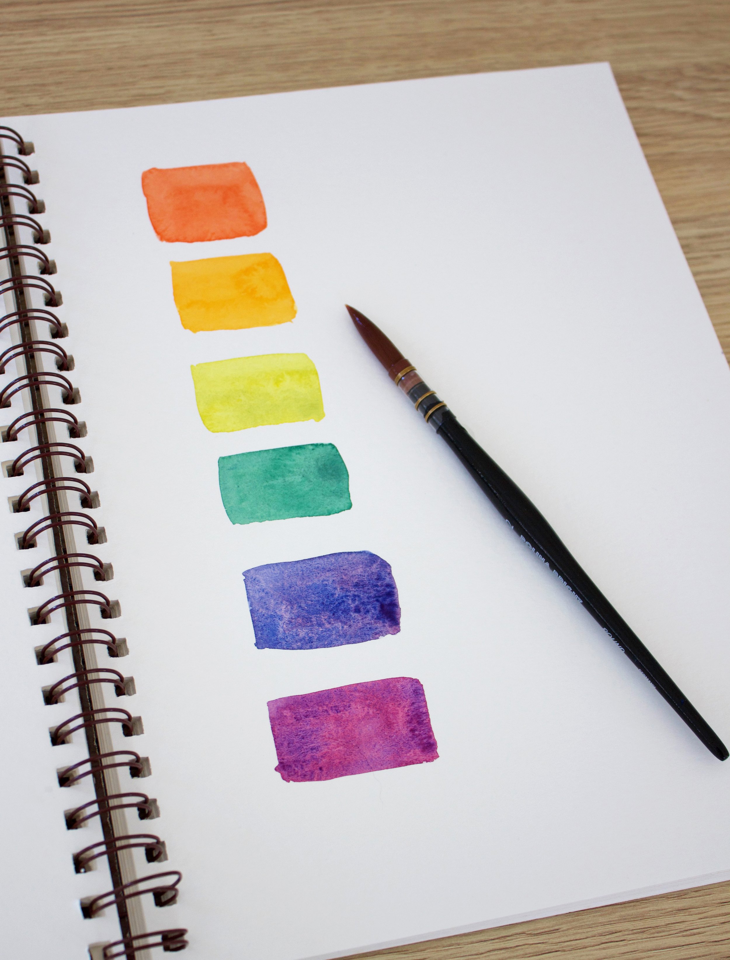
Create Your colour Wheel
Using your favourite mediums, craft a colour wheel with primary, secondary, and tertiary colours. This tangible creation will serve as your personal guide to understanding colour relationships. Try a different colour combination each time: use only cool colours, only warm colours or try mixing them both to compare the results. The colour combinations you achieve will teach you a lot about not only how to mix your own colours, but also about how to achieve balance and harmony.

Create your own colour wheel.
Experiment with colour Schemes
Select a colour scheme—complementary, analogous, or triadic. Create a piece that focuses on these harmonies. Notice how colours interact and influence the mood of the artwork. I have a leaf tutorial ready, which I created using a triadic colour scheme and a magnolia tutorial using a complementary colour scheme.

I have a magnolia tutorial using a complementary colour scheme.
Emotional Landscapes
Choose colours that reflect a specific emotion you wish to convey. Experiment with hues and saturation to see how they change the narrative of your piece. Why is blue calming? Why does red grab our attention? Understanding these aspects can dramatically enhance the effectiveness of your paintings.
Transformation Through Recolouring
Take an existing black and white image and apply different colour schemes. Observe how the story of the image changes with each scheme.
Create and Experiment with colour Palettes
Use a colour palette generator to create various colour palettes. Experiment with these palettes by applying them to different projects. Consider using triadic and tetradic schemes to see how they affect colour harmony. Pay attention to cultural and emotional implications of the colours you choose. Conduct user testing to gather feedback on your colour choices and refine your palettes accordingly.
So, whether you’re brushing a sunset onto a canvas, designing a logo, or curating your home décor, let colour theory guide your choices.
Embrace the principles of the colour wheel and colour harmony and watch as your creative endeavors bloom with potential.
Happy creating, everyone! Let your world be filled with colour.