Complementary Colours: How to use them in your Paintings
Colour is a language that speaks directly to our emotions, and understanding how to harness this power can elevate your artwork to new heights. We've already delved into the basics of colour theory, exploring the colour wheel and the significance of primary, secondary, and tertiary colours.
Today, we'll build on that foundation by exploring the vibrant and dynamic world of complementary colours, uncovering how these striking pairings can infuse your paintings with energy and intensity.

I contrasted a cool colour - violet, with it's complementary - warm colour - yellow, for this crab painting.
Primary colours
Primmary colours -red, blue, and yellow - are the building blocks of all other colours. These colours cannot be created by mixing other colours together, making them fundamental to any artist's palette. Understanding primary colours is crucial because they form the basis for creating secondary and tertiary colours, which, in turn, help us identify complementary colour pairs.
Complementary Colour Scheme
Complementary colours sit opposite each other on the colour wheel, creating a high-contrast, vibrant look when used together. This dramatic contrast of complementary colour combinations can create visual interest and can make each colour appear more vivid, adding excitement and movement to your compositions.

The blue and orange/yellow on the mixing palette are complimentary.
How to Create a Complementary Colour Palette
Select Your Base Colour: Choose one primary colour that you want to be the focal point of your palette.
Identify the Complement: Find the colour directly opposite your base colour on the colour wheel. This is your complementary colour.
Adjust Intensity: Experiment with different shades, tints, and tones of both colours to add variety and depth. This will help you create a palette that is dynamic but not overwhelming.
Balance Usage: Use the base colour predominantly and the complementary colour to accentuate and highlight specific areas - so let one colour dominate. This balance will ensure that the colours enhance rather than compete with each other.
Complementary colour examples, applications, and emotional impact
Red and Green
Imagine a red Waratah surrounded by lush green leaves. This combination of contrasting colours doesn’t just draw the eye; it evokes feelings of vitality and passion. The red symbolizes energy and life, while the green offers a grounding balance, making this pair perfect for capturing the essence of nature's exuberance.

I used complementary colours red and green on my Waratah painting.
Orange and blue
Picture a serene blue lake under a fiery orange sunset. This pairing is not only visually stunning, but also balances calmness with enthusiasm. The blue calms and soothes, while the orange ignites excitement and warmth, ideal for scenes that need to convey both tranquility and vibrancy. Eye catching!
In the painting below I used only two colours- French Ultramarine and Burnt Sienna.
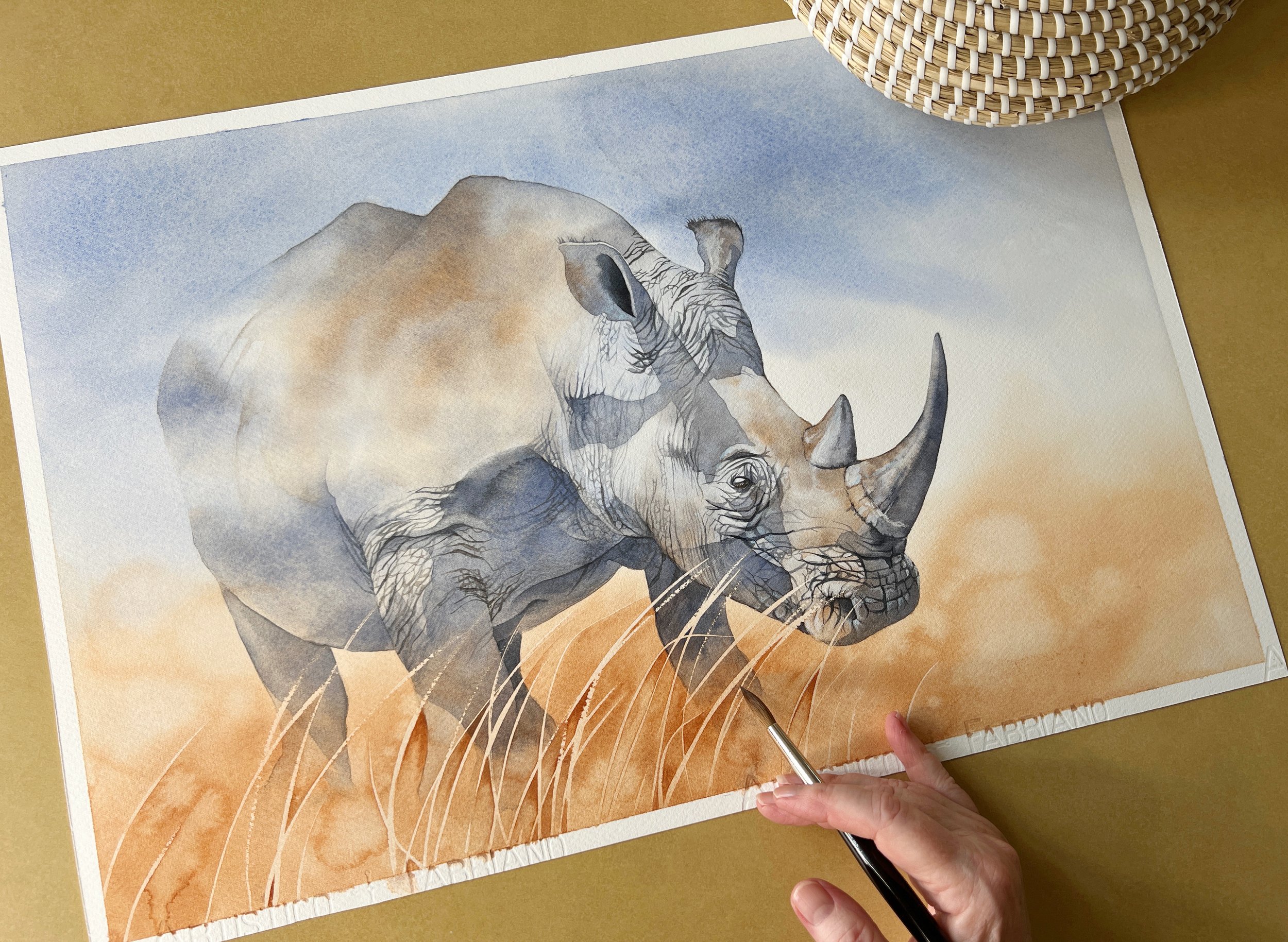
Allow one of the complementary colours to dominate- like I've done here with this Rhino painting.
Yellow and Purple
Envision a golden field of sunflowers against a deep purple twilight. This duo of opposite colours evokes a sense of luxury and mystery. The yellow brings joy and light, while the purple adds a touch of sophistication and intrigue, creating a scene that feels both regal and enchanting.


Complementary Colours - Tips for Use
Use complementary colours sparingly to highlight focal points and avoid overwhelming the viewer.
Experiment with different shades and tones of colours opposite to each other to adjust the intensity and create the desired emotional impact.
Utilize this colour scheme to add drama and draw attention to specific elements in your painting.
When mixed together, complementary colours neutralise each other and produce a range of greys. This can be useful for creating subtle shadows and muted areas, adding depth and complexity to your work.
Complementary colours, with their ability to evoke strong emotional responses, can transform your artwork, making it more dynamic and engaging. Embrace the bold, strong contrast and let your paintings burst with life and passion.
Blue background
Using a blue background in your artwork can dramatically enhance the visual impact of complementary colours. Blue, being a primary colour, pairs strikingly with its complementary colour, orange. This combination creates a vibrant and energetic contrast that can draw the viewer's eye and add depth to your composition.
One famous painting that masterfully employs complementary colours with a blue background is Vincent van Gogh's "The Starry Night." In this iconic piece, van Gogh uses a deep blue sky contrasted with vibrant yellow and orange stars and moon. This creates a dynamic, swirling effect that captivates the viewer and highlights the power of complementary colour schemes.
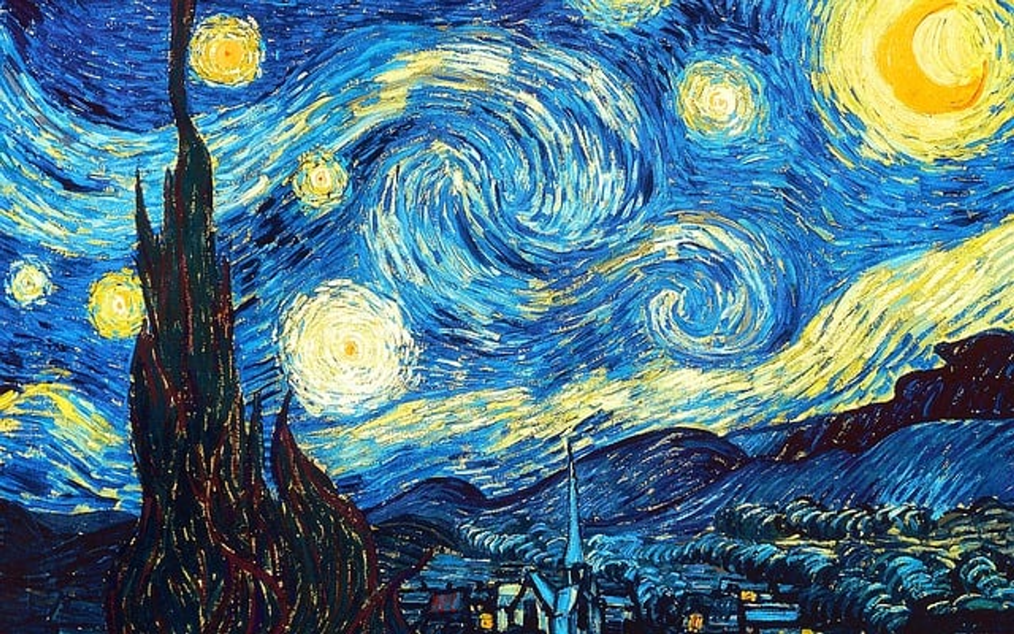
Vincent van Gogh's 'The Starry Night' creates high contrast with his use of yellow/orange and blue.
By mastering complementary colour schemes, you enhance your ability to create dynamic compositions that captivate and energise. This knowledge builds on our foundational understanding of colour theory, empowering you to make deliberate and impactful colour choices in your paintings, that evoke certain emotions, add depth, and grab the viewer's eye.
Remember, opposites attract, and in art, they create magic.
Happy painting!