Exploring Composition in Paintings
Tips for Floral Paintings
Have you ever finished a floral painting, only to feel disappointed despite the colours and technique being spot on? Often, it’s not the painting itself but the composition that’s lacking.
Good composition is more than just placing visual elements on a canvas - it’s about creating balance, depth, and flow to guide the viewer's attention toward the focal point. In my latest rose watercolour, I carefully arranged the composition to highlight the beauty of the flowers, using techniques like the rule of thirds, overlapping, and diagonal placement. In this post, I’ll show you how thoughtful composition can transform visual components, like two roses, into a dynamic and compelling piece of art.
Understanding Floral Compositions
Some floral compositions fall flat because they lack balance and flow. Even when the colours and painting techniques are beautiful, if the elements aren’t arranged thoughtfully, the painting can feel static or disconnected.
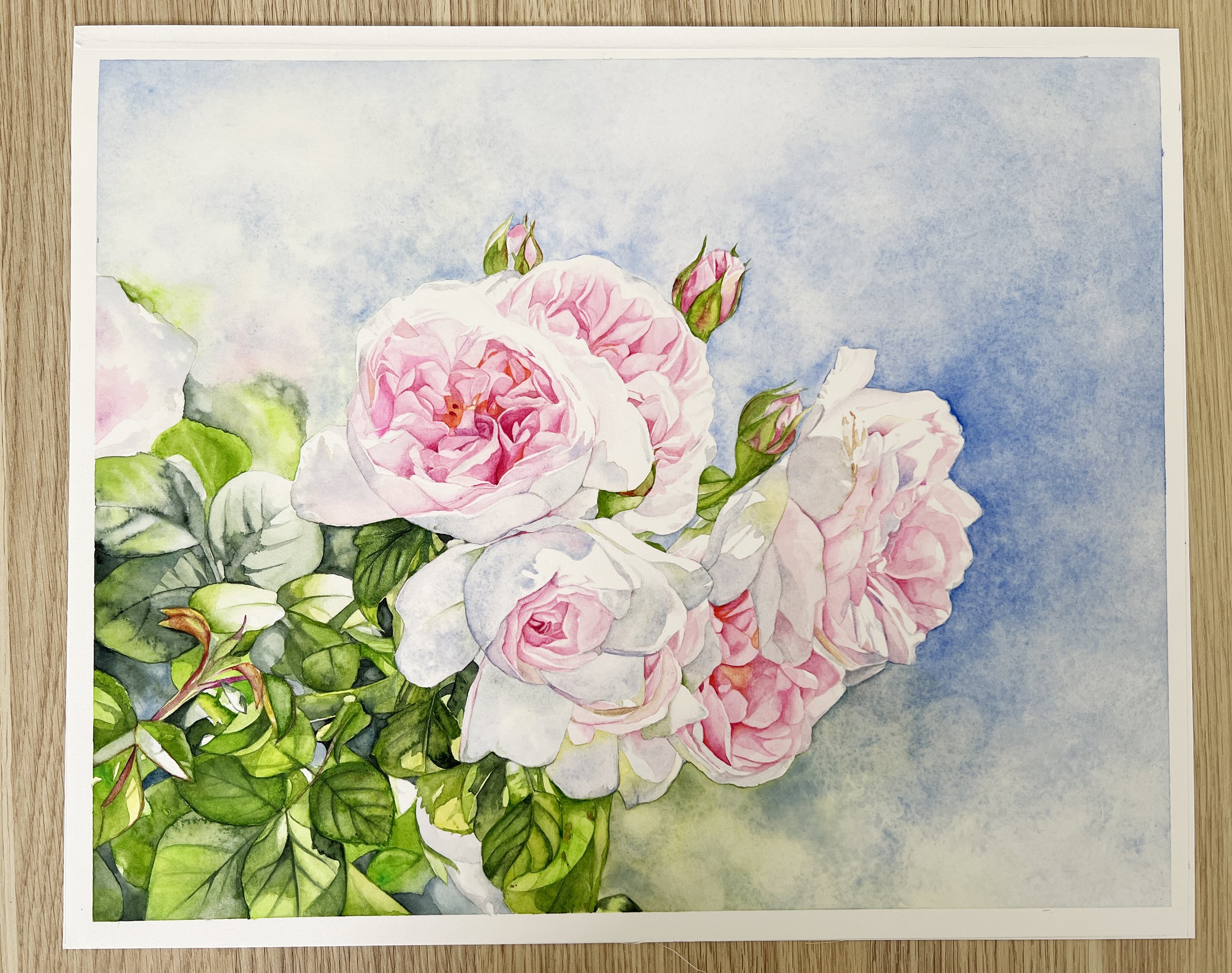
Take this painting below as an example. I painted this about ten years ago. While the colours are vibrant and the details of the roses are well-executed, the composition could be improved to create a more dynamic and engaging piece. Let’s break down some of the areas where the composition falls short and explore how thoughtful adjustments could enhance the overall balance and flow.
An early painting of mine. I didn't give much thought to the compositional elements when I painted this.
While the colours and details in this rose painting are lovely, the composition could definitely be improved to make it more dynamic and engaging. The roses are bunched up in the centre with no clear point of interest, which leaves the background on the right side feeling a bit empty and disconnected. If I shifted the roses slightly off-centre, following the rule of thirds, it would bring a better sense of balance and feel more natural.
Another thing to consider is the foliage in the lower left corner. It’s pretty dense at the moment, and breaking it up would add more variety. Right now, the foliage and the cluster of roses are about the same size, which makes the composition feel a bit repetitive and static. By varying the sizes of these elements, I could introduce more contrast and make the whole painting feel more dynamic and balanced. Breaking up the foliage would also create better flow, helping guide the viewer’s eye more naturally across the piece.
Rule of Thirds
You’ve probably heard of the rule of thirds - it’s a common compositional guideline that divides your canvas into a grid of nine equal parts, with two horizontal and two vertical lines. You might’ve noticed this grid when using the camera on your phone. The idea is to place your key elements along these lines or at their intersections to create a more balanced, engaging composition.
In this painting, I applied that by positioning the main subject (the focal rose) slightly off-centre and placing the second rose along the left third. This gives the composition a more natural feel and helps guide the viewer’s eye through the painting.
The horizontal and vertical lines of the rule of thirds help to arrange elements for a well composed painting.
Create Depth by Overlapping Elements
When painting two flowers, it’s a good idea to overlap them slightly. This simple technique adds a sense of depth and helps guide the viewer’s attention through the composition. The front flower naturally becomes the main attraction while the one behind adds context and layers, making the design elements feel more cohesive and dynamic. Overlapping also helps create tension, as the viewer’s eye is drawn to where the flowers intersect, adding energy to the piece. It’s an easy way to introduce dimension and tension while keeping your composition visually interesting without feeling too busy.
Diagonal Line
In this rose painting, I chose to angle the flowers diagonally across the paper, which brings a sense of movement to the composition. Diagonal lines are a powerful tool in composition because they naturally lead the viewer's attention through the artwork, creating a more engaging and dynamic flow. This approach helps avoid a static feel, giving the painting a more lively and interesting structure.
Create movement by placing the flowers on an angle to one another.
Negative Space and Background Decisions
The negative space, or the background shapes around the roses, plays an important role in the overall composition. These empty areas help define the edges of the flowers and give them more visual impact. By paying attention to the contours formed between the petals and the background, I was able to add balance and structure to the design. The soft, subtle shapes in the background also help the flowers stand out without competing for attention, keeping the composition harmonious and uncluttered.
The white area is the positive space where the roses sit and the negative spaces are the shapes formed by the background.
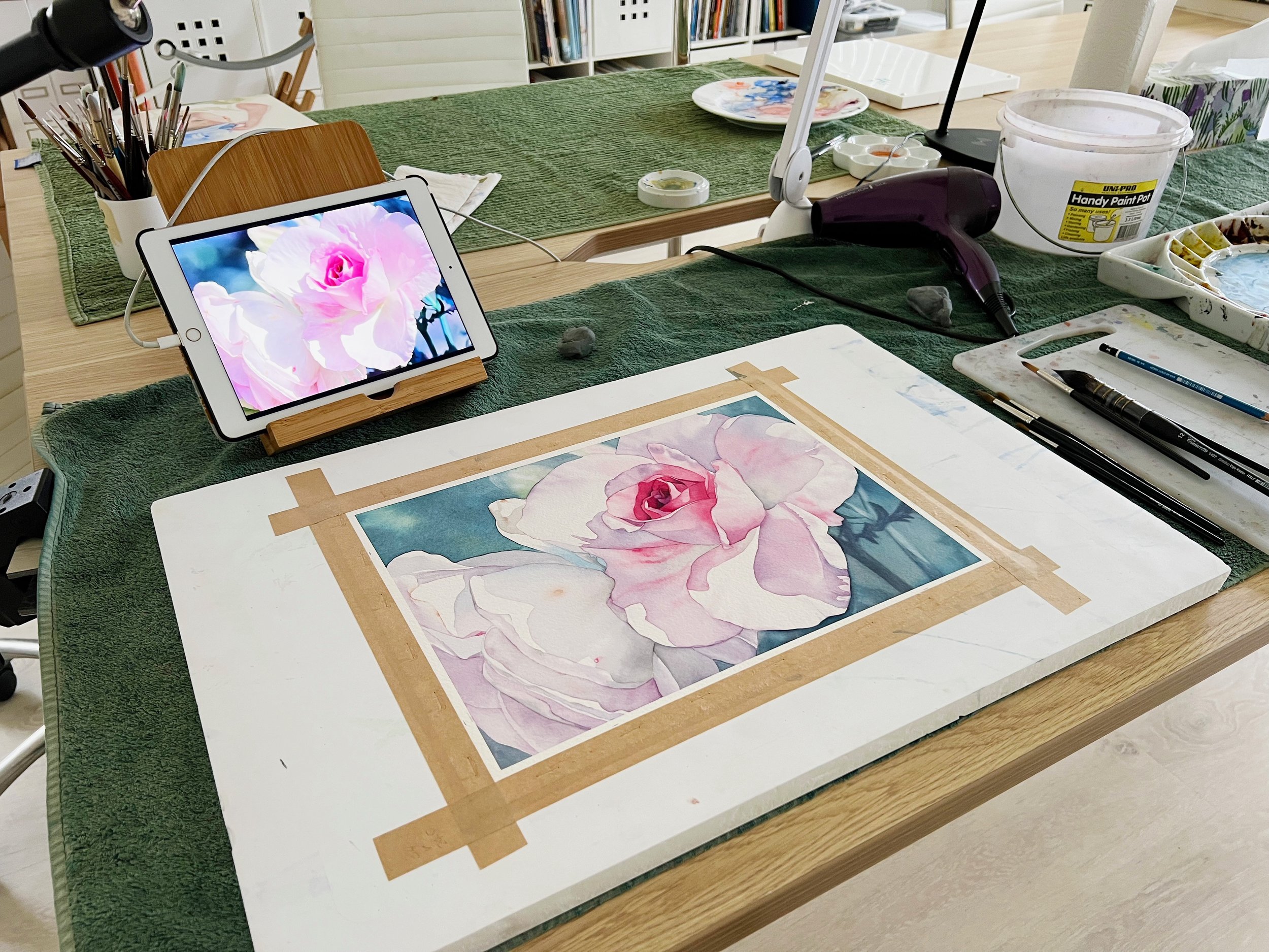
I decided to paint a soft blue-grey background instead of green to create an analogous colour scheme. By pairing the soft pinks of the roses with gentle blues, which sit close together on the colour wheel, the composition gains a harmonious, calming feel. This choice not only enhances the sense of balance but also keeps the focus on the flowers, allowing them to stand out without overwhelming the viewer. I painted the background wet-on-wet to create an atmospheric perspective, giving it a soft, distant look that keeps the attention focused on the roses.
Main Focal Point
The focal point of this painting is the centre of the main rose, which I positioned slightly off-centre to follow the rule of thirds and create a balanced composition. When planning a centre of interest, it's crucial to think about where you want the viewer’s eyes to rest first and where the strongest contrasts will be.
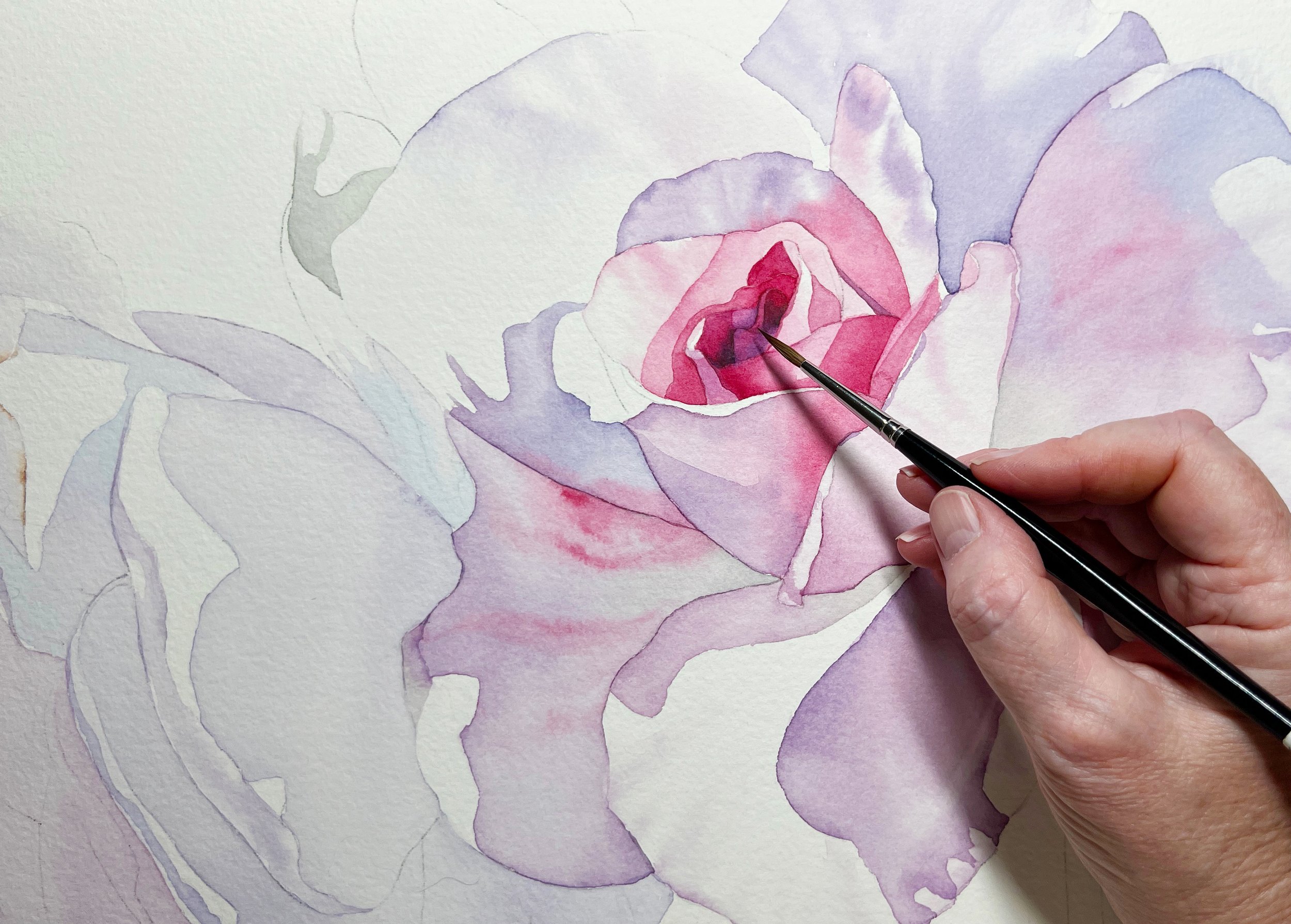
To draw attention to this area, I used my darkest values and applied Ruby Red straight from the tube for a bold pop of colour. For the deepest shadows, I mixed Ruby Red with Phthalo Blue, creating a rich, dark tone that makes the focal rose stand out. While I used wet paper for the outer petals to achieve soft, blended edges, I worked on dry paper in the focal area. This allowed me to create crisp, defined edges that naturally draw the viewer’s gaze.
I also built up several layers in this area to add high contrast, whereas on the outer petals I wanted light values so I kept it to just one or two washes. By concentrating my efforts here, I was able to give the key element a sense of depth and intensity that contrasts beautifully with the softer surrounding petals.
The centre of the rose is the main point of interest so the darkest colours are painted there.
Create Unity with Colour
A limited palette is one of the most effective ways to create visual harmony and cohesion in a painting. For this piece, I chose just four Schmincke colours: Ruby Red, Phthalo Blue, Transparent Sienna, and Indian Yellow. Using a limited selection of colours simplifies the choices I need to make, allowing me to focus more on composition and values without getting distracted by a wide array of pigments.
By mixing these core colours in various ways, I was able to create a harmonious range of tones that feel naturally unified. This approach also helps ensure that the colours throughout the painting work well together, reinforcing a sense of balance and unity. Simplifying the colour palette allows the roses to take centre stage without any competing hues, giving the painting a cohesive and calming feel.
As I mentioned, to enhance this harmony, I chose a soft blue-grey background rather than green, crafting an analogous colour scheme with soft pinks and blues. By keeping the colours closely related on the colour wheel, the composition gains a natural unity that feels both cohesive and peaceful.
Final Thoughts
Thoughtful composition transforms a simple floral painting into a balanced, engaging piece of art. By considering elements like focal points, colour harmony, negative space, and depth, you create a painting that not only captures beauty but also draws the viewer into a cohesive visual experience. I hope these tips inspire you to approach your own floral compositions with a fresh perspective. Remember, it’s these small adjustments that often make the biggest impact. Take the time to experiment with your compositions, and see how these techniques can bring your artwork to life!
If you are interested in learning to paint in watercolour, I have over 200 online, voiced over watercolour tutorials for all skill levels or join me on Skillshare and get a 1 month free trial.

