How to Make Grey Watercolour: Mastering the Art of Mixing Greys
Exploring Colour Combinations and Techniques for Stunning Results

A grey mixed from Burnt Sienna and Ultramarine Blue.
Creating beautiful grey tones in watercolour paintings can add depth, shadows, and subtle nuances to your artwork. In this guide, we'll explore how to mix grey watercolour using various techniques and colour combinations. Whether you're looking to mix warm or cool greys, my tips will help you achieve stunning results.
Basic Principles of Mixing Greys
Understanding Greys
Grey is a versatile and neutral colour that plays a crucial role in watercolour painting. Mixing complementary colours can result in intense colours and vibrant greys, adding depth and variations to your artwork. Its unique ability to bridge other colours and create balance makes it an essential part of an artist’s palette. Understanding the nuances of grey involves recognising its temperature variations and the methods used to create different shades.

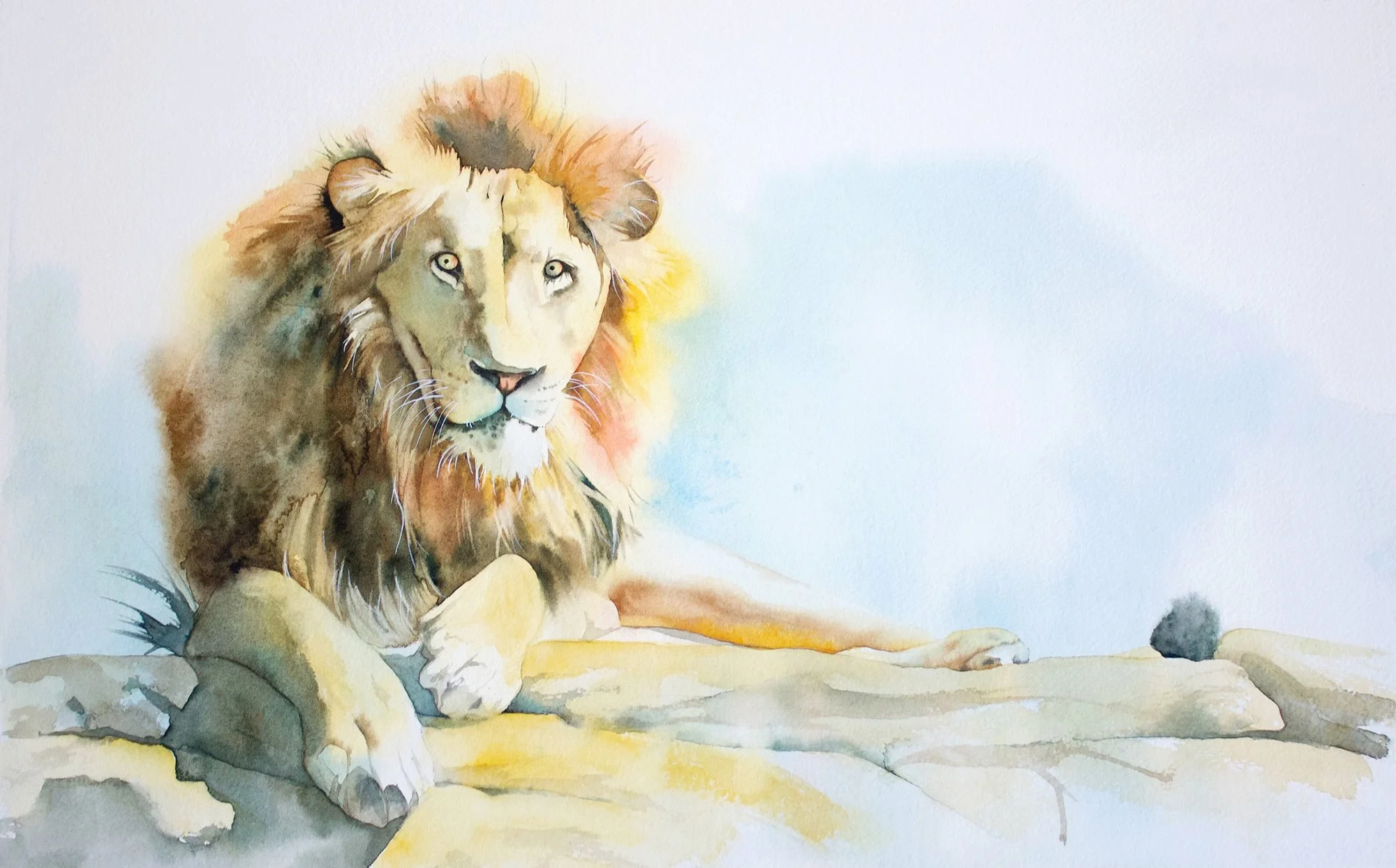
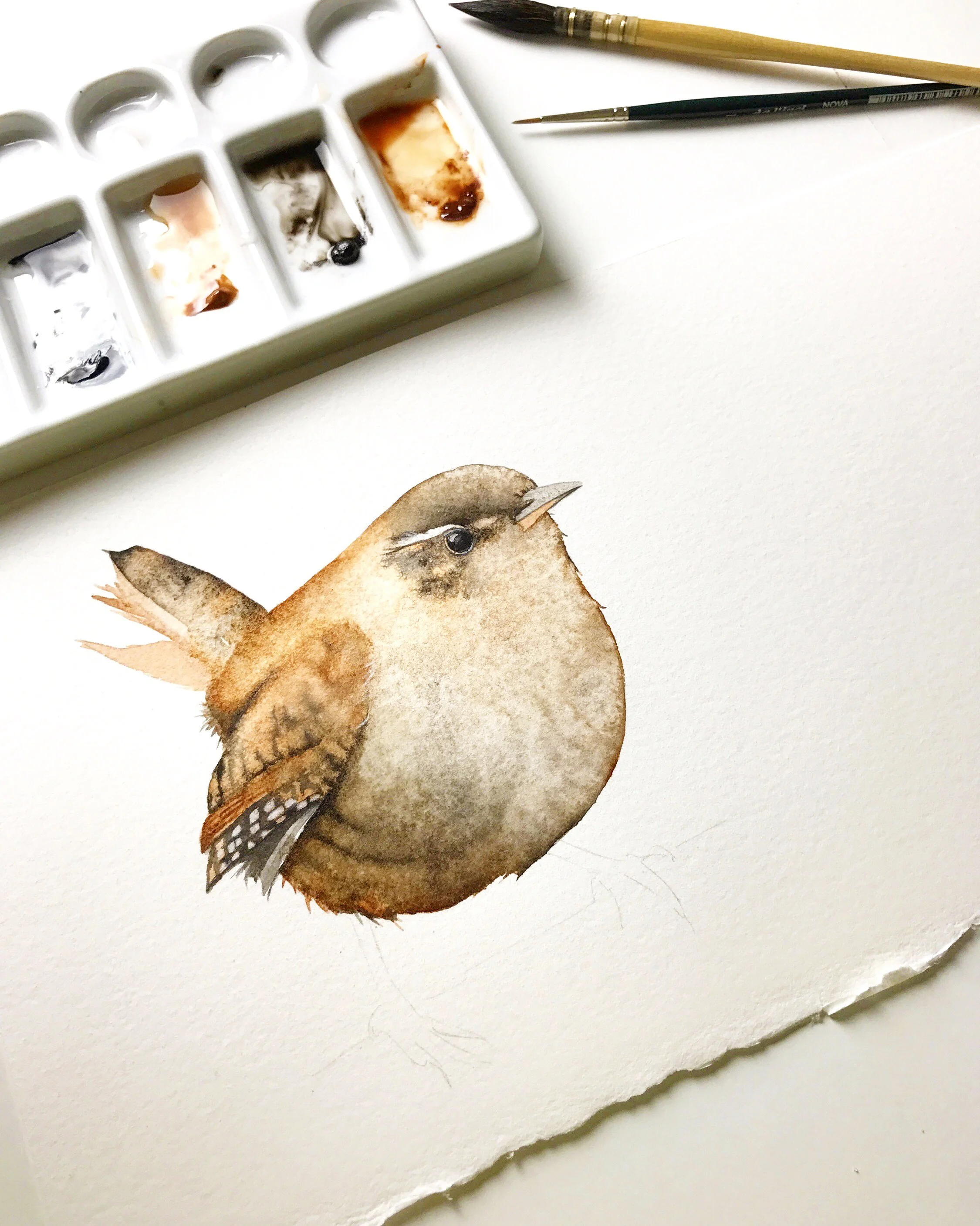
I used Burnt Sienna and Ultramarine Blue together to mix greys for this rhino painting.
Temperature of Greys
Warm greys have a hint of red, orange, or yellow, while cool greys have undertones of blue, green, or purple. The temperature of grey can affect the mood and depth of your painting. When you mix your own greys, you can adjust the temperature of the grey by selecting the colours and adjusting the ratio in which you mix them.
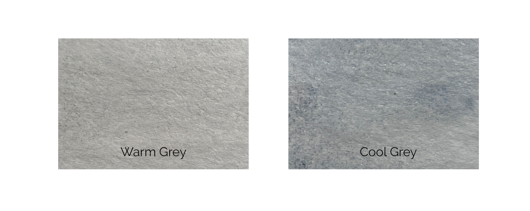
I mixed these greys using French Ultramarine and Burnt Sienna. To adjust the temperature, I added more Burnt Sienna to the warm grey and more French Ultramarine to the cool grey.
Understanding the temperature of the colour grey is crucial in painting as it directly influences the mood, atmosphere, and overall aesthetic of the artwork.
The temperature of greys can evoke specific emotions and set the tone of the painting. Warm greys, with hints of red, orange, or yellow, often create a sense of warmth, intimacy, and comfort.
In contrast, cool greys, with undertones of blue, green, or purple, evoke a sense of coolness, distance, or tranquility.
Depth and Dimension:
The temperature of greys also plays a crucial role in creating depth and dimension within a painting. Warm greys tend to advance towards the viewer, while cool greys recede into the background. By strategically using warm and cool greys, you can manipulate spatial relationships within your composition, enhancing the illusion of depth and perspective.
For example, employing warm greys for foreground elements and progressively cooler greys for distant objects can create a sense of atmospheric perspective, where objects appear to fade into the distance, mimicking the natural effects of haze or fog.
Cezanne's Mont Sainte-Victoire 1887 - demonstrates his use of cool greys for the mountain and warmer greys for the foreground trees and rocks. This makes the mountain appear distant and the foreground elements more prominent, thus enhancing the painting's spatial depth.
Harmonising Colour Schemes:
Understanding the temperature of greys allows you to harmonise your colour schemes effectively. By selecting greys that complement the predominant hues in your paintings, you can achieve visual cohesion and balance. Warm greys can harmonise with warm, earthy tones, while cool greys can complement cool, watery blues or greens.
Greys can act as mediators between contrasting colours, softening harsh transitions and creating a sense of unity within the painting. This ability to bridge different colours and create harmonious relationships underscores the importance of greys in achieving visual balance and harmony.
Colours to Use for Mixing Greys
Mix Complementary colours
Mixing complementary colours often results in a beautiful, balanced grey because the opposing pigments neutralise each other.
Red and Green: Try mixing Permanent Alizarin Crimson PR206 (a cool red) with Winsor Green blue shade PG7 (a cool green) for a rich, neutral grey. Adjust the proportions to make the grey warmer (more red) or cooler (more green).
Permanent Alizarin Crimson PR206 (a cool red) mixed with Winsor Green blue shade PG7
Blue and Orange: Combine Ultramarine Blue PB29 (a warm blue) with Burnt Sienna PR101 (a warm orange-brown) to create a variety of warm to neutral greys.

Ultramarine Blue PB29 with Burnt Sienna PR101
Yellow and purple: Mix Winsor Yellow PY154 with Winsor Violet PV23 (a strong, cool purple) for a range of warm to cool greys.

Winsor Yellow PY154 with Winsor Violet PV23
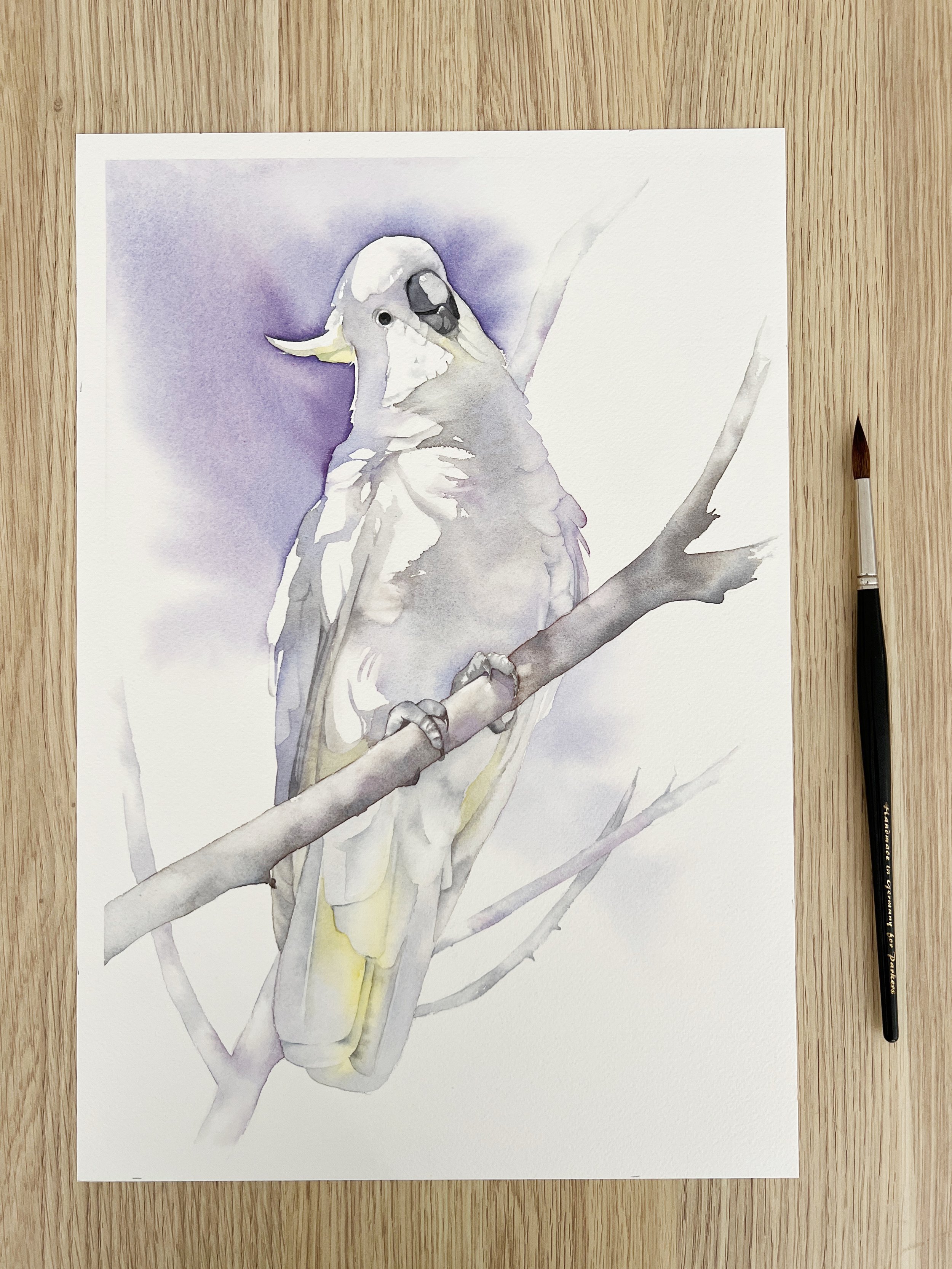
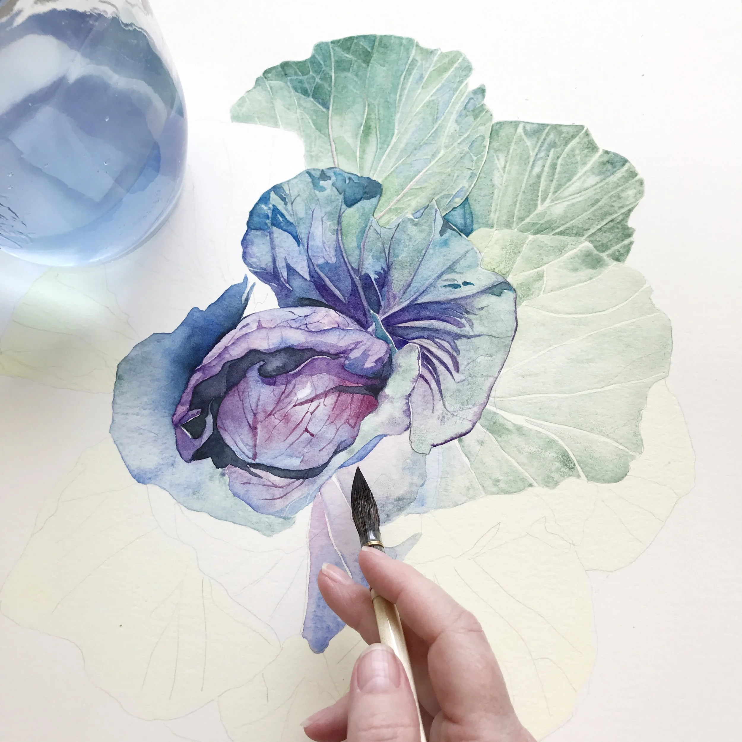
I mixed two complementary colours to make the grey for this Cockatoo painting - Schmincke's Cobalt Blue Light PB28 and Transparent Sienna Pr101. The dark gray on the beak was a darker mix of these two pigments.
Earth Tones: Burnt Sienna
Earth tones can also be mixed to create natural-looking greys.
Burnt Umber PBr7 - PY42 - PR101 and Ultramarine Blue PB29: This combination produces a lovely neutral to cool grey, excellent for shadow areas and natural scenes.

Burnt Umber PBr7 - PY42 - PR101 and Ultramarine Blue PB29
Raw Sienna PBr7 PY43 and Payne’s Grey PBk6 PB15:6: Mixing these creates a muted grey that can be adjusted by adding more of either colour.

Raw Sienna PBr7 PY43 and Payne’s Gray PBk6 PB15:6
Pre-mixed Colours
Pre-mixed grey watercolours are convenient and ensure consistency in your artwork. They save time and maintain uniformity across different pieces, making them ideal for beginners or fast-paced projects. However, they restrict creative flexibility and the ability to control subtle variations and undertones. Depending solely on pre-mixed greys can be problematic if a specific shade is discontinued or unavailable. Personally, I prefer mixing my own greys to adjust their temperature. I enjoy the process of seeing individual colours separate on wet paper, creating unique effects that wouldn't be possible with pre-mixed greys.
Neutral Tint: Winsor & Newton's Neutral Tint is a versatile and essential colour in many artists' palettes. It is designed to create a balanced, neutral grey that can be used to modify other colours or to create shadows without altering the hue of the original colours.

Neutral Tint - Start with small amounts when mixing with other colours. Gradually add more Neutral Tint to control the resulting shade.
Payne’s Grey: A popular choice for its rich, dark, and slightly cool hue. Payne's Grey offers a more subtle alternative to black, enabling rich, deep shadows and atmospheric effects without overpowering other colours. Its excellent blending capabilities make it a staple in many artists' palettes. When sourced from reputable brands - Payne's Grey ensures consistent performance and colour stability.

Paynes Grey
I used Schmincke's Paynes Grey to paint the background on this painting.
Davy's Gray: Named after Henry Davy, an artist known for his landscapes and genre scenes in the late 18th and early 19th centuries, Davy's Gray has been a part of artists' palettes for centuries. It is a muted, neutral grey colour used in painting, characterised by its subtle, earthy tones.

Davy's Gray
Tips for Mixing Greys in watercolour
Mixing Grey on a palette
Start Light: Begin with a lighter base colour and gradually darken it by adding small amounts of the complementary colour or other pigments.
Use a Clean Palette: Keep your palette clean to avoid unintended colour contamination.
Mix in Small Quantities: Start with small amounts of paint to maintain control over the mixing process and prevent waste.
Test on Scrap Paper: Always test your mixed greys on scrap watercolour paper to assess the colour accuracy and adjust as needed.
Keep Notes: Record the ratios and combinations of colours that produce your preferred grey tones for future reference.
Layering Colours to Mix Grey on Dry Paper
Layering or glazing is a technique where you apply one colour, let it dry, and then apply a complementary colour on top. This method gives you control over the final hue and transparency of the grey. In the image below I painted a light wash of Ultramarine Blue on the paper. I let it dry and then I started to wash over some Burnt Sienna.

A dry wash of Ultramarine Blue is painted over with it's complementary colour Burnt Sienna.
Blending Colours Wet on Wet
Wet on wet involves mixing colours directly on the paper while they are still wet. This method can create spontaneous blends and textures, perfect for more dynamic and fluid effects.
Pre-Wet Paper: Begin by wetting the area of the paper where you want to mix the colours. This helps the paint flow and blend more smoothly.
Apply Base Colour: While the paper is still wet, apply the base colour. Use a generous amount of water to keep the colour fluid.
Add Complementary Colour: While the base colour is still wet, introduce the complementary colour. Allow the colours to mingle and blend on the paper.
Manipulate the Flow: Tilt the paper or use a brush to guide the flow of the colours, creating organic blends and transitions.
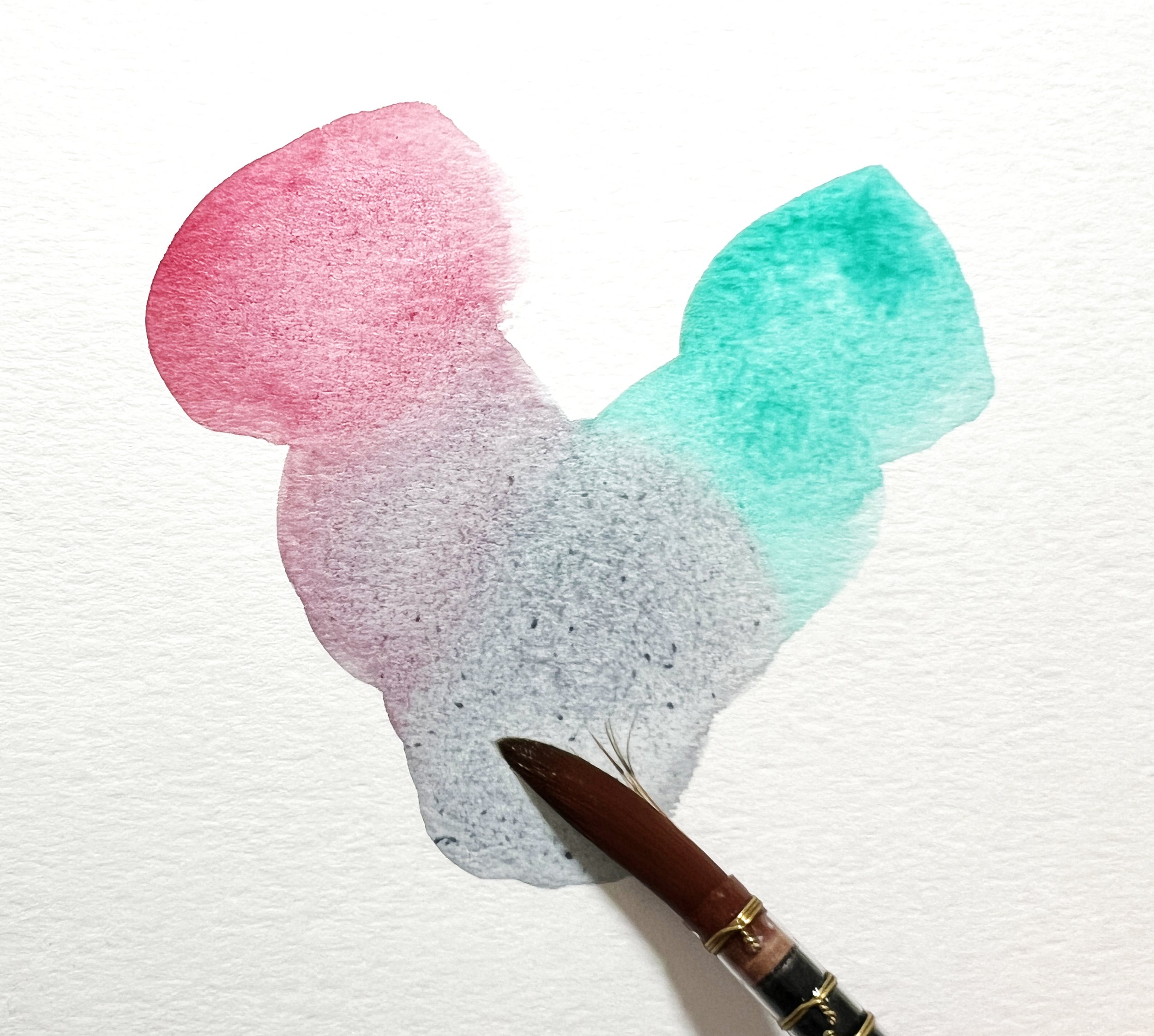
I wet the paper here and I applied a pale wash of Winsor Violet. While the violet was wet I painted on some Winsor Lemon. Then I lifted the paper and let the colours flow together.
Troubleshooting Tips for Mixing Greys
Issue: Muddy Colours
Problem: When mixing greys, the colours become muddy and lose vibrancy.
Solution: Ensure that your palette and brushes are clean before mixing. Muddy colours often result from residual pigments contaminating your mix. Also, try using fresh paint and avoid overmixing, which can dull the colours.
Issue: Inconsistent Grey Tones
Problem: The grey tones are inconsistent across different sections of the painting.
Solution: Mix a large batch of grey on your palette to ensure consistency throughout your artwork. If you're layering, let each layer dry completely before applying the next to avoid unintended blending.
Issue: Unwanted Warm or Cool Undertones
Problem: The grey has an unwanted warm or cool undertone that doesn’t fit with the rest of the painting.
Solution: Adjust the balance of your complementary colours. For instance, if your grey is too warm, add a bit more of a cool colour (like blue). If it’s too cool, add a touch of a warm colour (like red or orange). Always test on scrap paper before applying to your painting.
Issue: Greys Too Dark or Light
Problem: The grey is too dark or too light for the desired effect.
Solution: Adjust the water-to-pigment ratio. To lighten a grey, add more water. To darken it, add more pigment.
Issue: Patchy Washes
Problem: Grey washes appear patchy or uneven when applied.
Solution: Ensure your paper is evenly wet before applying a wash. Use a large, soft brush to apply the wash in smooth, continuous strokes. Work quickly to prevent the paint from drying unevenly.
Issue: Overpowering Greys
Problem: The grey is too dominant and overwhelms other colours in the painting.
Solution: Use a more diluted grey to allow underlying colours to show through. Apply the grey in thinner layers or glazes to build up the desired tone gradually without overpowering other elements.
In mastering the art of mixing greys with watercolour, understanding the principles of temperature, colour combinations, and techniques opens up endless possibilities for enhancing your paintings. Whether you prefer the control of mixing your own greys or the convenience of pre-mixed options, each method offers unique advantages. Experimentation with different pigments and techniques, such as layering and wet-on-wet blending, allows artists to achieve subtle variations in tone and texture that elevate their artwork. Embrace the versatility of greys in watercolour to add depth, atmosphere, and harmony to your artistic creations.