How to Mix Vibrant Violet
The Secret to Perfect Purples
Violet colour - how to make? Mix a cool red with a warm blue.
Violet or purple (whatever you call it) it is one of those tricky colours in watercolour that can either look rich and beautiful… or dull and lifeless. In this post, we’ll look at how to mix vibrant violets using cool reds and a warm blues, and why that combination matters. I’ll also chat about the pros and cons of mixing your own violet versus reaching for a pre-mixed tube.
A Common Mistake When Mixing Violet in Watercolour
We’ve all heard the classic line: “blue and red make violet.” But do they really? Not always - at least not the vibrant violet we might be aiming for.
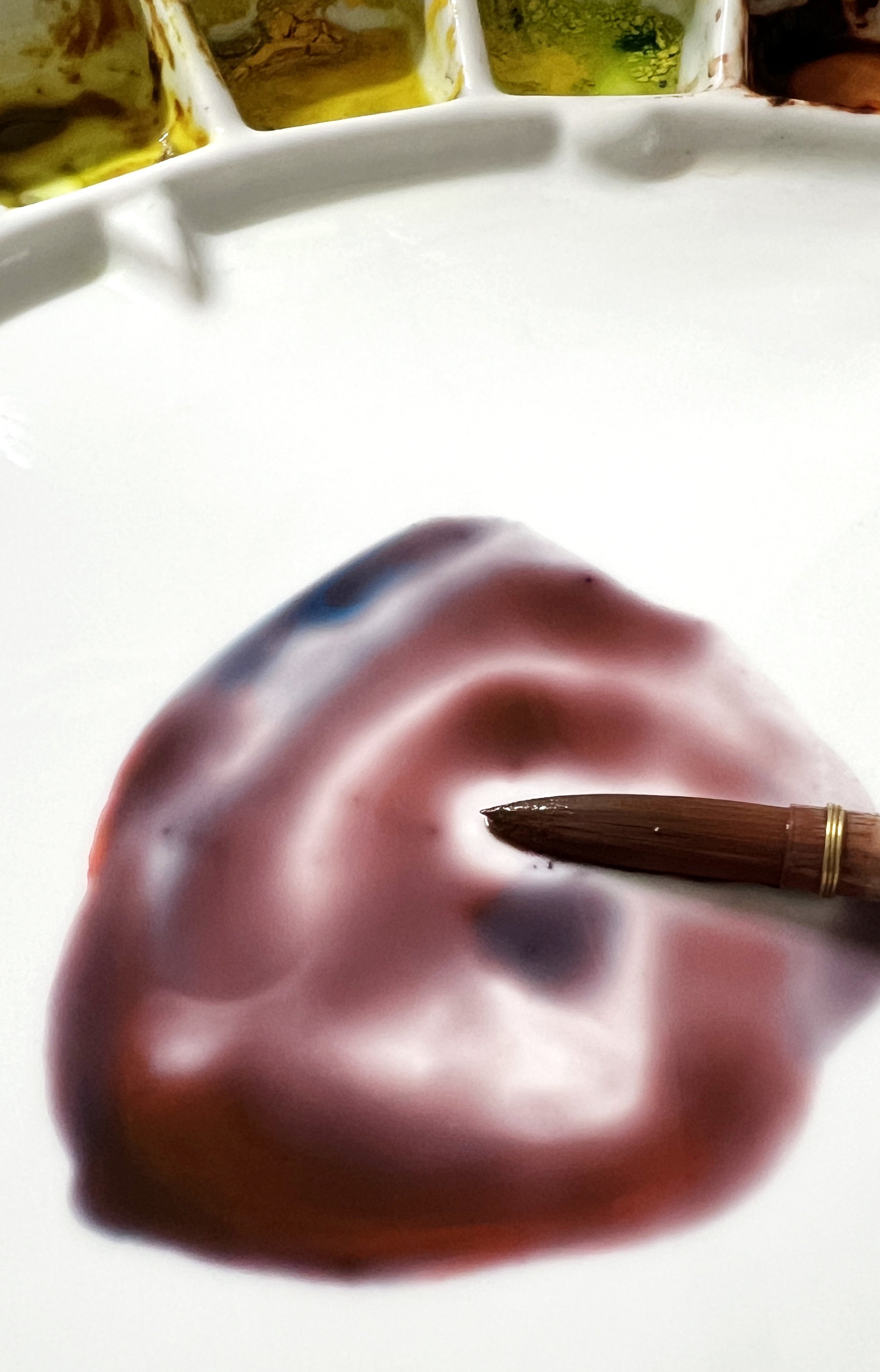
It all comes down to which blue and which red you’re using. I saw a beginner in a Facebook group post a photo of a mix she thought would give her violet. But it turned out dull and muddy - more brown than anything. She’d used a warm red and a cool blue, which is a common mistake. Those colours lean away from violet on the colour wheel, so instead of working together, they cancel each other out.
This blue and red mixture looks more brown than violet because I used a warm red and a cool blue.
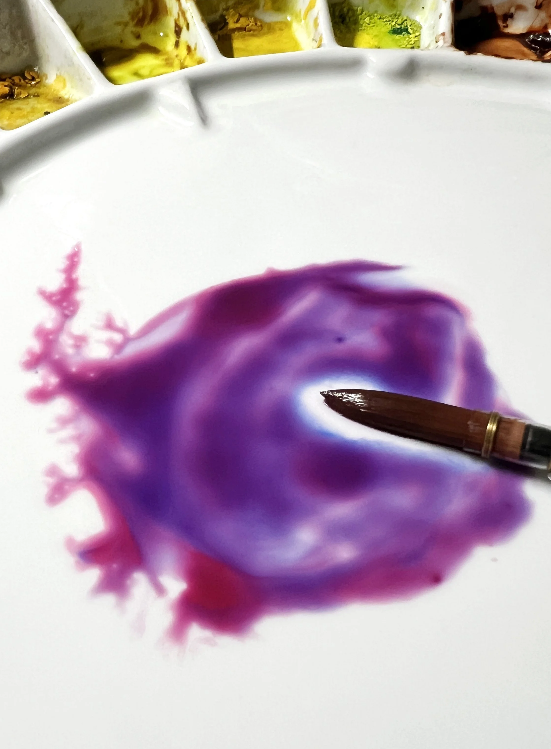
When you're colour mixing- to create violet - use a cool red and a warm blue.
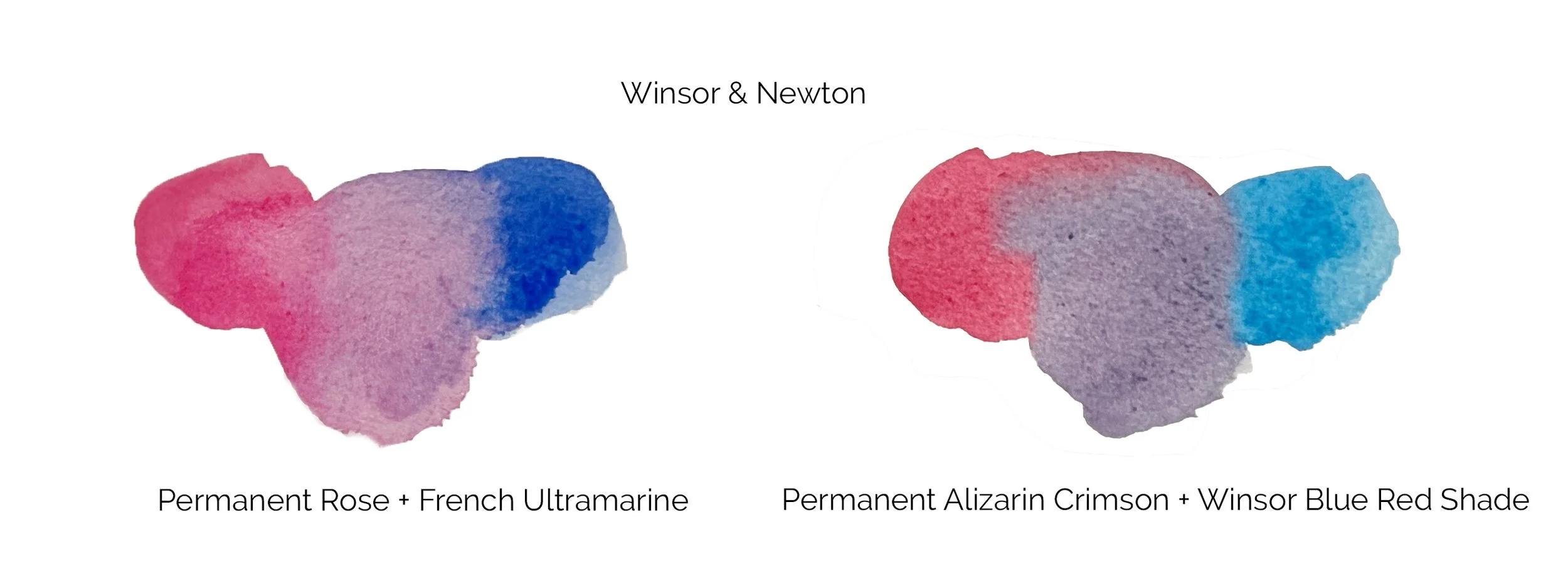
To get a clean, rich violet, you want a cool red (like Permanent Rose) and a warm blue (like French Ultramarine). Both lean towards violet, so when they mix, they create something beautiful - not a dull earthy brown or grey.
Best Cool Reds and Warm Blues for Mixing Violet in Watercolour
If you want vibrant violets, it helps to know which paints to reach for. Here's a list of cool reds and warm blues from a few popular brands to get you mixing like a pro. I've included pigment codes too, so you can compare across brands.
Cool Reds (lean towards violet):
These reds have a bluish undertone, perfect for mixing clean purples.
Daniel Smith:
Quinacridone Rose – PV19
Permanent Alizarin Crimson – PR177
Winsor & Newton:
Permanent Rose – PV19
Permanent Alizarin Crimson – PR206
Schmincke:
Ruby Red – PV19
Madder Red Dark – PV19/PR179
Warm Blues (lean towards violet):
These blues have a reddish undertone and pair beautifully with cool reds.
Daniel Smith:
French Ultramarine – PB29
Cobalt Blue – PB28 (considered a neutral to slightly warm blue - it leans just a touch towards red, which makes it a good option for mixing violets.)
Winsor & Newton:
French Ultramarine – PB29
Winsor Blue (Red Shade) – PB15:1
Schmincke:
French Ultramarine – PB29
Prussian Blue – PB27 (less warm, but still useful for violet mixes)
If you're not sure what temperature your colours are - read this.
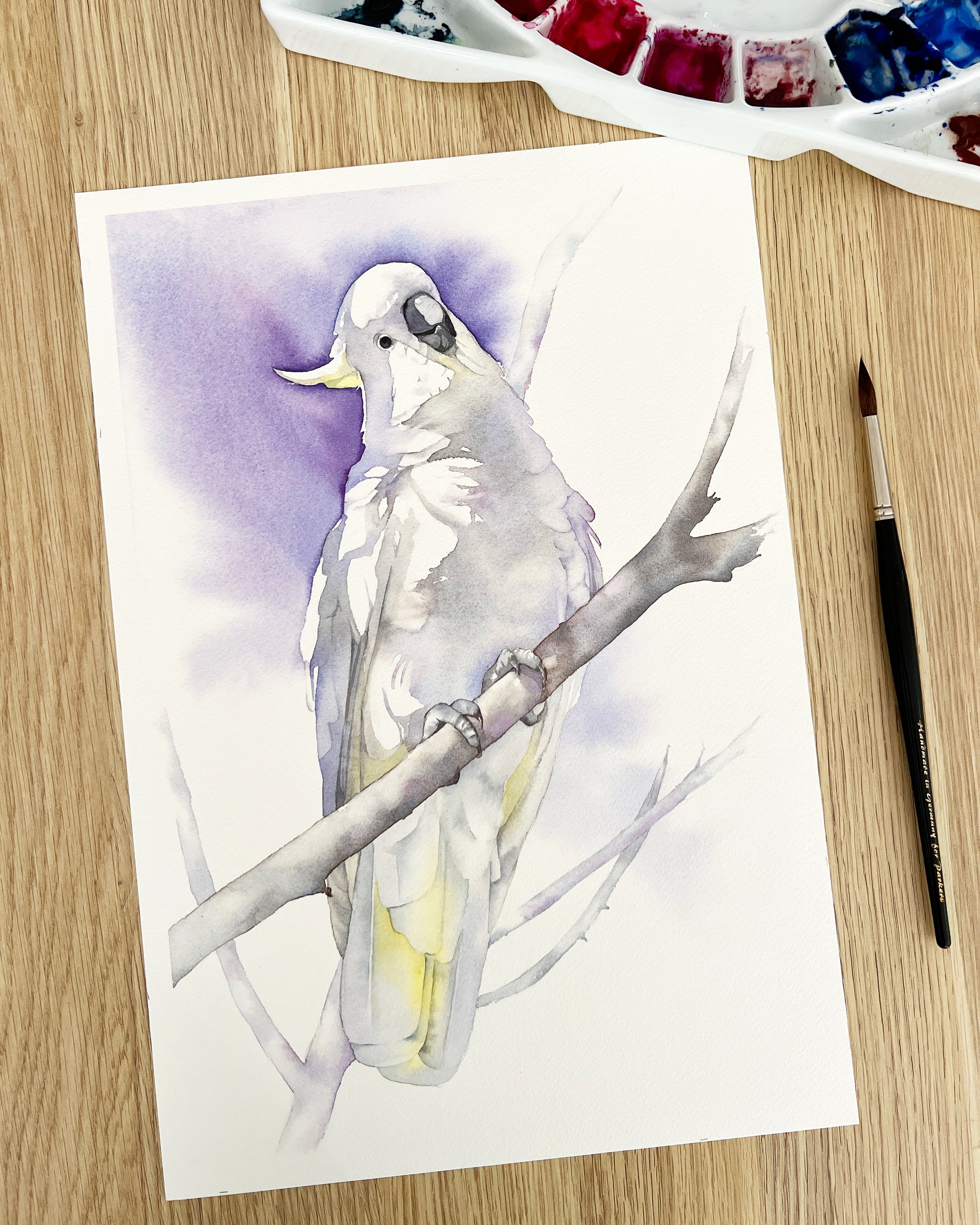
I mixed together Schmincke's Cobalt Blue Light and Ruby Red for the violet on this Cockatoo painting.
Pre-Mixed Violet vs. Custom Mixes: What’s Best?
These days I almost always mix my own violets because it helps me stick to a limited palette, which naturally creates better colour harmony across the whole painting. I also paint wet on wet a lot, and there's something beautiful about watching the pigments separate on the paper when you mix violet yourself - especially with granulating colours like Ultramarine.
Another bonus is control - you can easily warm up or cool down your violet just by adjusting the red-to-blue ratio.
That said, I do keep a premixed violet on hand. They’re super convenient when I want to add a quick pop of colour, especially in looser areas.
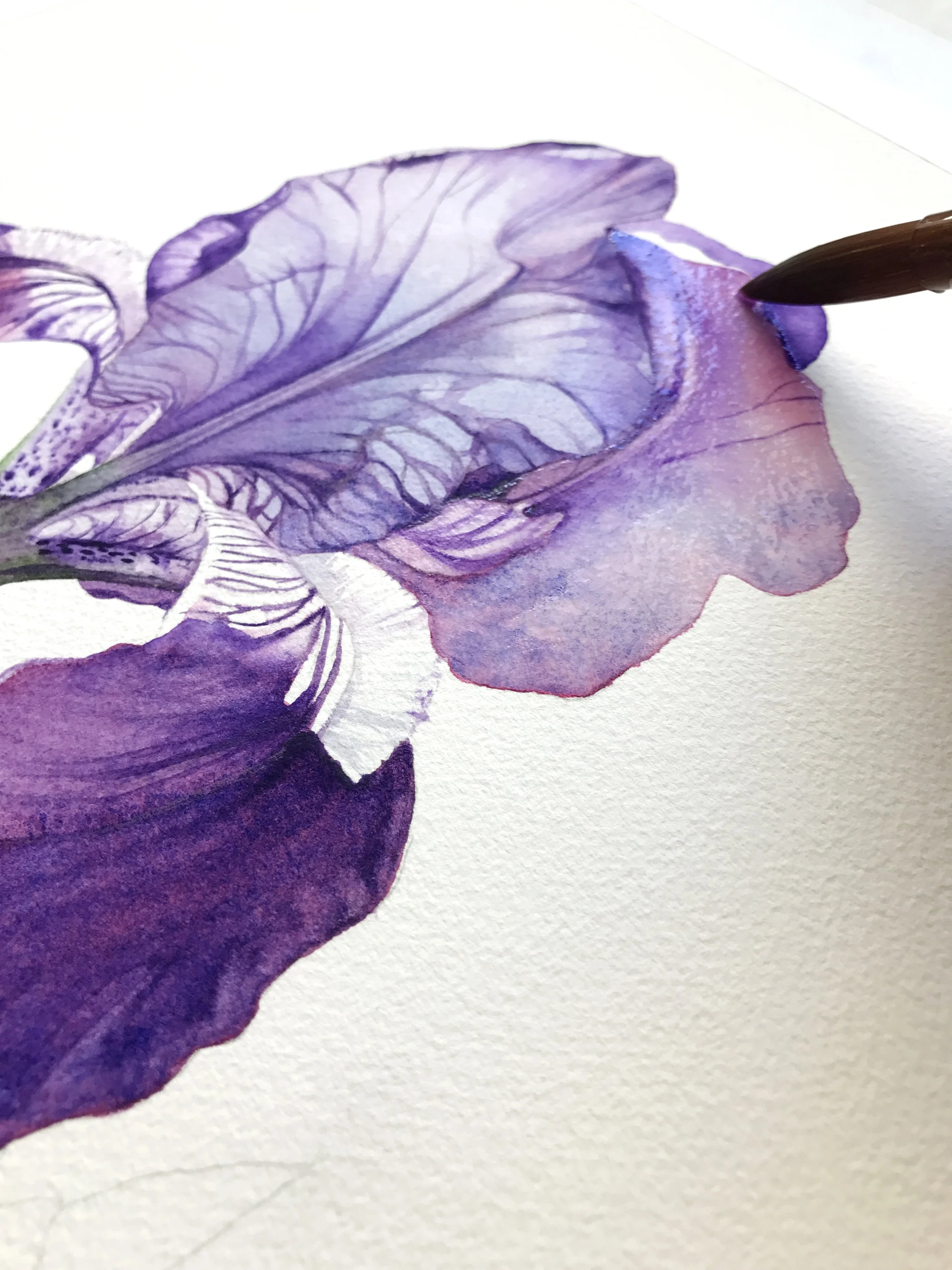
To create the violet I used for these Lisianthus I used a mixture of Permanent Carmine and Ultramarine Blue dark (A.Gallo colours). To create the darker shade on the petals I used more pigment- less water.
With this rabbit painting, instead of mixing red and blue paint I worked a little Winsor Violet into the fur wash to break up the tones and keep it visually interesting.
Sometimes I’ll drop a bit of violet into an unexpected spot - like the early wash on a rabbit’s fur - just to create a bit of interest and subtle contrast. Premixed violets also save time when I need consistency across larger areas or when I’m painting quickly.
A few of my pre mixed favourite violets are:
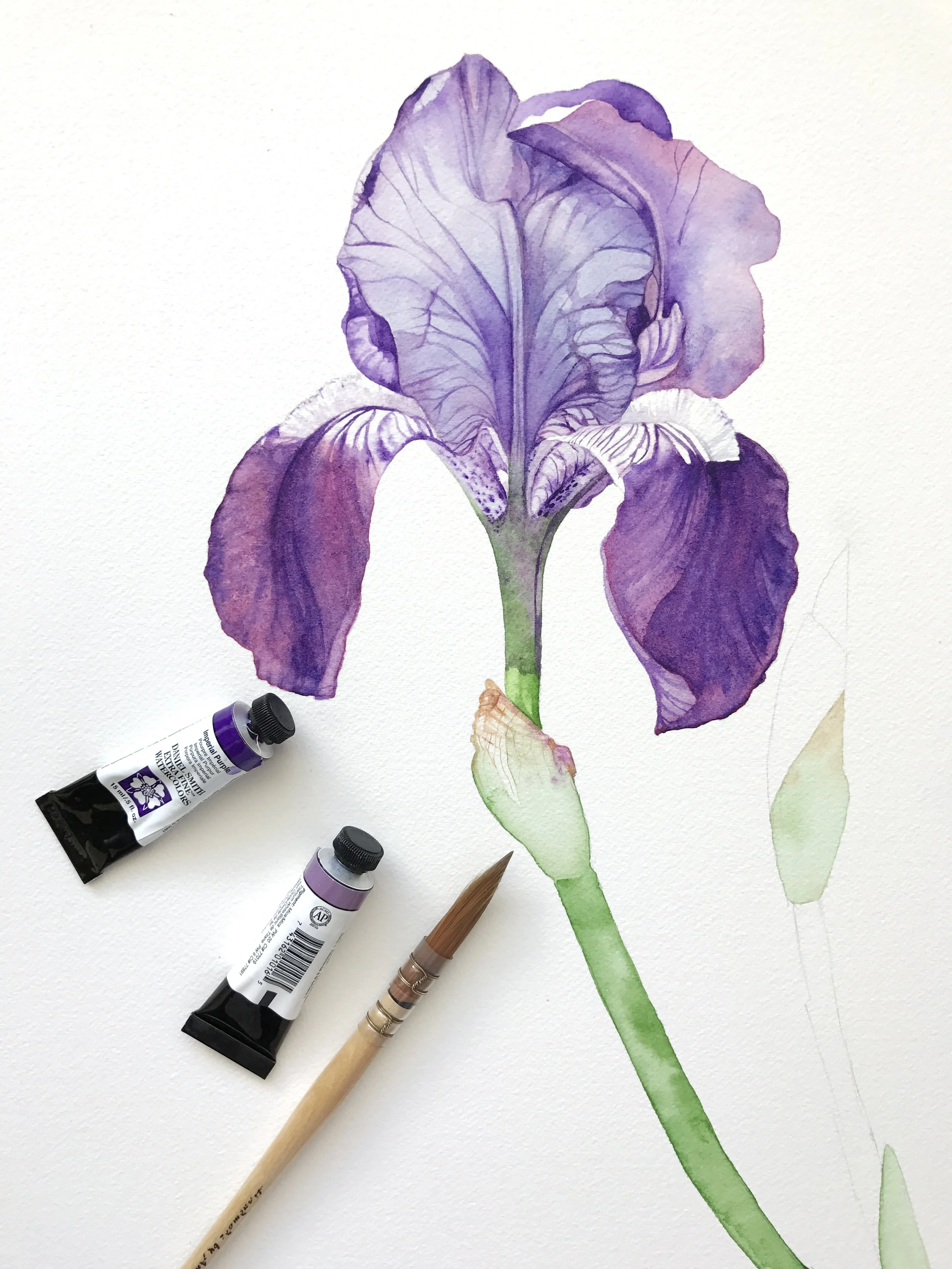
Daniel Smith Imperial Purple – rich and dramatic, with great granulation
Schmincke Violet – smooth and clean, really handy for layering
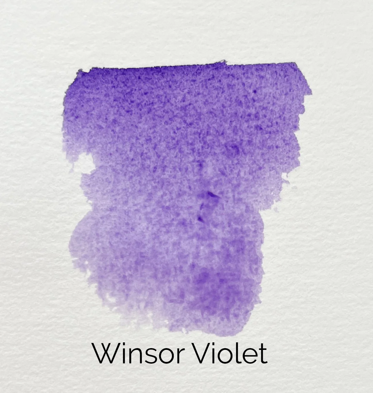
Winsor & Newton Winsor Violet (Dioxazine) – bold and intense, great for deep shadows
The beautiful violet paint here is Daniel Smith's Imperial Purple.
So, what’s best? Honestly, it depends on how you paint. I prefer mixing my own for the flexibility and harmony it gives me, but premixed violets still have their place - especially when I’m painting loose or working fast. Having both options gives you the best of both worlds.
Final Thoughts: Make Violet Work for You
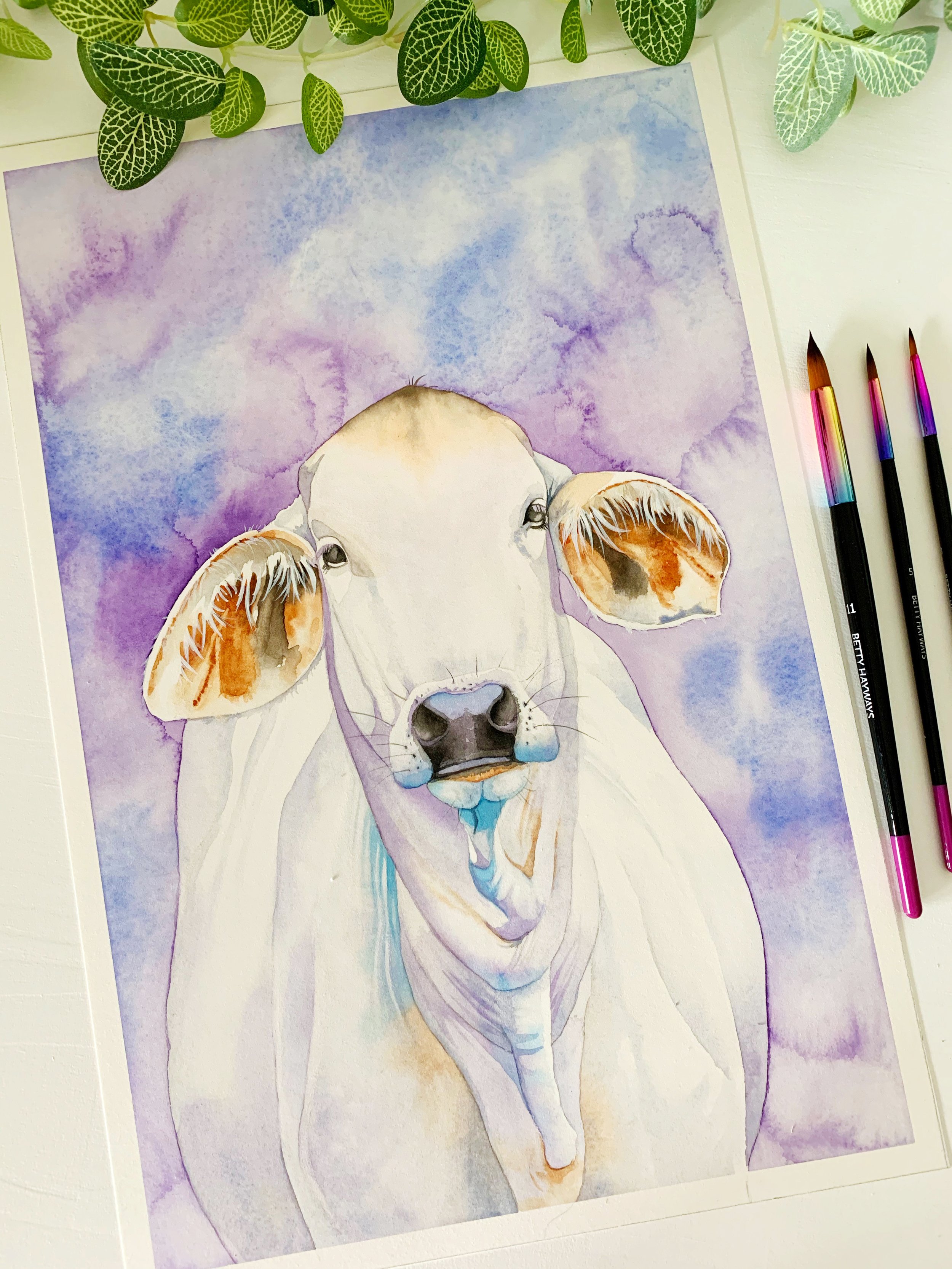
Beautiful Winsor Violet was used for the background of this painting.
There’s no one-size-fits-all approach when it comes to mixing violet in watercolour. The key is understanding your pigments and how they behave together. Whether you’re mixing your own or reaching for a premixed violet, the real magic comes from using it with intention. When you mix colours -try out different combos, play with temperature shifts, and don’t be afraid to drop in a touch of violet where it’s least expected. The more you experiment, the more confident you’ll get at making violet work for your painting style.
If you are interested in learning to paint in watercolour, I have hundreds of online, voiced over watercolour tutorials for all skill levels.
