Mastering Watercolour Greens: Mixing vs. PreMixed Pigments for Stunning Results
Green is a versatile and essential colour in watercolour painting, appearing in everything from the delicate leaves of a botanical painting to the varied shades of green in a lush landscape. As a watercolour artist, you might wonder whether to mix your greens or rely on premixed greens from your palette. This choice can significantly impact your artwork, affecting colour harmony and your personal growth as an artist.
In this blog post, we'll dive into the benefits of mixing your own green watercolour paints versus using premixed green paints. You'll learn about the advantages of custom mixing and the convenience of pre-mixed greens.
Understanding Green

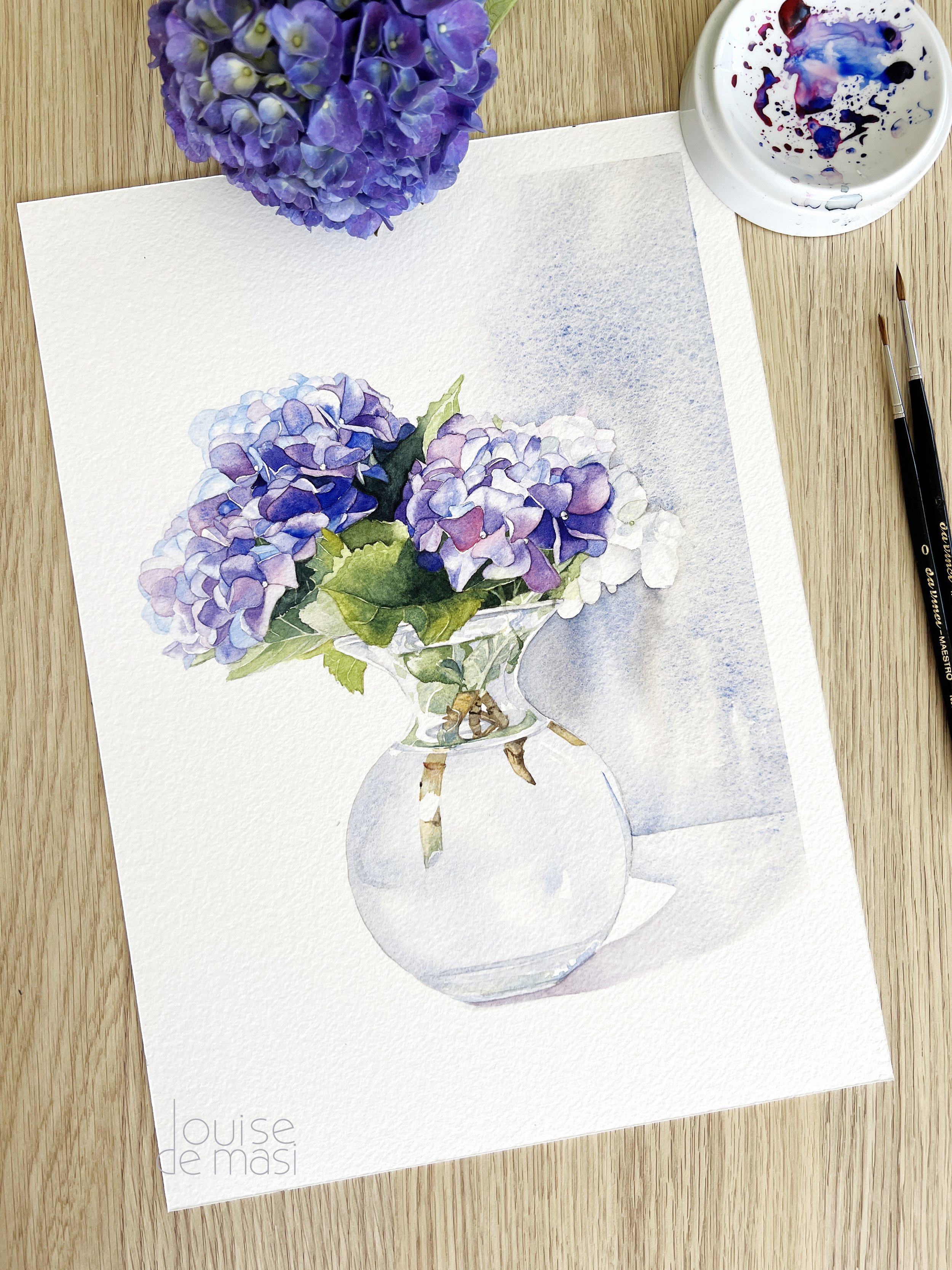
One of my earlier paintings when I used to rely on premixed greens.
Green is a secondary colour made by mixing blue and yellow, but it can be challenging to mix correctly. Greens can easily become too saturated, too dull, or too muddy, and when used incorrectly, they can appear artificial.
Many of my early paintings suffered because of vibrant greens that looked unnatural. Mastering the art of mixing greens is essential for achieving realistic and vibrant results in your watercolour paintings. By experimenting with different blue and yellow combinations and paying attention to the specific needs of your subject, you can create a wide range of beautiful, natural-looking greens.
Why Mix Your Own Greens?
While there are plenty of premixed green options available to buy, mixing your own greens can offer several distinct advantages.
Creativity and Customisation: Mixing your own greens allows you to create a wide range of unique shades tailored to your specific painting needs, giving you greater creative control over your work.
Colour Harmony: Custom-mixed greens can help maintain colour harmony throughout your painting, ensuring that all the colours work together seamlessly for a more cohesive and balanced composition.
Learning and Skill Development: The process of mixing your own greens enhances your understanding of colour theory and improves your overall painting skills. Experimenting with different ratios and combinations will deepen your knowledge of how colours interact.
Versatility: By mixing your own greens, you can adjust the hue, value, and intensity to suit different elements of your painting, from bright, vibrant leaves to muted, shadowy foliage.
Cost-Effective: Mixing your own greens can be more economical, as you can create multiple shades from a limited palette of primary colours, reducing the need to purchase numerous tubes of pre-mixed paint.
Temperature Bias when Mixing Greens
Understanding temperature bias is crucial when mixing greens. Colours can have either a warm or cool bias, which affects the overall temperature of the green you create. Generally, because green is considered a cool colour, mixing a cool blue with a cool yellow will produce a bright and vibrant green. In contrast, mixing a warm blue with a warm yellow will result in a more subdued and dull green.
If you're unsure about the temperature of your colours, check out my blog post that explains how to determine their temperature.
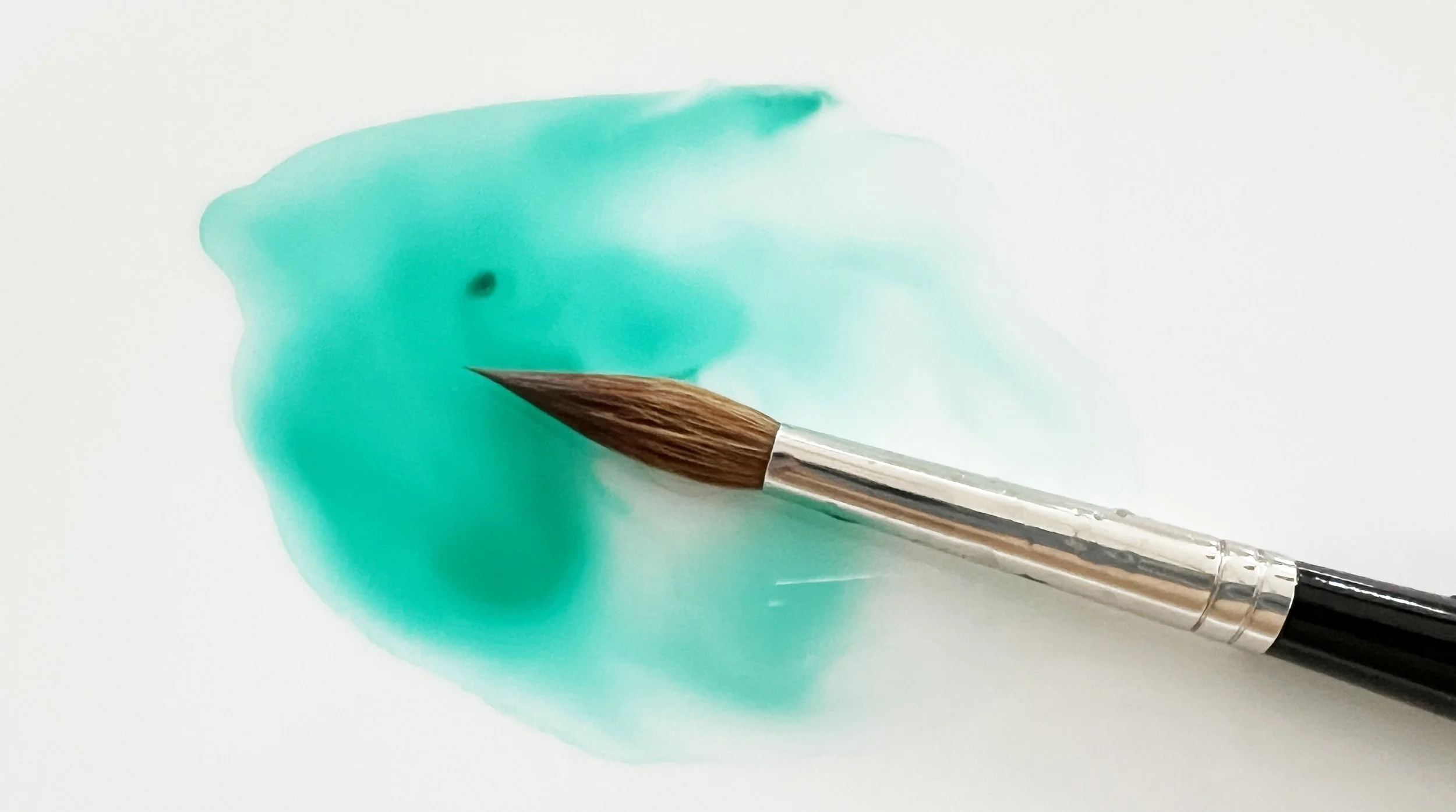
In the image below I mixed two warm colours: Indian Yellow and French Ultramarine together to make a subdued natural looking green. The bright green was mixed from two cool colours: Cadmium Yellow Light and Phthalo Blue.
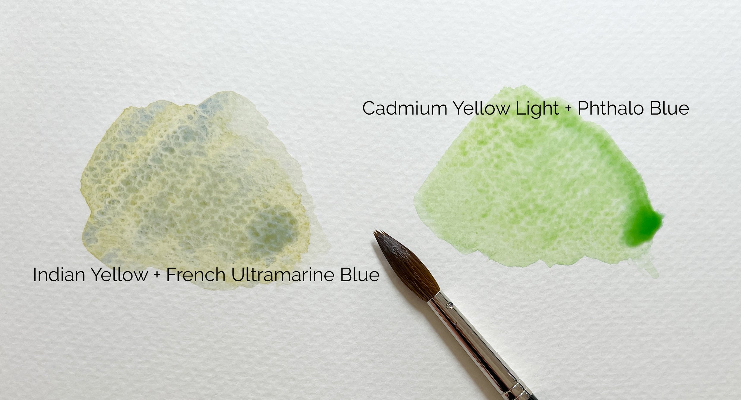
Understanding the temperature of colours and how they affect mixing is important.
Why use Premixed Greens?
Pre-mixed greens offer several benefits that can be particularly appealing, especially for beginners or when convenience is key.
Convenience: Premixed greens save time, allowing you to focus more on painting and less on mixing colours. This can be especially helpful during quick painting sessions or when working on multiple projects.
Consistency and Predictability: Using premixed greens ensures consistent colour throughout your painting. You won't have to worry about matching a custom-mixed shade every time you need more paint, which can be challenging and time-consuming. Premixed greens provide predictable results, giving you confidence in achieving the exact hue you need. This reliability is reassuring, especially for beginners or when you're aiming for a specific colour in your artwork.
Ease of Use: Premixed greens are ready to use straight from the tube, making them ideal for artists who may find colour mixing challenging or who prefer a straightforward approach to their palette.
Range of Hues: Many brands offer a variety of premixed greens, each with its unique characteristics. This allows you to choose the perfect hue for different elements in your painting without having to experiment with mixing.
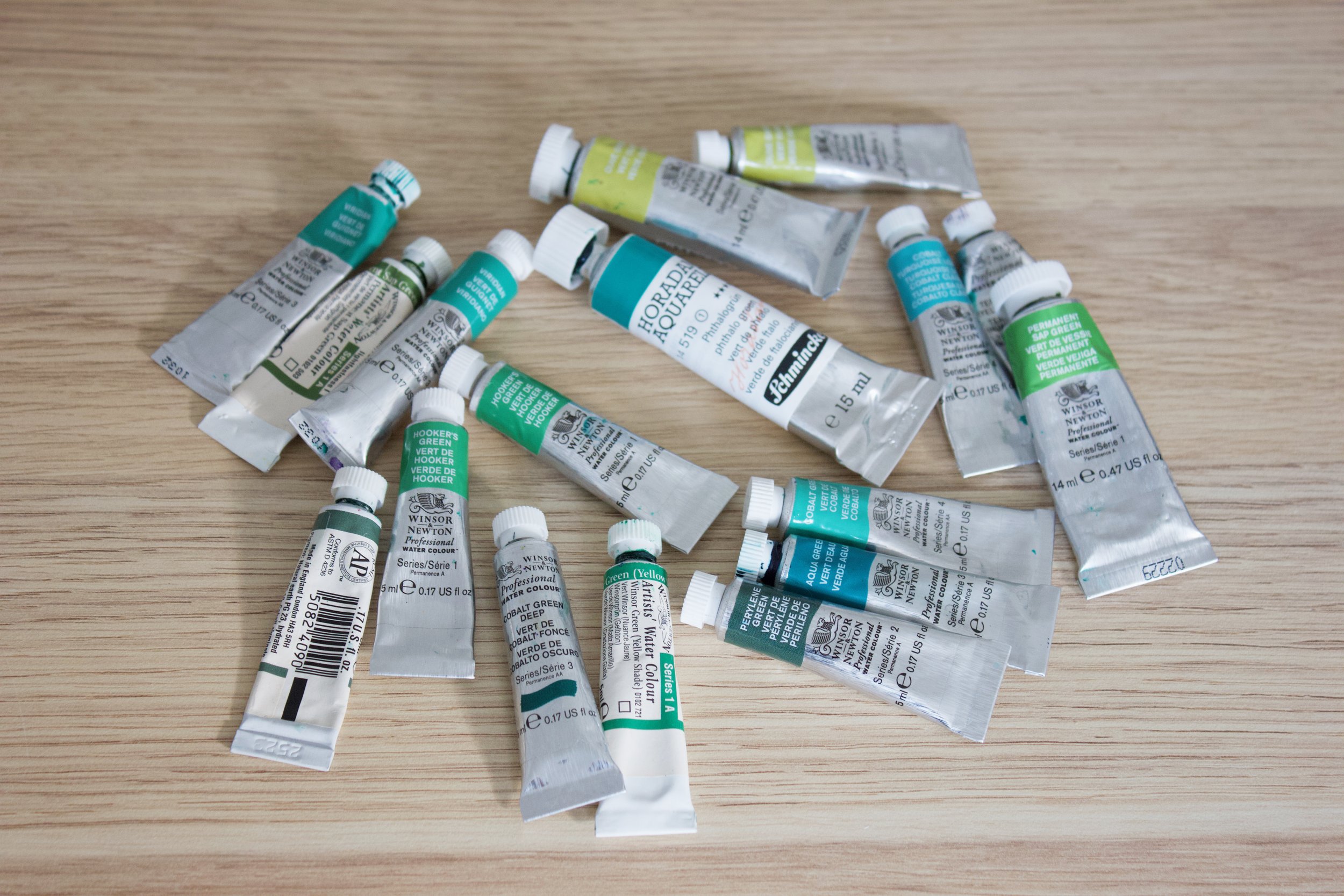
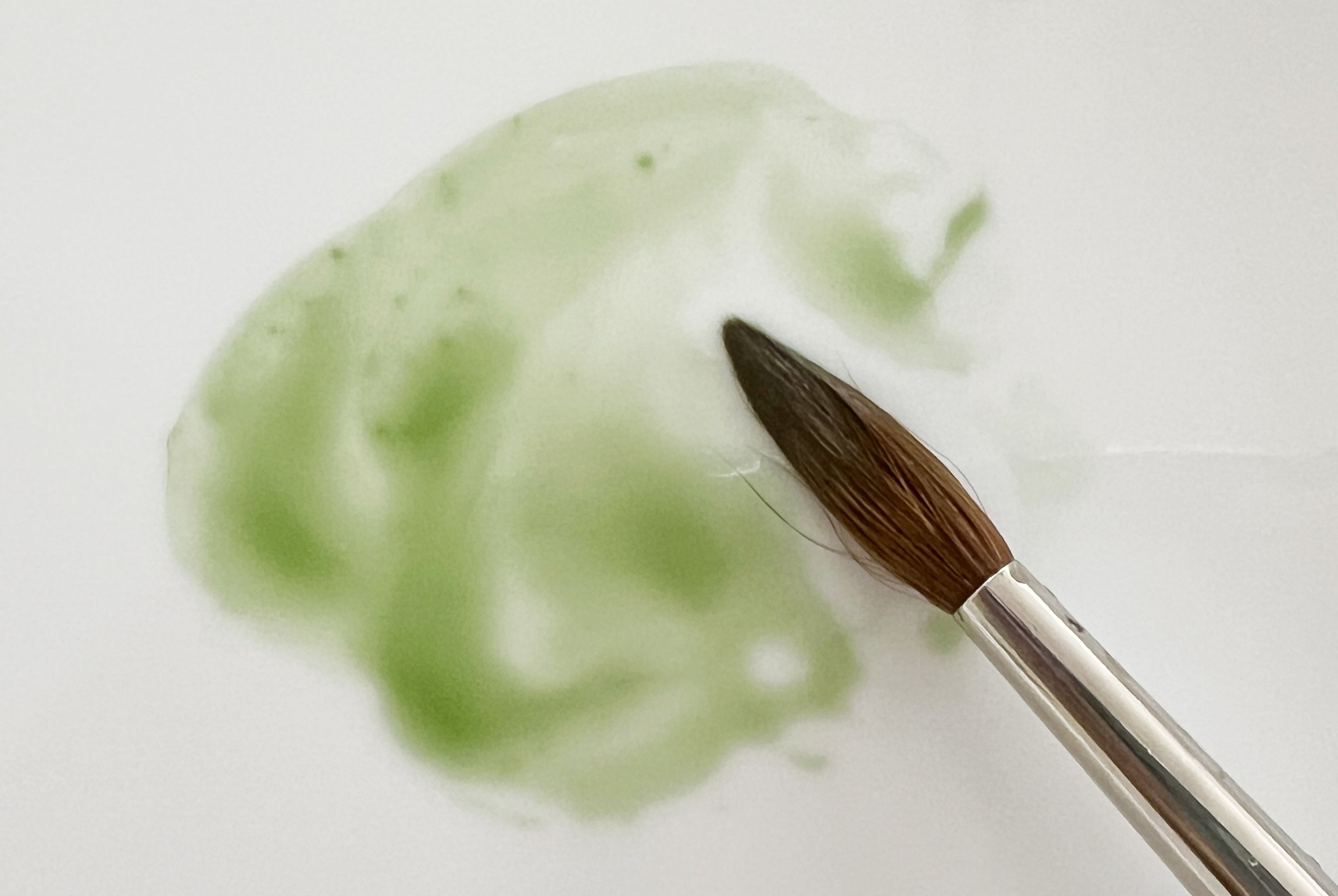
Beautiful greens - pre mixed and ready to use.
Popular Premixed Greens
Permanent Sap Green

Beautiful Sap Green by Winsor & Newton
Sap Green is a popular premixed green watercolour pigment known for its versatility and natural appearance. It is a staple in many artists' palettes due to its range of uses and appealing characteristics.
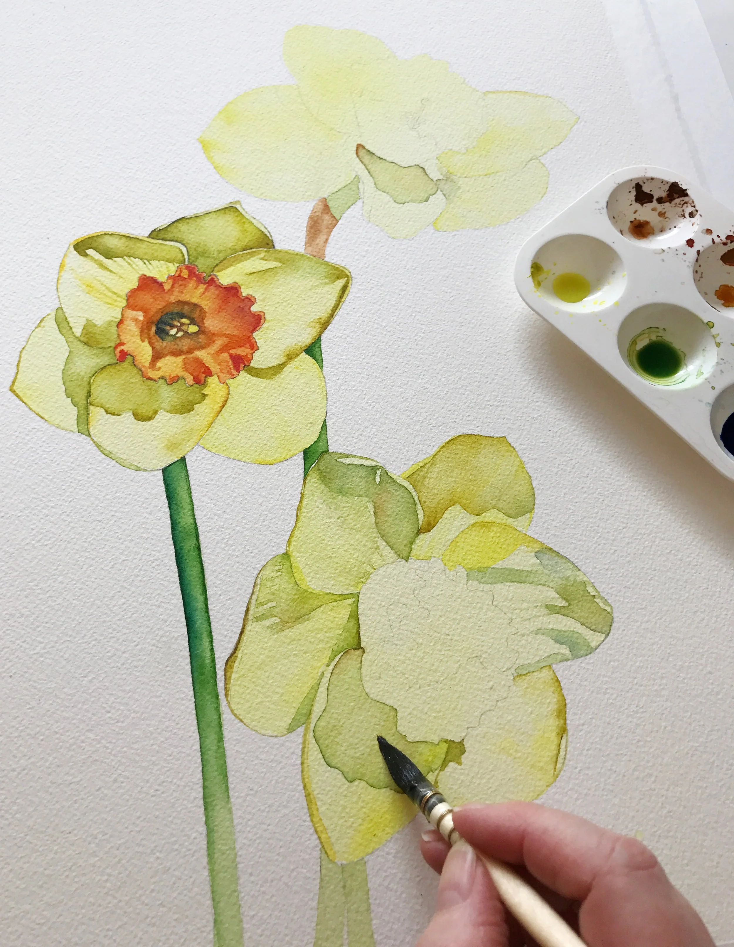
I used a mix of W & N Sap Green and yellow for the stems in this daffodil painting, and applied Sap Green straight from the tube for the shadows on the petals.
Of all of the premixed greens I have found that Winsor & Newton's Permanent Sap Green is the most useful for my work. Its transparent nature allows for effective layering and glazing techniques. This can add depth and dimension to your paintings without overpowering the underlying colours. It's ready to use straight from the tube, which saves time and gives you consistent results.
Sap Green mixes well with a variety of other colours. Combining it with yellows can produce brighter greens, while mixing it with blues can create deeper, cooler greens. It also blends beautifully with earth tones like Burnt Sienna to produce more muted, natural greens
The pigment code for Sap Green can vary depending on the manufacturer, as it is often made from a mixture of different pigments. However, common pigment combinations for Sap Green include:
Daniel Smith Sap Green: PG7 (Phthalo Green) and PO49 (Quinacridone Gold)
Winsor & Newton Sap Green: PG36 (Phthalo Green) and PY110 (Isoindolinone Yellow)
Schmincke Sap Green: PG7 (Phthalo Green) and PY153 (Nickel Dioxine Yellow)

Single Pigment Greens
Single pigment greens are green paints made from just one pigment, rather than a mixture of multiple pigments. This results in pure, consistent colours that are easier to control when mixing with other paints. They are valued for their clarity, predictability, and reliability in colour mixing. Using single pigment greens helps avoid muddy or unexpected results when blending colours, providing more precision and vibrancy in your paintings.
Examples include:
Phthalo Green (PG7 or PG36)
Viridian (PG18)
Cobalt Green (PG50)
Chromium Oxide Green (PG17)
Perylene Green (PbK31)
Green Gold (PY129)
Phthalo Green (PG7 or PG36)
Phthalo Green
Phthalo Green is a highly valued pigment because of its intense and vibrant hue. Known for its strong tinting strength, it can produce bold, striking effects and add dramatic contrasts to your paintings. Its transparency makes it ideal for glazing and layering, allowing you to build up colour gradually and achieve rich, complex shades.
This green can be used on its own, but its real strength lies in how well it mixes with other colours, making it versatile for various effects. Combining it with yellows creates bright, lively greens, while mixing with blues gives you deeper, cooler tones.
Phthalo Green is also lightfast, ensuring your paintings maintain their colour integrity over time.
Phthalo Green is available in both Yellow Shade and Blue Shade. Each has unique characteristics and uses in watercolour painting.
Phthalo Green Yellow Shade (PG7):
Phthalo Green Yellow Shade is a warm, yellow-toned green that leans towards a more yellow-green hue. Its bright and clear appearance can add a sense of vibrancy and freshness to your artwork.
Phthalo Green Blue Shade (PG36):
Phthalo Green Blue Shade, on the other hand, has a cooler, blue-leaning tone. The cooler undertones can help in achieving a more subdued and atmospheric effect in your paintings.
Both shades of Phthalo Green are highly transparent and mix well with other colours, but their temperature bias affects the final colour outcome. The Yellow Shade offers warmth and brightness, while the Blue Shade provides depth and coolness. Depending on the effect you want to achieve, choosing the appropriate shade can greatly influence the mood and appearance of your watercolour paintings.

Viridian (PG18)
Viridian is a cool, bluish-green with a soft, muted tone, making it ideal for landscapes and botanical work. Its transparent nature allows for subtle layering and glazing, adding depth without overwhelming other colours. Because it's transparent it won't muddy your colour mixes. It lifts easily and it has a slight granulating effect that can enhance texture in watercolour washes.

Beautiful, transparent Winsor & Newton's Viridian
Though Viridian can be used on its own, it’s often mixed with other colours to create a range of greens. It pairs well with yellows for lighter, more vibrant greens and with blues for cooler, more subdued tones.
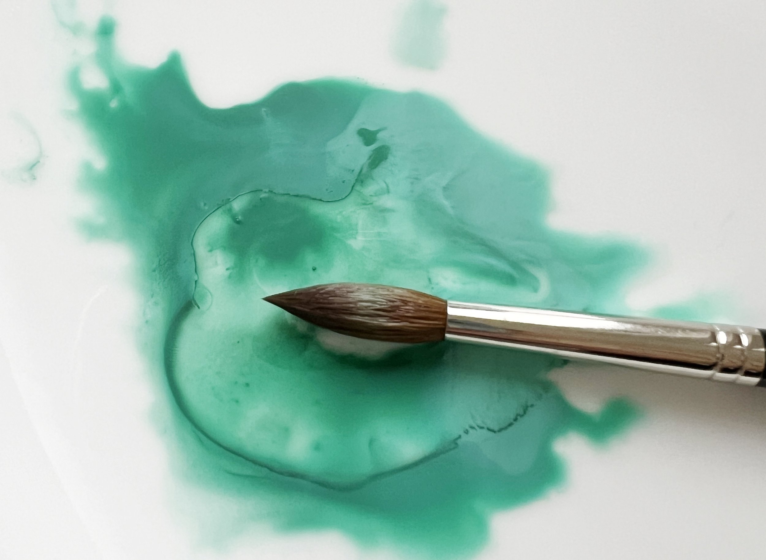
If you mix a small amount of red with green, the red will neutralise and desaturate the green, creating a more muted, natural-looking colour since red is the complementary colour of green. Below I have mixed Winsor & Newton's Light Red with Viridian to create two desaturated greens.

Viridian mixed with Light Red.
Cobalt Green (PG50)
Cobalt Green has a cool, muted, slightly bluish-green tone. It’s not as vibrant as some other greens, like Phthalo Green, but it has a subtle, soft quality that gives it a serene, natural appearance.
Cobalt Green
It is semi-transparent, which makes it an excellent choice for layering and glazing and it has good lightfastness. While it can be used alone, Cobalt Green mixes well with other colours, particularly blues and yellows, to produce a wide range of green shades. Its subtle tone is ideal for achieving softer, more natural hues in your paintings.
Mix Cobalt Green with Phthalo Blue or Ultramarine Blue to create a beautiful green that’s perfect for painting water. For a vibrant, fresh green, combine it with a cool yellow such as Transparent Yellow. If you want a more subdued green, try mixing Cobalt Green with an earth tone like Burnt Sienna.

Chromium Oxide Green (PG17)
Chromium Oxide Green is a muted, earthy green, known for its subtle and natural quality. It is a warm granulating colour.
It is opaque, providing strong coverage, and it has excellent lightfastness, ensuring the colour remains stable over time. Because it is opaque, when mixing it with other colours, it’s best to use transparent pigments. The opacity of Chromium Oxide Green can dominate mixtures and lead to muddy results if combined with other opaque or semi-opaque colours. By mixing it with transparent colours, you can maintain the clarity and vibrancy of your mixture, allowing the unique qualities of Chromium Oxide Green to blend effectively without overwhelming the overall colour.
Winsor & Newton's Oxide of Chromium.
Perylene Green a useful Dark Green (PBk31)
Perylene Green is a versatile pigment with a dark green shade that leans slightly towards blue. Known for its high tinting strength, it provides rich, subdued greens without overpowering other colours. Transparent and non-granulating, it mixes smoothly and is excellent for layering and glazing, making it ideal for adding depth to paintings. Its excellent lightfastness ensures that it resists fading over time.
I used to reach for it a lot whenever I needed a dark green shade.

Winsor & Newton's Perylene Green

I used both Sap Green and Perylene Green for the leaves and stem of this sunflower painting.
Green Gold (PY129)
Green Gold has a warm, yellow-green hue that shifts from a bright, yellowish-green when applied in mass tone to a more transparent golden yellow when diluted with water.

Winsor & Newton's Green Gold has a warm golden yellow hue. I like to mix it with blue to create beautiful greens.
Green Gold is a highly transparent pigment, perfect for glazing and layering to add a luminous glow to landscapes or botanical subjects. It is low to moderately staining, allowing for adjustments, and has excellent lightfastness.
It is an excellent mixer, especially for creating a wide range of natural greens. When mixed with blues like Phthalo Blue or Cobalt Blue it produces fresh, vibrant natural looking greens. It also works well in mixtures to add a golden glow or to brighten other greens without overpowering them. You can also glaze it over other greens to give them a golden glow.

Final Thoughts
In my early watercolour journey, I leaned heavily on premixed greens for convenience. However, these days, I prefer working with a limited palette and mix my own greens from the specific blues and yellows that best suit my painting. This approach allows me to tailor the greens to my needs and achieve a more cohesive look. While I still appreciate the convenience of premixed greens and occasionally use them, I find that mixing my own greens offers greater flexibility and control over the colours in my artwork. Ultimately, whether you choose to mix your own greens or use premixed options, the key is finding what works best for your style and goals as an artist.
If you are interested in learning to paint in watercolour, I have over 200 online, voiced over watercolour tutorials for all skill levels.