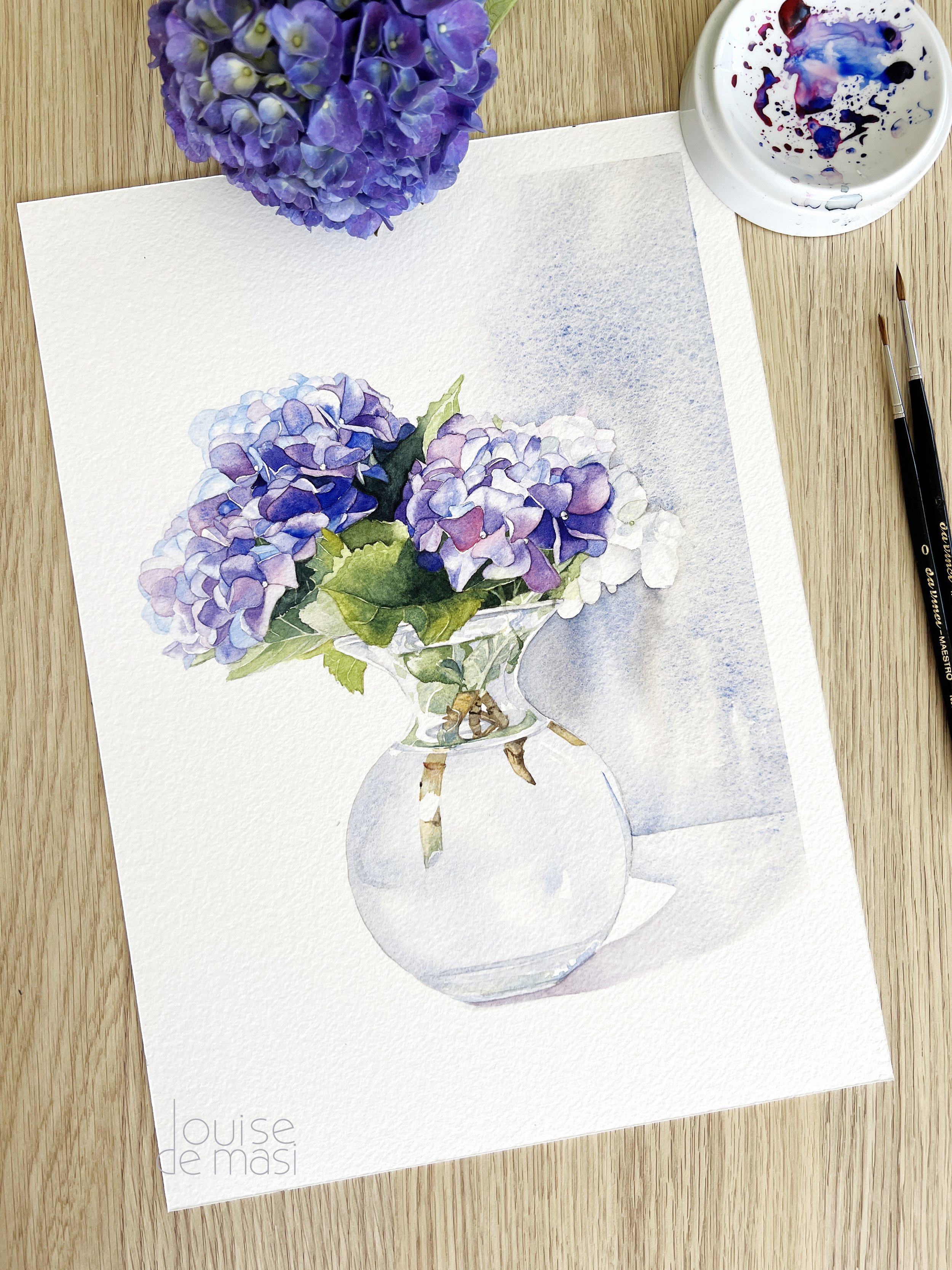
Mastering Green: Mixing Greens in Watercolour
Mixing greens in watercolour is both an art and a science. When I first started painting, I often shied away from mixing my own greens, relying instead on premixed greens straight from the tube. While convenient, these greens often left my paintings looking a bit unnatural and lacking the subtle variations found in nature.
Over time, I realised that by mixing my own greens, I could achieve much better colour harmony and bring a more lifelike quality to my work. In this post, we’ll explore the techniques and I’ll share some colour combinations that will help you master the art of mixing greens, so you can create paintings rich in depth and natural beauty.

Learning to mix greens
Understanding the Basics of Mixing Green Paint
Greens in watercolour come to life by mixing two primary colours: blue and yellow. It might sound simple, but the exact hues of blue and yellow you pick can make a world of difference. Depending on your choices, you could end up with vibrant, fresh greens or more muted, earthy tones.
You need to understand that simply mixing any blue and yellow won't necessarily result in a pure, vibrant green. Instead, understanding the subtle differences in hues and their biases is key to mastering colour mixing.
Here are the key points to understand:
1. Understanding Colour Temperature and Hue Bias
Warm vs. Cool: Most blue and yellow hues have a temperature - either warm or cool. A cool blue like Phthalo Blue has a greenish undertone, while a warm blue like Ultramarine has a reddish undertone. The same goes for yellows; Lemon Yellow is cool and leans towards green, while Cadmium Yellow is warm and leans towards red.
Mid Yellows and Blues: Not all yellows and blues fall strictly into warm or cool categories. Mid yellows, like Pure Yellow, and mid blues, like Cobalt Blue, have a neutral temperature bias, making them versatile choices for creating balanced greens that aren't too bright or too dull. These colours offer flexibility in mixing, allowing you to achieve greens that are natural and harmonious, perfect for a wide range of subjects.
Mixing for Effect: Combining a cool blue with a cool yellow will give you bright, lively greens because both colours lean toward green. On the other hand, mixing a warm blue with a warm yellow results in more subdued, earthy greens due to the red undertones in both hues. And by using mid yellows and blues, you can create greens that are balanced and neutral, giving you the best of both worlds.
By understanding the temperature and bias of the blues and yellows you’re working with, you can better control the types of greens you create, tailoring them to the mood and atmosphere of your painting.
If you aren't sure whether your colours are cool or warm - I have a blog post that might help.

2. Transparency and Opacity:
Pigment Properties: The transparency or opacity of the pigments you use also affects the final green. Transparent blues and yellows tend to mix into more luminous, glowing greens, while opaque colours can create greens that are more solid and less light-reflective. If you choose and opaque pigment to mix with, pair it with a transparent colour to avoid a muddy green with no life.
3. The Importance of Experimentation:

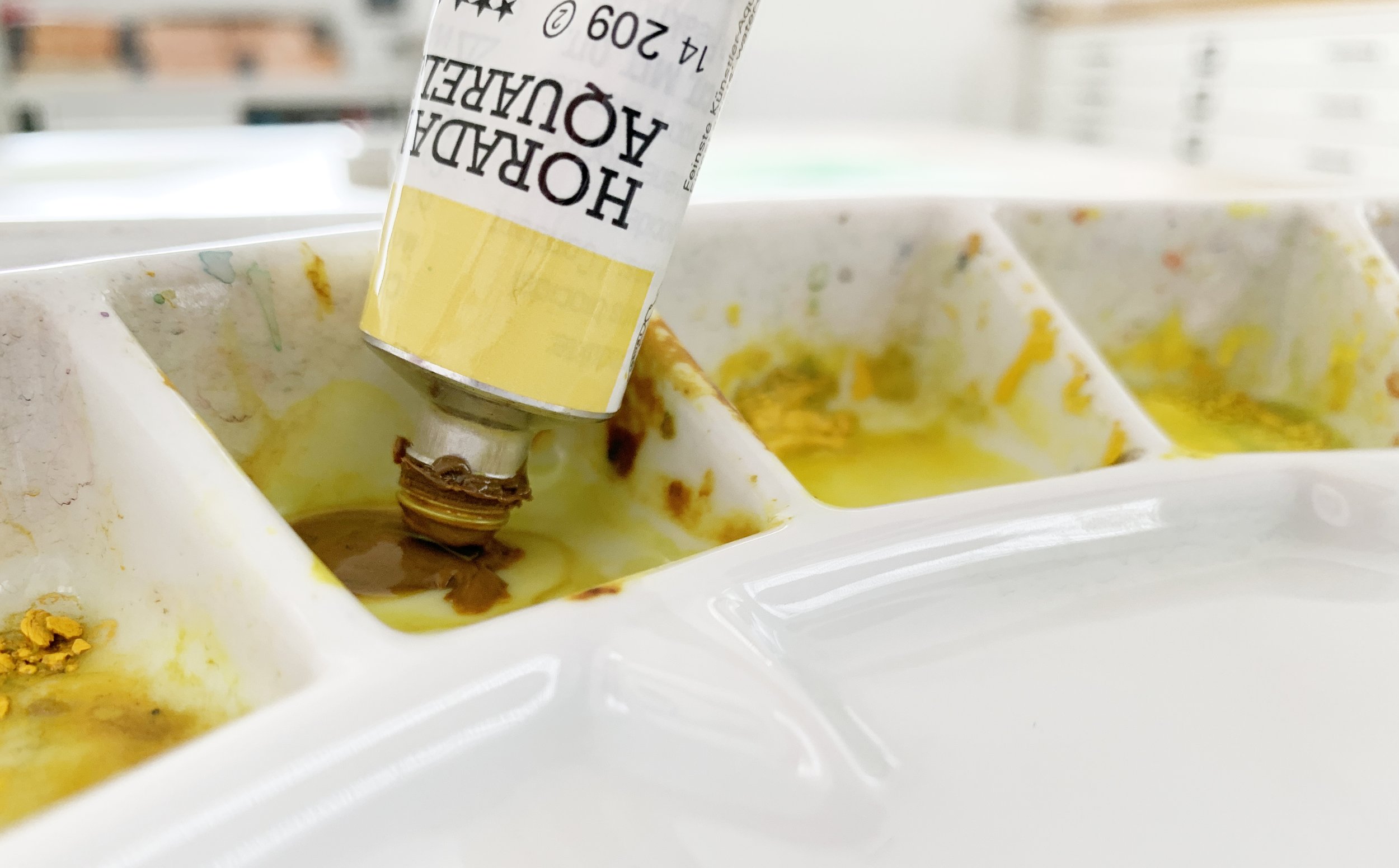
Testing Your Mixes: Because every brand and batch of paint can vary slightly in colour, it’s essential to test your mixes before applying them to your painting. Create a swatch chart with different combinations of your blues and yellows to see the range of greens you can produce.
Exploring Variations: Don’t hesitate to experiment with mixing different ratios of blue to yellow. Adding more yellow will result in a lighter, more yellow-green, while adding more blue will darken the green and give it a cooler tone. And if you want to tone down the intensity of your green, try adding a touch of red to the mixture. The red will neutralise the green, creating a more muted, earthy colour that can be perfect for shadows or natural elements in your painting.
By understanding the interplay between the shades of blue and yellow you select, you can take control of your green mixes, ensuring that they perfectly suit the mood and atmosphere of your watercolour paintings.
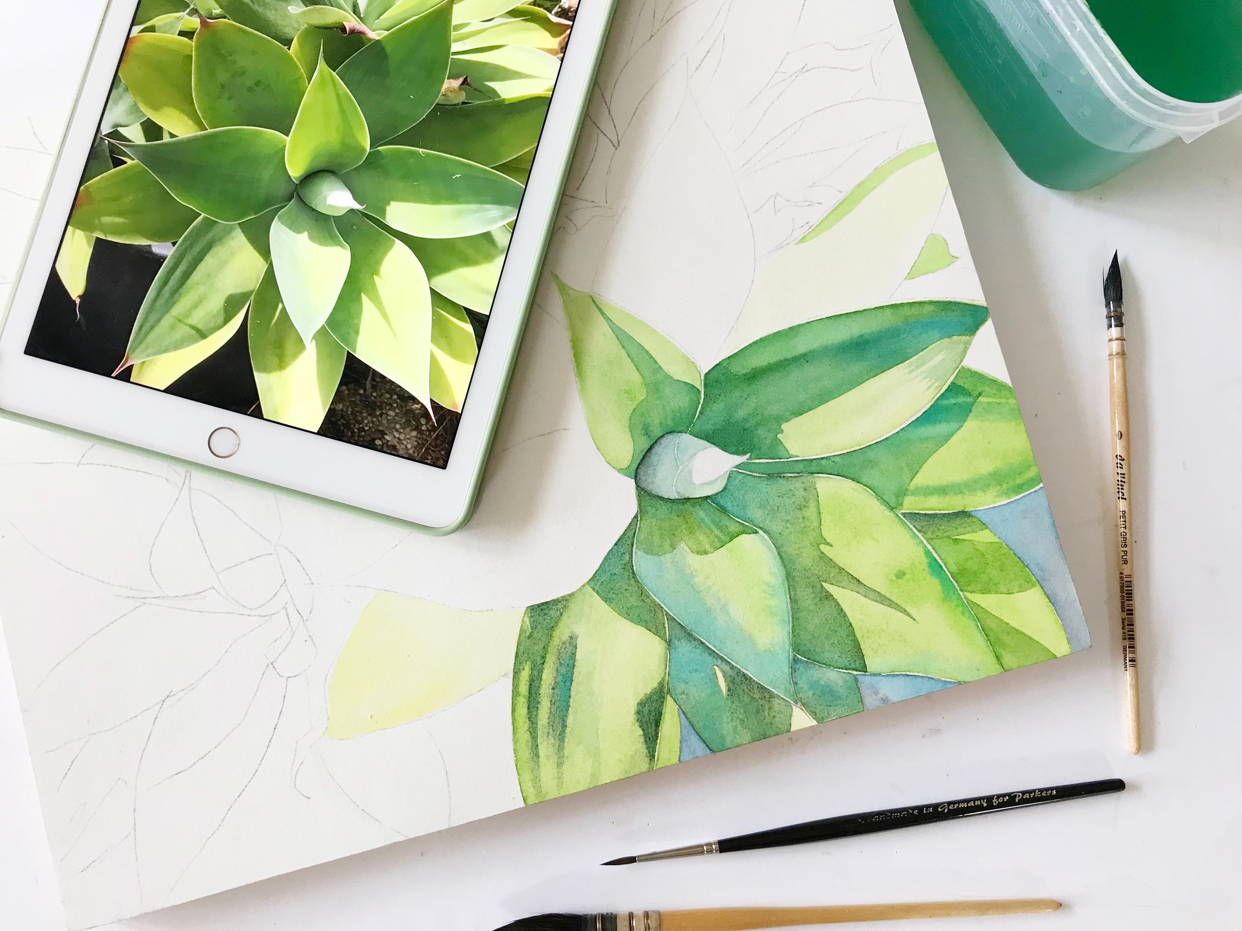
Getting Practical: How to Mix Green
Now that we’ve covered the basics, let’s roll up our sleeves and dive into the fun part - actually mixing those greens!
This is where the magic happens, and I promise, it’s not as daunting as it might seem. Whether you're aiming for a fresh spring green or a deep forest shade, the right colour combinations can make all the difference.
So, grab your paint palette, and let’s experiment with some tried-and-true mixes that will give you just the right colour green for any painting.
You can read all about the mechanics of mixing watercolour paint here.
I try to remember to start with yellow and then I add blue to my green mixtures.
Creating Balanced Greens with Mid Yellows and Mid Blues
Mid yellows and mid blues are the unsung heroes of colour mixing, offering a balanced foundation that doesn't lean too warm or too cool. These versatile hues are perfect for creating harmonious colour blends, especially when mixing greens.
By pairing a mid yellow like Schmincke's Pure Yellow (PY154) with Schmincke's mid blue - Cobalt Blue (PB28), you can achieve greens that are natural, vibrant, and perfectly suited for a variety of subjects, from lush landscapes to delicate botanicals.

Greens mixed from Schmincke's Pure Yellow and Cobalt Blue
How to Mix Bright Green
To mix a bright vibrant green try mixing two cool colours together. Adjust the ratio for a slightly cooler or warmer green as needed. If you need to know more about how to determine the temperature of the colours on your palette - read this.
Schmincke:
Try mixing Schmincke's Transparent Yellow (PY150) with Phthalo Blue (PB15)
Transparent Yellow has a slight orange undertone but it is considered a cool colour because it leans more towards green than red.
Schmincke's Phthalo Blue has a cool, greenish bias and it is suitable for creating vibrant greens and cool blue hues.

Schmincke's Transparent Yellow and Phthalo Blue mixed together in varying ratios
Winsor & Newton:
Try mixing Winsor & Newton's Winsor Lemon (PY175) with Winsor Blue green shade (PB15)
Winsor Lemon has a bright, cool bias that complements cool blues effectively.
Winsor Blue green shade is a cool, intense blue with a greenish bias, perfect for creating vibrant greens. It has a very strong tinting strength and is often used for mixing bright, clear greens.

Winsor & Newton's Winsor Lemon and Winsor Blue green shade mixed together in varying ratios
Daniel Smith:
Try mixing Daniel Smith's Hansa Yellow Light (PY97) with their Phthalo Blue green shade (PB15:3).
Hansa Yellow Light is known for its bright, cool tone and transparency, making it ideal for mixing vibrant, clean greens.
The cool undertones of Phthalo Blue green shade will ensure that the resulting greens are lively and balanced, without becoming too warm.

Daniel Smith's Hansa Yellow Light mixed with Phthalo Blue green shade in varying ratios.
How to Mix Less Saturated or Muted Greens
When aiming for earthy, muted and less saturated greens, reaching for warm colours is key. If your painting calls for greens that blend seamlessly into a natural landscape - think moss-covered rocks or the subtle tones of late summer leaves - then earthy, muted greens are your go-to. These greens have a quiet, understated beauty that can add depth and realism to your work.
Schmincke:
Mix together Schmincke's Indian Yellow (PY110, PY154) with French Ultramarine Blue (PB29) to create some earthy, desaturated greens.
Vary the ratio and consistency of the pigment to create different green hues using the same colours.

Schmincke's Indian Yellow mixed with French Ultramarine.
Winsor & Newton:
Mix together Winsor and Newton's Indian Yellow (PO62, PY139) and Winsor Blue red shade (PB15)
Winsor and Newton's Indian Yellow is a deep, golden-yellow hue with a strong, warm undertone. It has a distinctive, earthy quality that can add warmth and depth to paintings.
Winsor Blue red shade is a deep, rich blue with a noticeable reddish undertone. It’s slightly warmer than typical Phthalo Blues, giving it a unique depth and warmth.

Winsor & Newton's Indian Yellow and Winsor Blue red shade mixed together in varying ratios.
How to Mix Dark Green
When it comes to painting shadows or creating depth in foliage, mastering dark greens is essential. Achieving the right balance between richness and subtlety can transform a flat landscape into a dynamic, lifelike scene. Let's explore some techniques and colour combinations that will help you mix those deep, moody greens with confidence.
Start with Deep, Dark Blues: Mixing with deep blues like Prussian Blue (PB27), Indigo, or Payne’s Grey can help create darker greens. These blues naturally have a darker value and, when combined with yellows or greens, produce rich, shadowy greens.
Use Earth Tones: Adding earth hues like Burnt Sienna, Burnt Umber, or even Sepia to your green mixes can deepen the colour and introduce a more natural, muted quality.
More Blue, Less Yellow: Increasing the amount of blue in your mix while reducing the yellow can result in darker, cooler greens. This works well for shadow areas in foliage or landscapes.
Add a Tiny Bit of Red: Adding a small amount of a complementary colour like Permanent Alizarin Crimson can neutralise the green slightly, giving you a darker, more muted shade. Be careful not to overdo it, as it can turn the green too brown or grey.
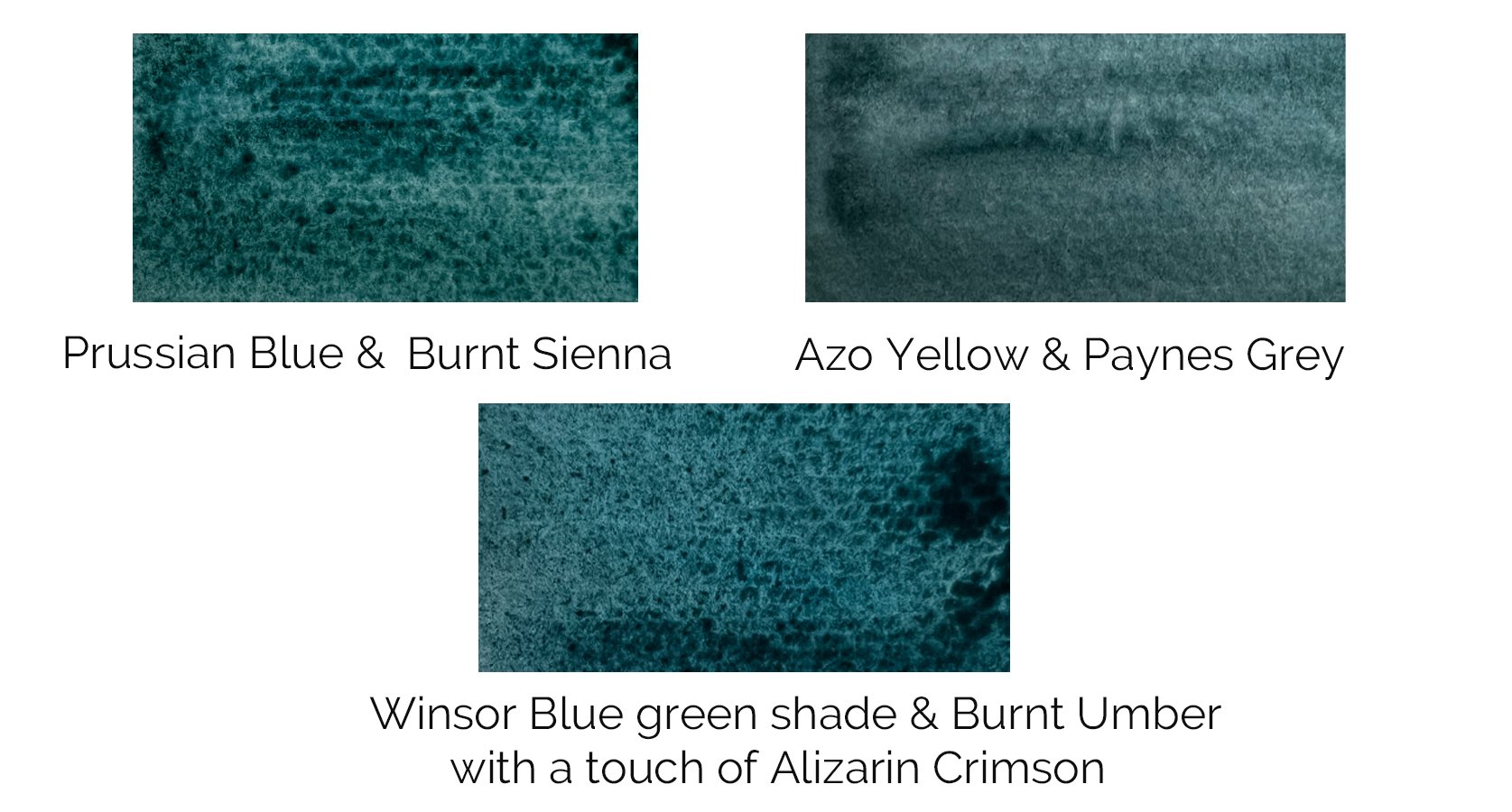
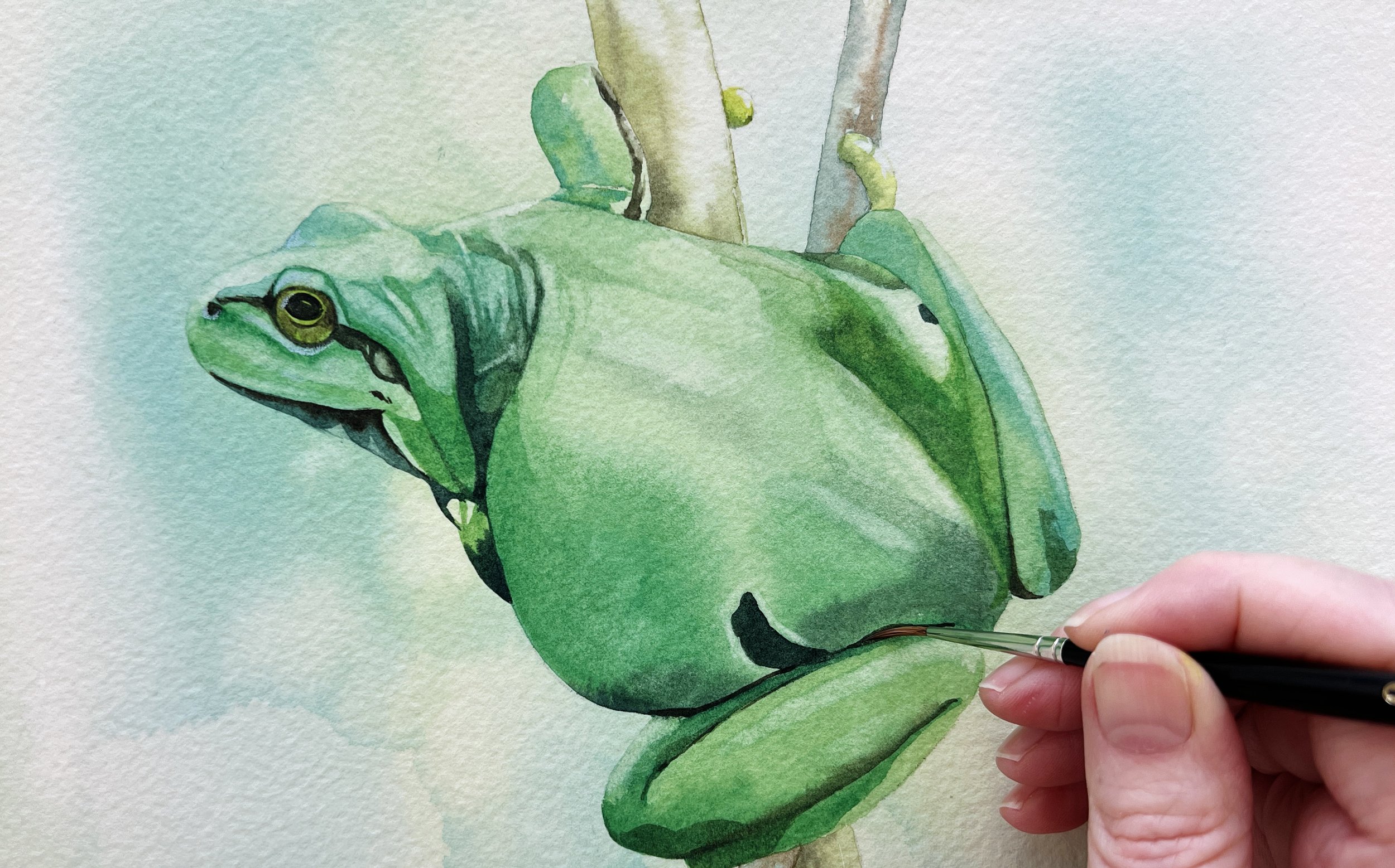
The darkest greens on this frog painting were mixed from Winsor & Newton's Prussian Blue and Burnt Sienna.
Final Thoughts: Bringing Your Greens to Life
Mixing your own greens in watercolour may seem challenging at first, but with practice, it becomes an intuitive and rewarding part of the painting process. By understanding the different hues, temperature biases, and properties of your blues and yellows, you can create a wide range of greens that bring depth, vibrancy, and harmony to your work.
Remember, the key to mastering green is experimentation. Don’t be afraid to try different combinations and ratios, and always take the time to test your mixes before applying them to your painting. With patience and practice, you'll soon find yourself mixing greens that perfectly capture the beauty of the natural world.
If you’re ready to dive deeper into colour mixing, be sure to check out my other posts on mastering colour in watercolour.
Happy painting!
If you are interested in learning to paint in watercolour, I have over 200 online, voiced over watercolour tutorials for all skill levels.