Exploring Watercolour Washes
Techniques for Beautiful Results

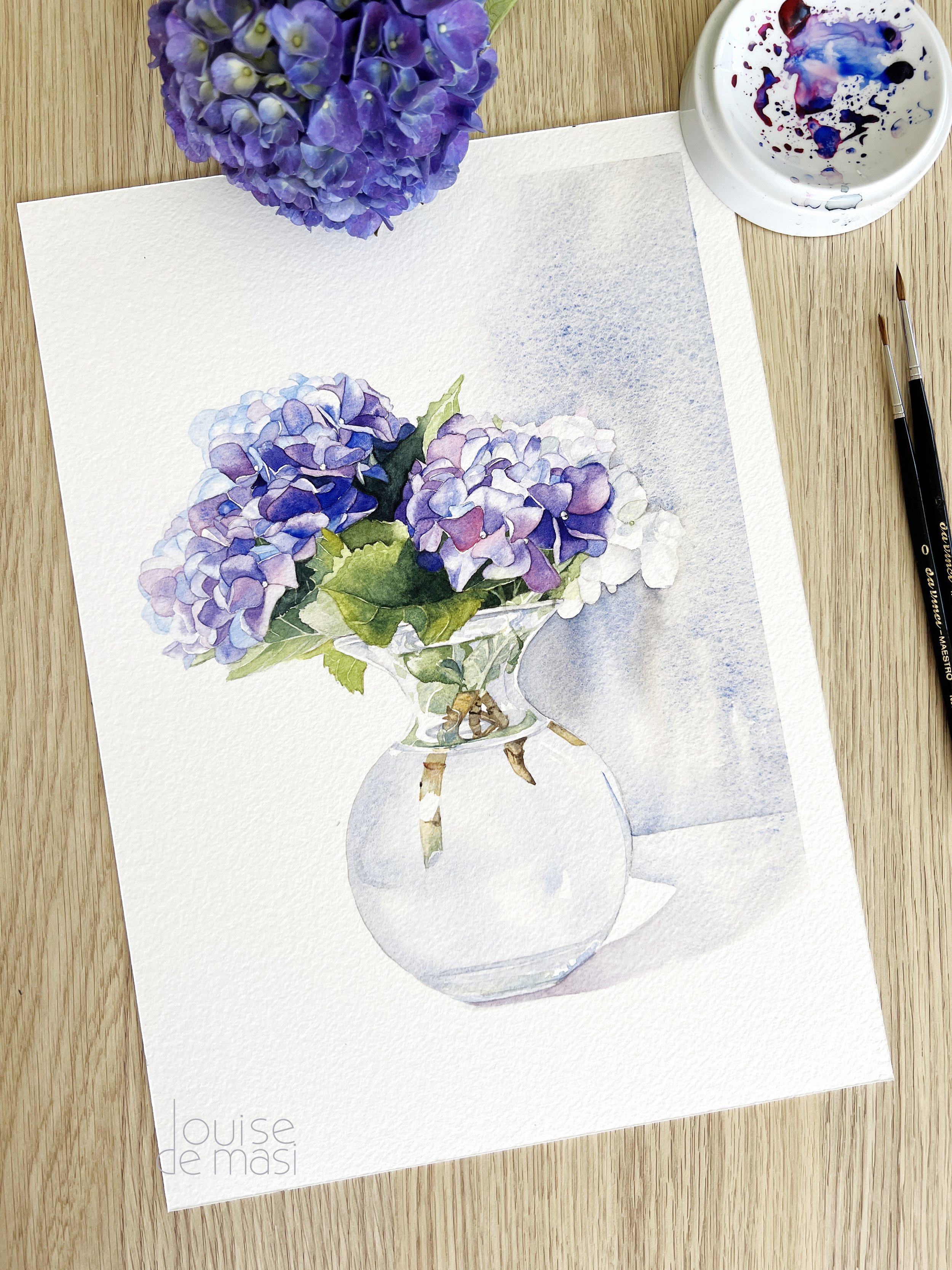
One painting makes use of many different watercolor techniques.
Watercolour painting is a delightful journey where each stroke tells a story. It allows artists to create stunning visuals with just a few watercolour techniques.
In this post, we’ll delve into special kinds of watercolour art techniques; the different types of washes—flat, graduated, and variegated—and explore how to master them. Each technique has its own charm and application, whether you're creating a serene landscape or a vibrant sunset.
Water you waiting for?
Let’s dive in and make a splash with our colours!
Flat, Graded, and Variegated Washes Explained
Flat Washes
A flat watercolour wash is the foundation of many basic watercolour painting techniques. It involves laying down a consistent layer of colour across your watercolour paper, making it perfect for backgrounds or areas requiring uniformity.
To achieve a smooth, flat wash, start by mixing a generous amount of your desired wet paint colour. It’s essential to have enough watercolour paint ready to avoid any inconsistencies.
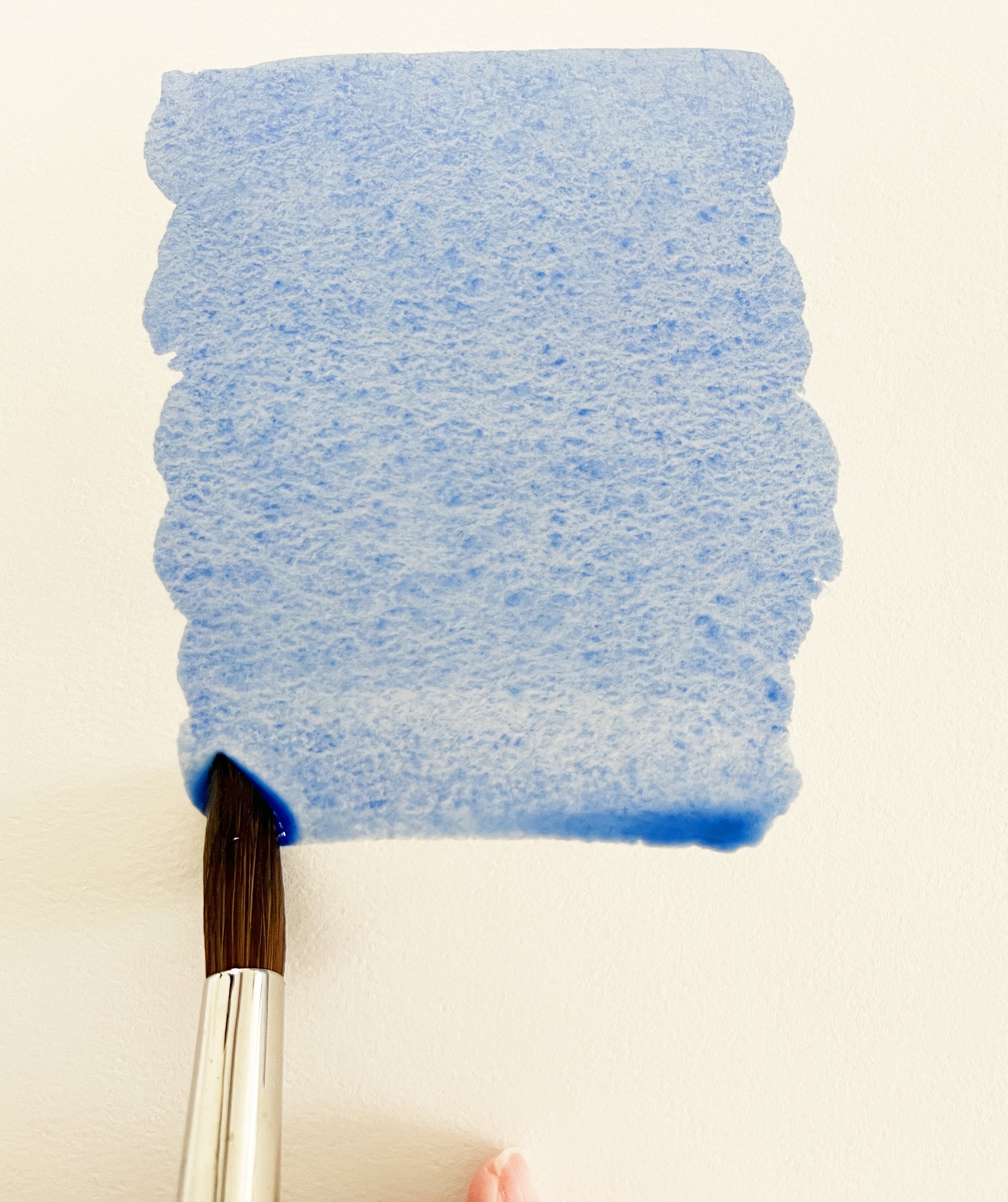
Flat wash.
When applying the wash on untouched white paper, use the largest brush you feel comfortable with, as this will help you cover larger areas quickly and evenly.
Begin at one edge of the paper and, with a wet loaded brush, apply wet paint horizontally. Keep the brush strokes steady and avoid overworking the paint to maintain that smooth finish. Always ensure the paint is applied evenly and without streaks. It might help if you tilt your paper on a slight angle towards yourself and then keep moving that bead of paint that forms at the bottom. The result should be a beautifully rich, solid layer of colour. A really simple technique with great outcome.
I have a video here that demonstrates this technique.
This watercolour technique sets the stage for more complex washes, so get ready to "wash away the competition"!
Graduated or graded wash
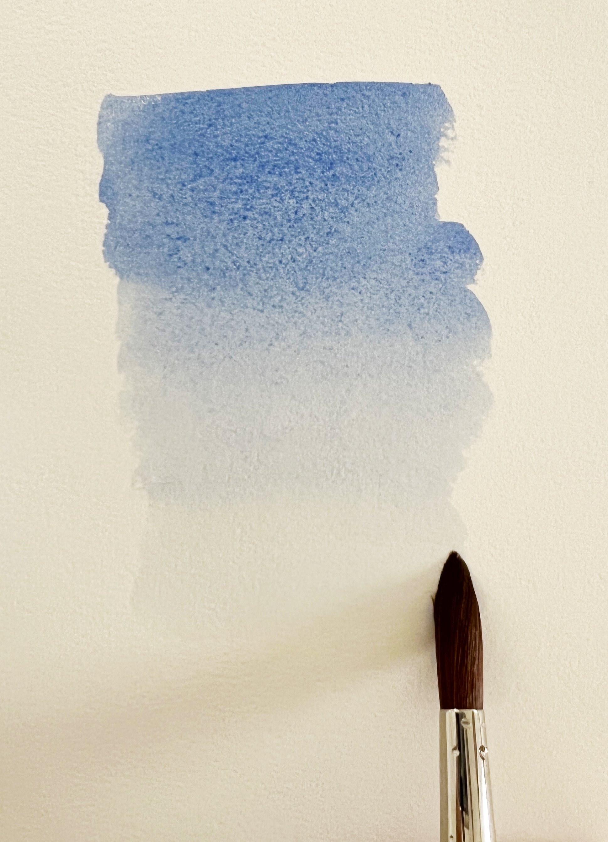
Graduated wash.
Next, we have the graduated wash, where one colour transitions smoothly to another. Picture a sunset fading from vibrant orange to soft pink. This watercolour technique adds depth and dimension to your artwork.
The graduated wash is where you can start to play with the depth and dimension of your watercolour. This technique allows you to create a gradient effect, transitioning from a darker tone to light within a single wash. Begin with the same principles as the flat wash—mix ample paint and use a large brush.
To create the gradient, start with a darker colour at the top of your paper and gradually add more water to your brush as you move downward, which lightens the pigment. This technique is particularly useful for skies or water, where a subtle shift in tone, a natural gradient, adds realism. Always test your colours on scrap paper to ensure they blend harmoniously before applying them to your final piece.
I have a video here demonstrating how to paint a graded wash.
“Dab it and fab it!”—test your colours on scrap paper to see how they mix. The key is to maintain a consistent, smooth transition without any harsh lines. This method is about creating a seamless gradient that captivates the eye.
Variegated Wash
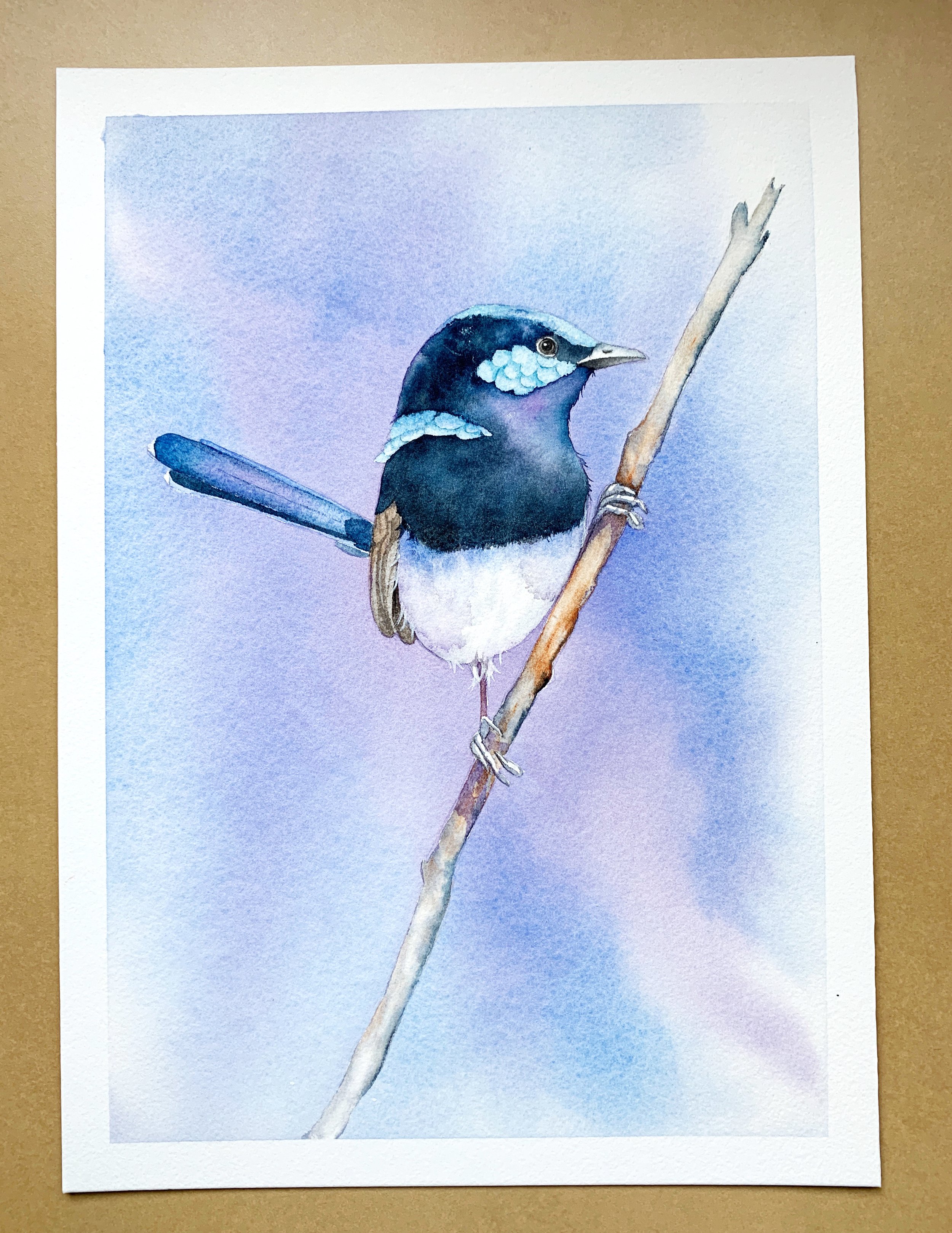
I painted a variegated wash behind this wren.
Now, let’s turn our attention to the variegated wash, my personal favorite. This watercolour technique involves multiple colours applied in a less predictable manner, resulting in a beautifully chaotic effect. Think of it as a watercolour party on your paper!
When creating a variegated wash, if you choose complementary colours, keep them apart. This prevents muddy mixes that can dull your vibrancy. Apply water to your paper and then add your colours randomly. As you work, tilt the paper slightly to let the colours dance together. Just remember, “It’s a wash of colour!”

Painting a variegated wash on wet paper.
Start by wetting your paper thoroughly, ensuring an even sheen across the surface. Work quickly, as wet paper allows the colours to blend beautifully. Begin with one colour—say, a vibrant blue—and apply it in a loose, random manner. Then, switch to another colour, such as yellow or orange, making sure to overlap slightly with the previous stroke. The key is to keep complementary colours apart to avoid muddying your wash.
As you layer your colours, consider tilting your paper to encourage the colours to flow into one another. This adds a dynamic quality to your work, creating organic blends and textures. Be mindful of excess paint pooling, as this can lead to unwanted watercolour blooms, which, while sometimes beautiful, can disrupt the flow of your intended design.
For an added touch of texture, embrace those accidental watercolour blooms.
It's important to let your washes dry properly. If you notice any excess moisture, gently remove it with a clean brush or tissue. The goal is to maintain control over the paint, allowing you to create intentional blooms if desired. Once dried, the colours will settle into a harmonious blend, enriching your artwork with depth and interest. I have made a video demonstrating how to paint a variegated wash.
Techniques and Tips for Stunning Results
The Art of Colour Theory
Understanding colour theory is foundational to mastering watercolour washes and many other watercolour techniques. Colour theory helps you make informed choices about the hues you select for your paintings. When working with washes, consider using complementary colours—colours opposite each other on the colour wheel. These can create striking contrasts that make your artwork pop. For example, pairing blue with orange or yellow with violet can add dynamism to your piece.

Complementary colours were used on this crab painting.
Alternatively, you might choose analogous colours, which sit next to each other on the colour wheel, such as blue, blue-green, and green. These combinations tend to create harmony and can evoke feelings of tranquility in your washes. As you experiment, keep in mind that the way colours blend on paper can result in unexpected and delightful surprises.
I chose an analogous colour scheme for this painting for a tranquil mood.
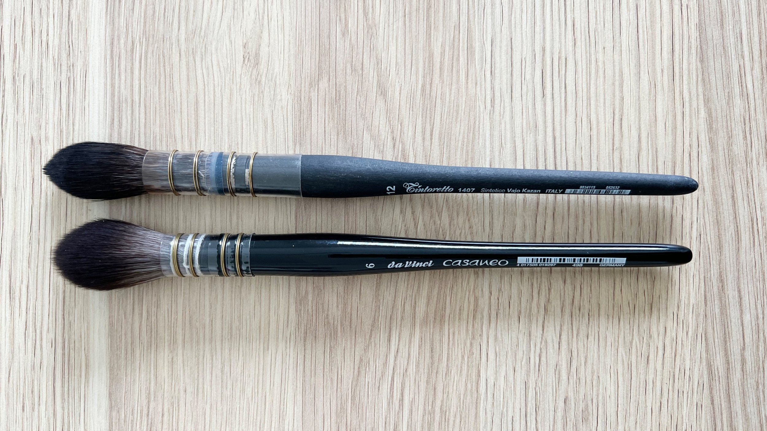
Brush Types and Techniques
The choice of watercolour brush can significantly influence the outcome of your washes. A larger mop brush is ideal for laying down a flat wash, as it holds a considerable amount of water and paint, allowing for smooth, even coverage. When applying a graded wash, a smaller round brush can give you more control as you gradually change the intensity of the colour.
Large mop brushes are excellent for applying flat washes of paint.
For variegated washes, consider using a combination of brushes. A flat brush is excellent for broad strokes, while a smaller round brush can help you place colours with precision. Experimenting with different brush shapes—such as fan brushes for unique textures or filbert brushes for rounded edges—can elevate your washes and add depth to your work.
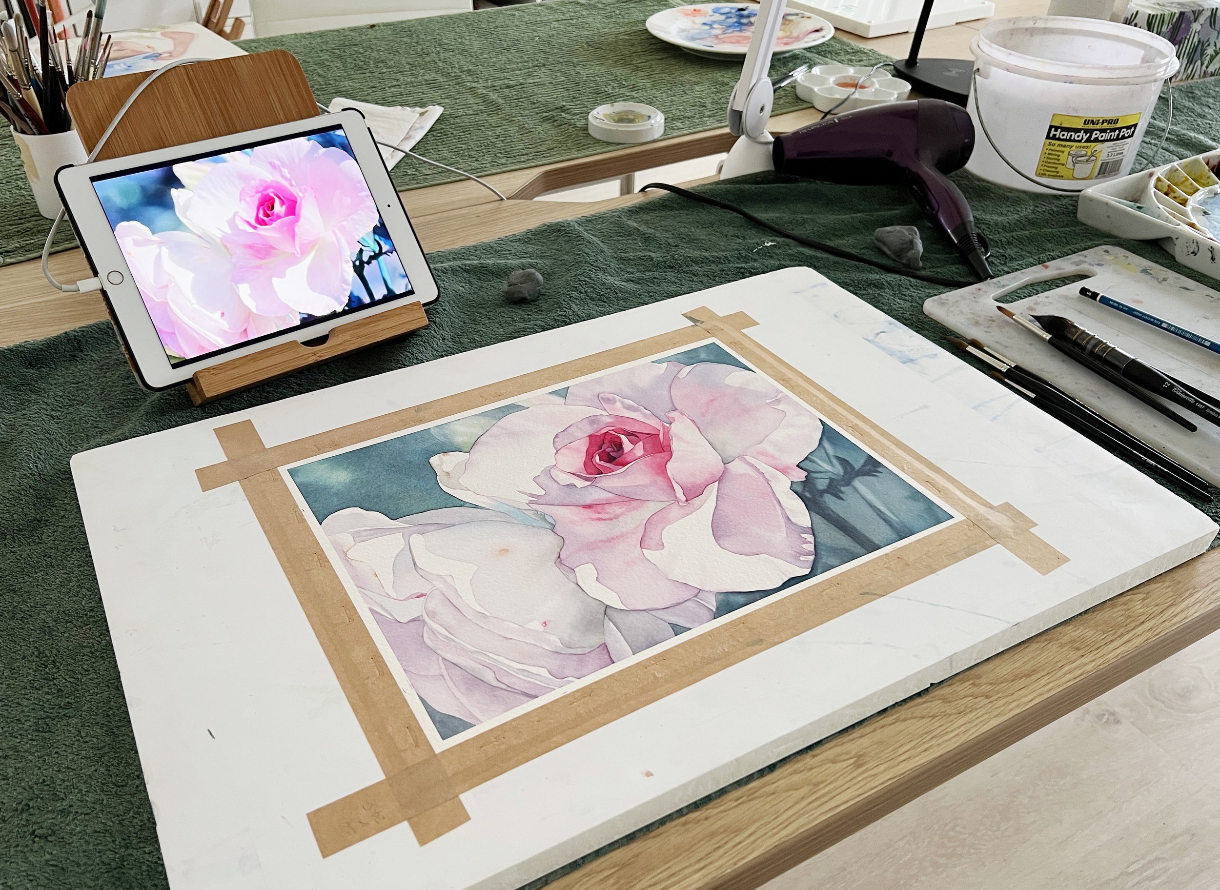
Choosing the Right Watercolour Paper for Stunning Washes

My favourite paper to work on is Arches cold press paper 640gsm.
Selecting the appropriate watercolour paper is essential for successful washes and watercolour techniques. The paper's weight, texture, and absorbency significantly affect how the paint interacts and dries. Here’s a closer look at the different types of watercolour paper:
Weight: Watercolour paper comes in various weights, typically measured in grams per square meter (gsm). The heavier the paper, the more water it can absorb without warping. For washes, a paper weight of at least 300 gsm (140 lb) is recommended. This allows for multiple washes without compromising the paper's integrity.
Texture: Watercolour paper is available in three primary textures: rough, cold-pressed (notable for its slight texture), and hot-pressed (smooth). Rough paper creates interesting textures and lends itself well to expressive washes, while cold-pressed paper balances texture and smoothness, making it versatile for various techniques. Hot-pressed paper is ideal for detailed work and fine lines, but it may not hold washes as effectively.
Composition: Look for 100% cotton watercolour paper, which offers excellent absorbency and durability. This type of paper allows for better colour lift and reworkability, making it easier to achieve the desired results with your washes.
When working with washes, always test your colours and techniques on a small scrap of the same paper before applying them to your final piece. This practice ensures you understand how the paper interacts with your chosen pigments and helps you adjust your technique as needed.
Brush Care and Colour Vibrancy
Taking care of your brushes and palettes is essential to ensure that your watercolour paints remain vibrant, and that your brushes perform well. After each painting session, clean your brushes thoroughly with warm water and a gentle soap to remove paint residue. Avoid leaving brushes resting in water, as this can damage the bristles and alter their shape.
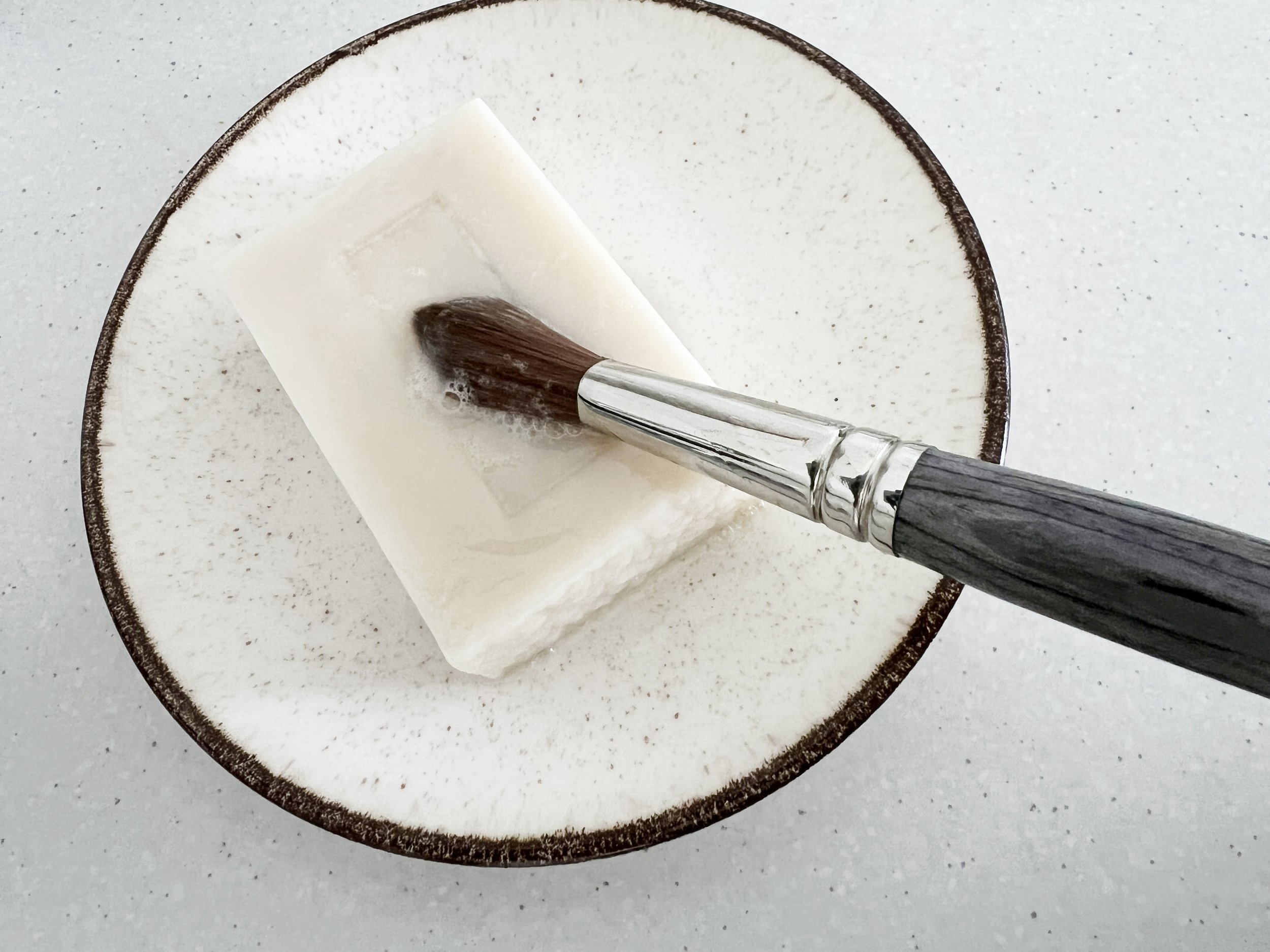
Washing a wet brush with some brush manufacturer's brush soap.
When it comes to palettes, keep your colours organised and avoid mixing hues that can muddy your palette. Consider using a separate well for each colour, and always test your mixes on scrap paper before applying them to your artwork. This simple practice can save you from unexpected results and keep your colours fresh and bright.
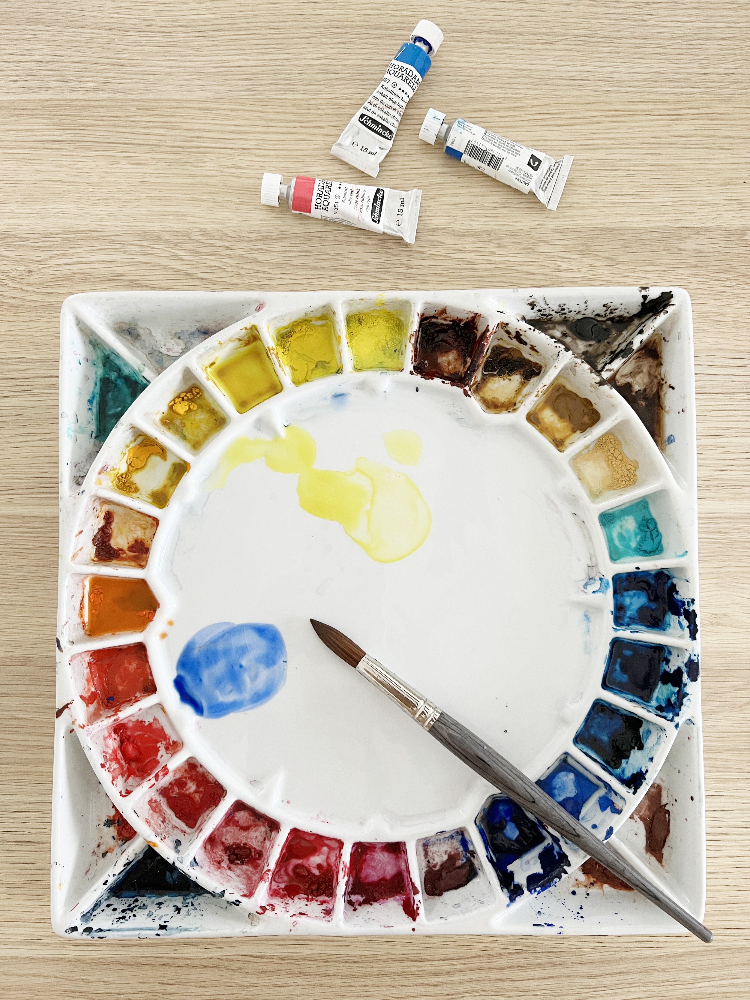
Use clear water when applying it to your paper. I like to have two water containers - one for cleaning the brush and the other for applying water to the paper.
Common Mistakes and How to Avoid Them
As you delve into watercolour washes, it’s essential to recognise common pitfalls that can hinder your progress. One frequent mistake is overworking your paint, which can lead to muddied colours and unwanted blooms. Instead, try to let your washes completely dry before adding more layers; this will help maintain clarity and vibrancy.
Another common issue is using too much water. While water is vital for achieving the desired wash effect, an excess of it can cause paint to run uncontrollably or create puddles. Always start with a controlled amount of water, and if you notice a puddle forming, gently dab it with a tissue or a clean brush to lift the excess.
Finding Inspiration for Your Washes
Inspiration can strike in the most unexpected places, so keep your eyes open! Nature is a fantastic source of inspiration for watercolour washes—observe the soft gradients of a sunset or the vibrant colours of a flower garden. You might also explore photographs or other artworks that resonate with you.
Creating a sketchbook dedicated to colour experiments can be incredibly beneficial. Use it to try out different washes and colour combinations. This practice not only allows you to refine your watercolour techniques but can also serve as a valuable resource for future projects. You might discover a combination that you love and want to incorporate into larger watercolour paintings!
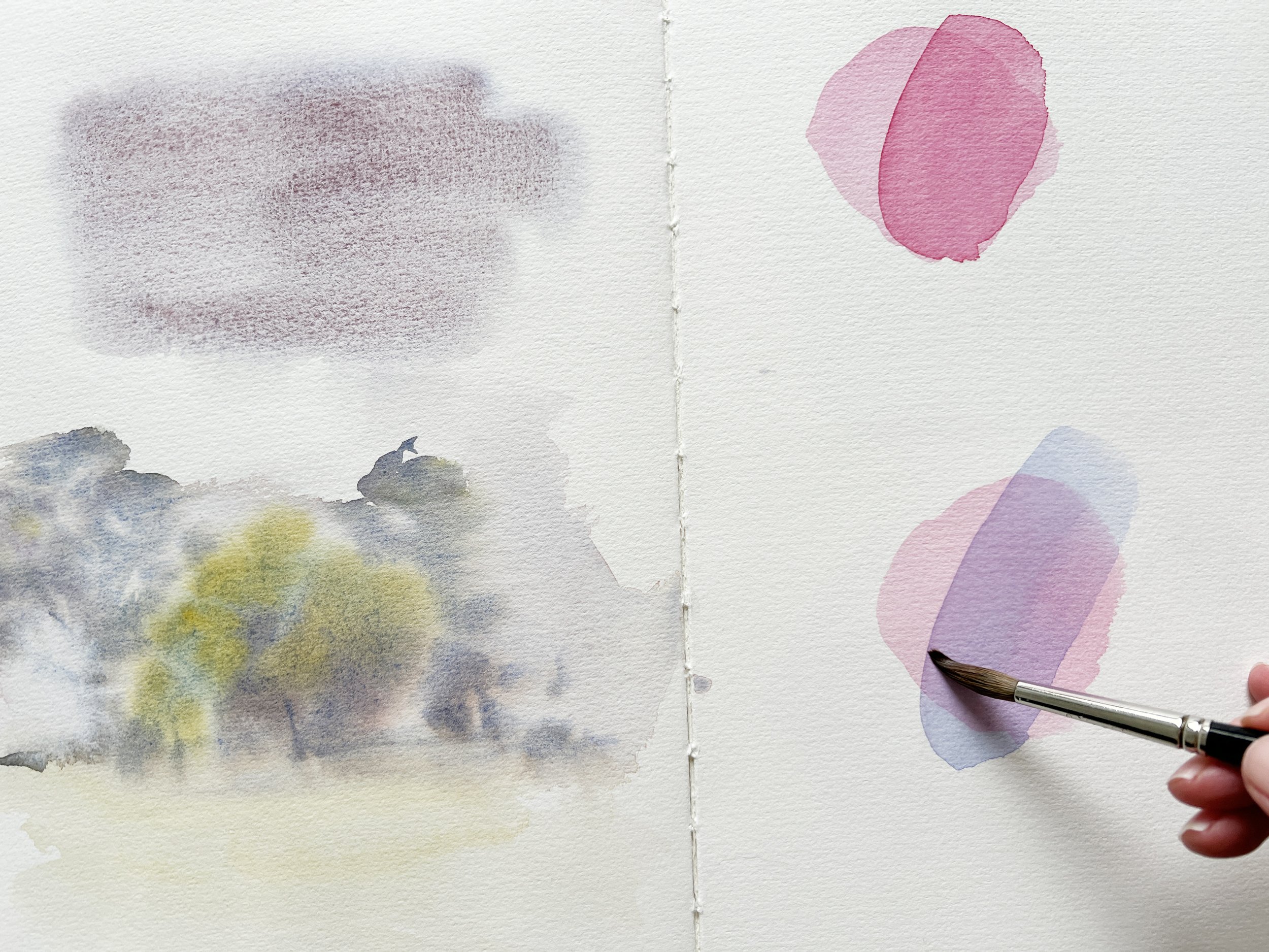
Experimenting in my journal.
Now, something really fun for you to try...
Dropping Watercolour into a Wet Wash: Embracing the Unexpected
Dropping watercolour into a wet wash is a delightful way to create intriguing textures and vibrant, organic patterns in your paintings. This technique allows you to harness the fluid nature of watercolour, resulting in dynamic and often unpredictable outcomes.
Dropping Cobalt Turquoise into a grey wash.
Understanding the Basics
To start, you need a wet wash already applied to your paper. This could be a flat, graded, or variegated wash, depending on your desired effect. The key is to ensure that the wash remains wet enough for the new colours to spread and blend beautifully without becoming muddy. Watch the magic of wet on wet unfold on the paper!
The Process
Preparation: Begin with a solid wash—be it flat or graded. Make sure it’s still shiny and wet. If the surface has started to dry, your new colours may not spread as effectively.
Choosing Your Colours: Select vibrant colours that will stand out against the background wash. Complementary colours often work well, creating striking contrasts. For example, if your base wash is blue, consider using warm colours like reds or oranges for a visually appealing effect.
Dropping the Colour: Using a clean brush or dropper, gently introduce the new colour into the wet surface. You can use a brush to dab or drop the colour in various areas, allowing it to disperse naturally.
Manipulating the Flow: If desired, tilt your paper slightly to guide the paint as it spreads. You can also use a spray bottle to introduce a light mist of water, which will encourage the colours to move even more.
Watching the Magic Happen: One of the most enchanting aspects of this technique is observing how the colours interact. The new paint will bloom and create beautiful patterns, often leading to unexpected shapes and gradients, along with an interesting texture.
Controlling the Outcome
While the spontaneity of this technique is part of its charm, you can still exercise some control over the outcome. For instance:
Layering Colours: Consider layering different colours at different times, allowing some to dry before adding others. This can create complex textures that add depth to your artwork.
Adjusting Water Levels: The amount of water in your wash and in the newly dropped colour will affect how much it spreads. Experiment with varying the water content for different effects; a wetter wash will produce softer, more blended edges, while a slightly drier wash will create sharper, more defined shapes.
Applications in Artwork
This technique is particularly effective in creating backgrounds for landscapes, skies, or abstract watercolour painting pieces. For example, when painting a sunset, you could drop warm hues into a wet wash of blue to mimic the colours of the setting sun reflecting on water.
Moreover, it can also be used to depict natural elements like flowers or foliage. Dropping greens into a wet wash of yellow can create a lovely representation of sunlight filtering through leaves, resulting in a sense of light and movement.
Encouragement to Experiment
As with all watercolour techniques, practice is key. Set aside time to explore dropping colours into wet washes, observing how they interact and create unique results. This technique not only encourages spontaneity but also allows you to develop your intuition as an artist, making decisions based on how the colours respond on the paper.
Embrace the unexpected and let your creativity flow! This painting technique invites a playful exploration of colour, resulting in stunning visual effects that can elevate your watercolour paintings.

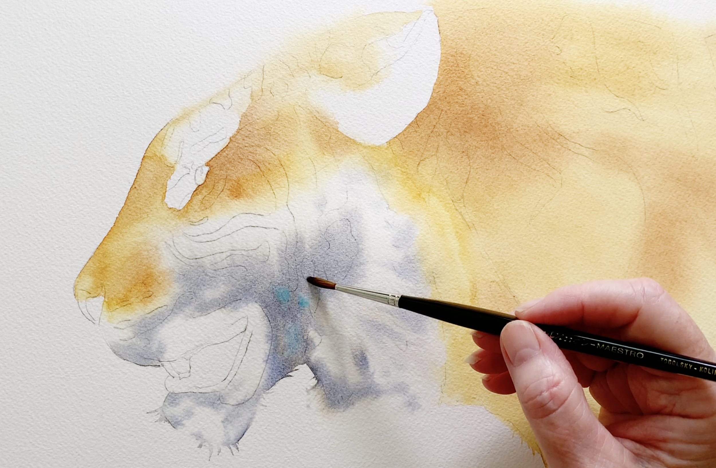
Dropping some Winsor Violet into a wet wash on this rabbit painting
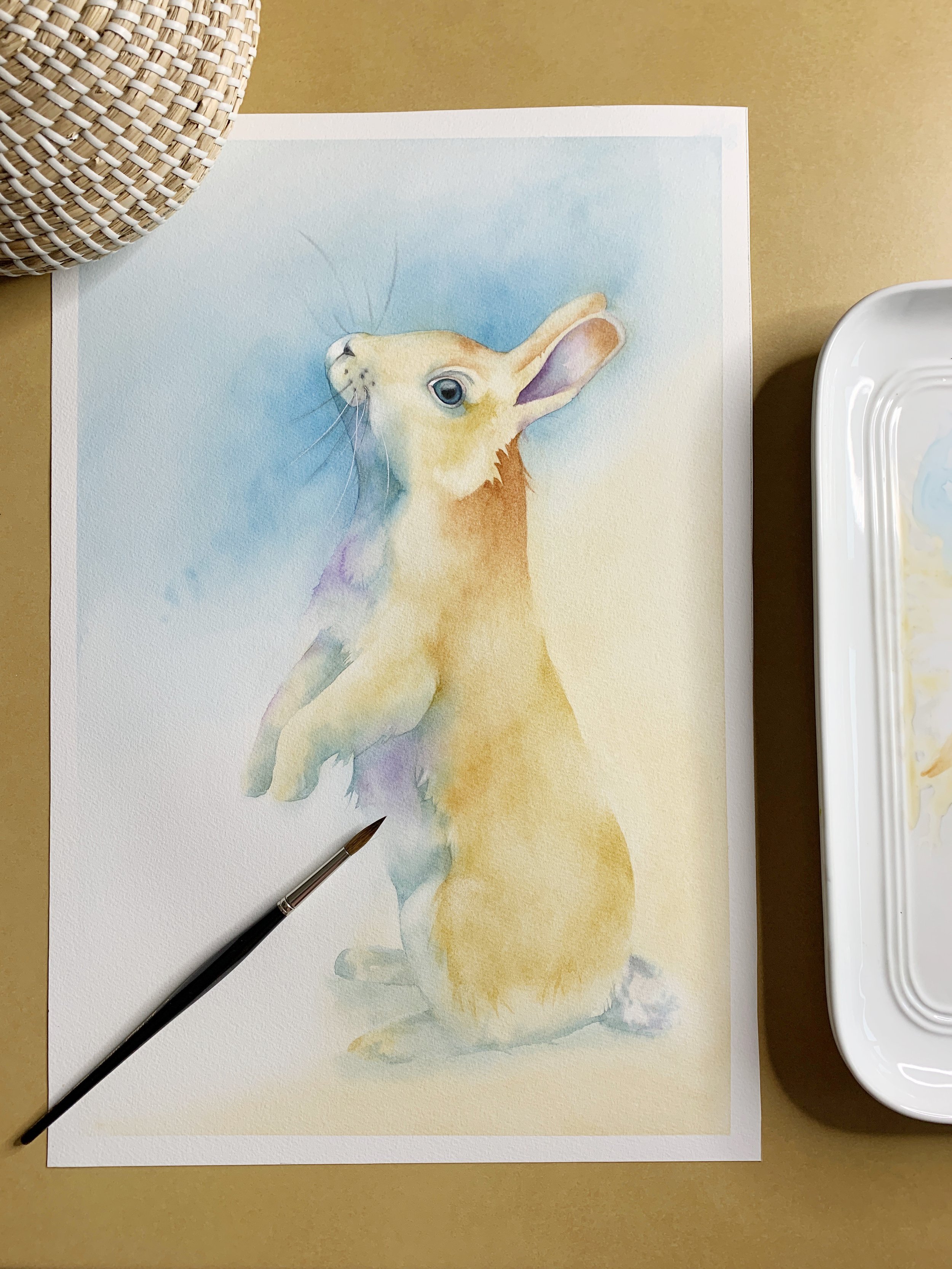
The finished rabbit painting. You can see how the violet created an unexpected but beautiful effect in the fur.
Now It's Your Turn!
Watercolour washes are a powerful tool in any artist's arsenal, allowing for expressive colour applications that can transform your work. By understanding colour theory, selecting the right brushes, maintaining your tools, avoiding common mistakes, and seeking inspiration, you can elevate your watercolour painting practice to new heights.
Mastering these watercolour washes opens a world of possibilities for your artistic expression. Each technique brings its own unique flair, allowing you to adapt your approach based on the subject matter and mood you wish to convey.
For a more detailed demonstration of these different watercolour techniques, be sure to check out my free video tutorials, where I share my expertise and practical tips that can greatly enhance your watercolour practice.
Happy painting!
Remember, practice is key, and each wash you create will bring you one step closer to mastering the art of watercolour.